Class 16 Stat701 Fall 1997
Graphical Analysis of High Dimensional Data
Todays class.

- This is going to be an unusual class as it will be
based entirely on issues concerning the graphical representation of high
dimensional data. There is not alot of theory but here are some examples
of items we will cover:
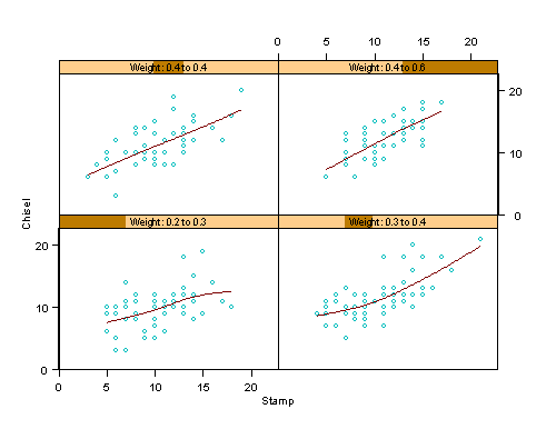
- Image 1 shows a Trellised scatterplot conditioned
over the weight variable, with a smooth superimposed.
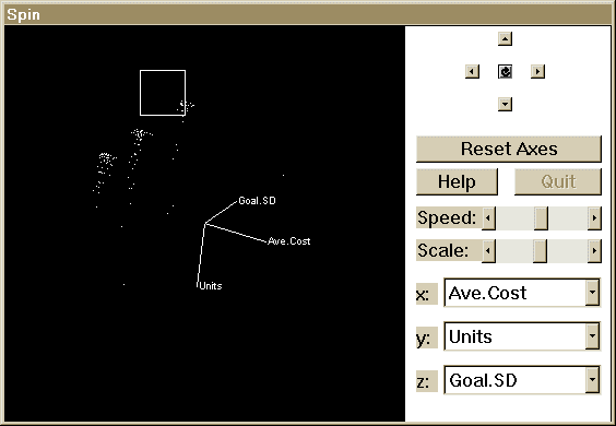
- Image 2 shows a 3-D rotatable scatterplot, that is infact dynamically linked to a scatterplot matrix.
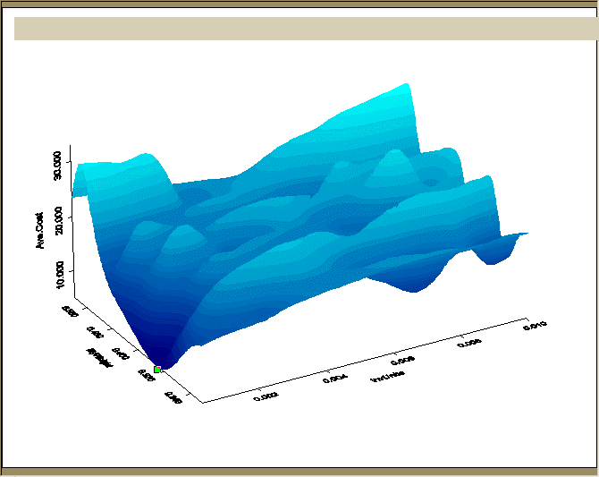
- Image 3 shows a 3-D surface, formed by using a smoothing spline. The color coded contours produce a reasonable representation of
3-D surface .
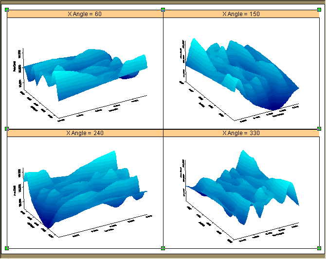
- Image 4 shows the same 3-D surface, but now viewed
from 4 different angles.
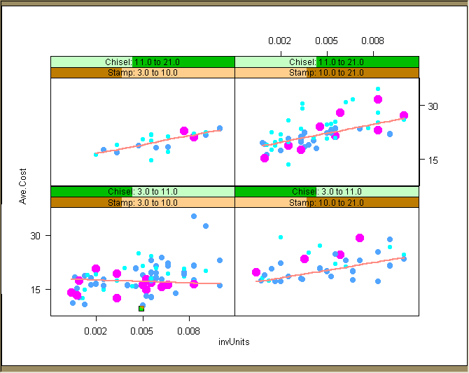
- Finally Image 5 displays a two dimensional scatterplot, Trellised or conditioned over the levels of two other variables. Hence it
is looking at a representation of a four dimensional relationship. Furthermore,
with the addition of color an extra dimension is added, and together with
varying symbol iszes 5 different variables are represented in this plot.
Richard Waterman
Thu Oct 30 1:21:21 EDT 1997