5 Association between Categorical Variables
Association between categorical variables concerns contingency tables, tables that count the number of cases that have the same values of two categorical variables. Like a frequency distribution, contingency tables rely on counting rather than measuring. The native version of a contingency table in R made by the aptly named function table is rather sparse, but others have added packages that enhance the default. The key functions and tasks illustrated in this chapter are (in order of appearance):
- review the use of
barplot,order, andparfor making a bar chart summaryto summarize variables in a large data frametableto create a contingency tablerowSumsandcolSumsto find the margins of a contingency tablerequiremakes sure that a package of R functions is loaded and ready for useinstall.packagesinstalls supplemental packages into the running version of RCrossTablefrom the packagegmodelsrenders a more complete contingency tablesubsetto use a portion of a data framemosaicplotfor mosaic plots
5.1 Analytics in R: Car Theft
This first example is very similar to those in Chapter 3, with the difference being the presence of two categorical attributes rather than just one. Instead of just counting the number of cars of different model types, we’re counting the number of cars of different model types that were stolen. Here’s the data, already in the form of counts. There are counts, however, of thefts for many more models than shown in the text example.
Theft <- read.csv("Data/05_4m_car_theft.csv")
dim(Theft)
## [1] 211 3This data frame has the relevant counts for a contingency table, but the data frame is not organized like such a table. Instead, the counts in the data frame are not mutually exclusive. Those 5 stolen Audi A3 models shown in the following list are part of the 3,719 that were made. The column Made is actually the margin of the contingency table rather than cells of the table. The rows are sorted in alphabetical order by the model of the vehicle.
head(Theft) # head shows the first 6 rows of a data frame## Model Stolen Made
## 1 ASTON MARTIN DB9 0 128
## 2 ASTON MARTIN V8 VANTAGE 0 236
## 3 AUDI A3 5 3719
## 4 AUDI A4/A5 36 47939
## 5 AUDI A6 8 19268
## 6 AUDI A7 13 6626To make these counts into a contingency table, we have to subtract the number stolen from the number made, getting a table that starts out like this.
with(Theft,
    head(data.frame(Model=Model,Stolen=Stolen,Not_Stolen=Made - Stolen))
)
## Model Stolen Not_Stolen
## 1 ASTON MARTIN DB9 0 128
## 2 ASTON MARTIN V8 VANTAGE 0 236
## 3 AUDI A3 5 3714
## 4 AUDI A4/A5 36 47903
## 5 AUDI A6 8 19260
## 6 AUDI A7 13 6613The original data frame is more convenient for this analysis, however, because we want to know the models with the highest rate of theft. It is simple to compute and add the proportion stolen to the columns in the original data frame.
Theft$PctStolen <- 100 * Theft$Stolen/Theft$MadeNow we sort the data (or look at the data using View) based on the number made, much as we did back in Chapter 3. Here are the rates of theft for the 10 most common models.
i <- order(Theft$Made, decreasing = TRUE)
Sorted <- Theft[i,]
Sorted[1:10,]
## Model Stolen Made PctStolen
## 97 HYUNDAI ELANTRA 469 411249 0.11404283
## 142 NISSAN ALTIMA 693 393800 0.17597765
## 81 HONDA ACCORD 231 372134 0.06207441
## 87 HONDA CIVIC 189 361723 0.05224993
## 101 HYUNDAI SONATA 388 313346 0.12382478
## 179 TOYOTA COROLLA 566 313314 0.18064944
## 50 FORD ESCAPE 265 310054 0.08546898
## 178 TOYOTA CAMRY 353 280399 0.12589203
## 88 HONDA CR-V 102 278583 0.03661386
## 32 CHEVROLET EQUINOX 115 259361 0.04433974The function barplot produces a bar chart. To get the plot to look presentable, we have to adjust the margins of the display. Otherwise, there’s no room for labeling the bars. The function par manages the parameters that control the format used in plots, including the amount of room left on the margins.
savedPar <- par(mar=c(4,11,1,1), las=1)   # make room for names

with(Sorted,
     barplot(PctStolen[1:10], names=Model[1:10], horiz=TRUE, xlab="% Stolen")
     )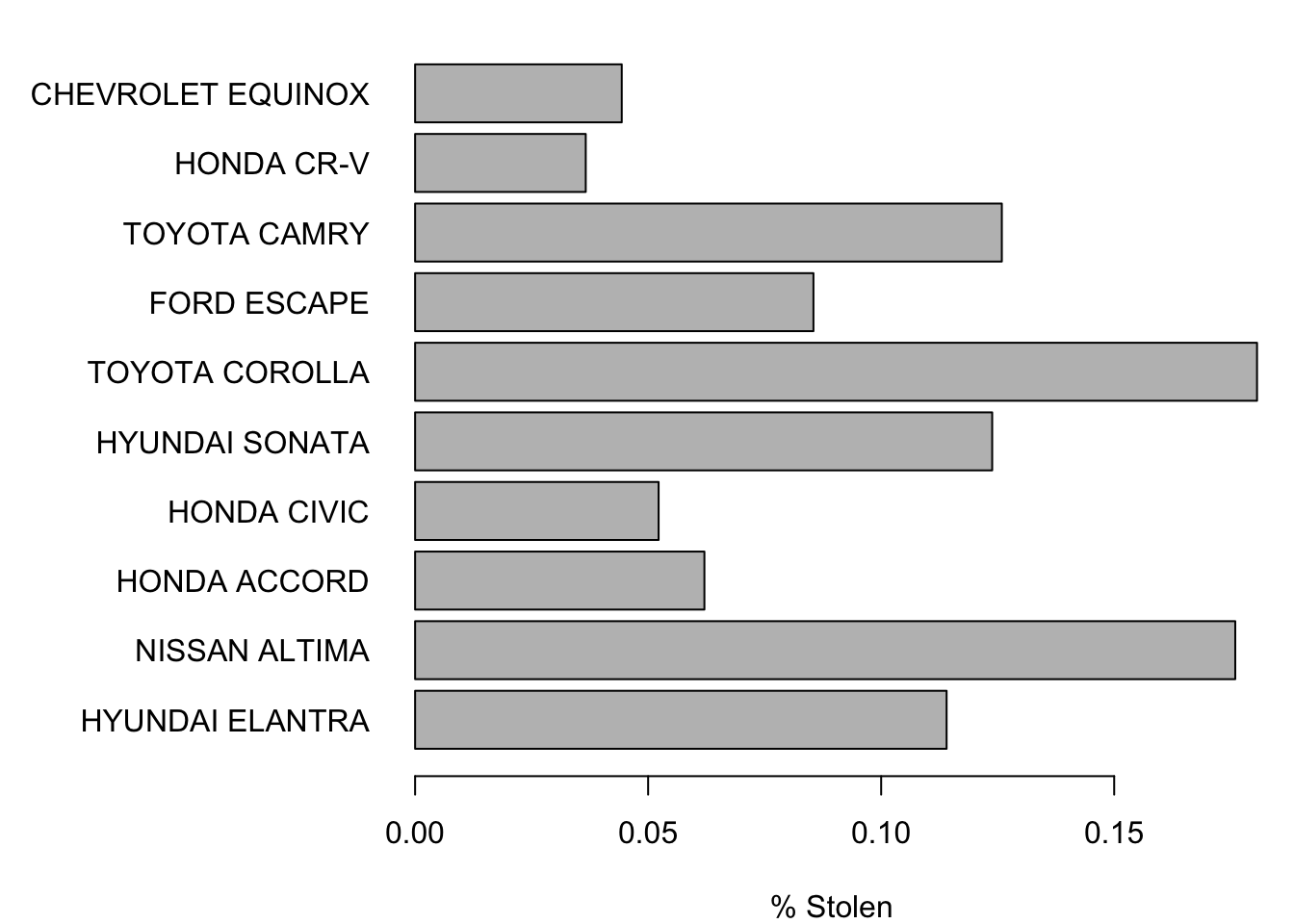
par(savedPar) # restore default plot parametersIf you prefer to see these in the order shown in the textbook, reverse the order of the indices. That is, in place of the indices 1:10, use 10:1. Just remember to reverse the indices in both places that the indices appear or you will ruin the correspondence between the model and percentage stolen.
savedPar <- par(mar=c(4,11,1,1), las=1)

with(Sorted,
     barplot(PctStolen[10:1], names=Model[10:1], horiz=TRUE, xlab="% Stolen")
     )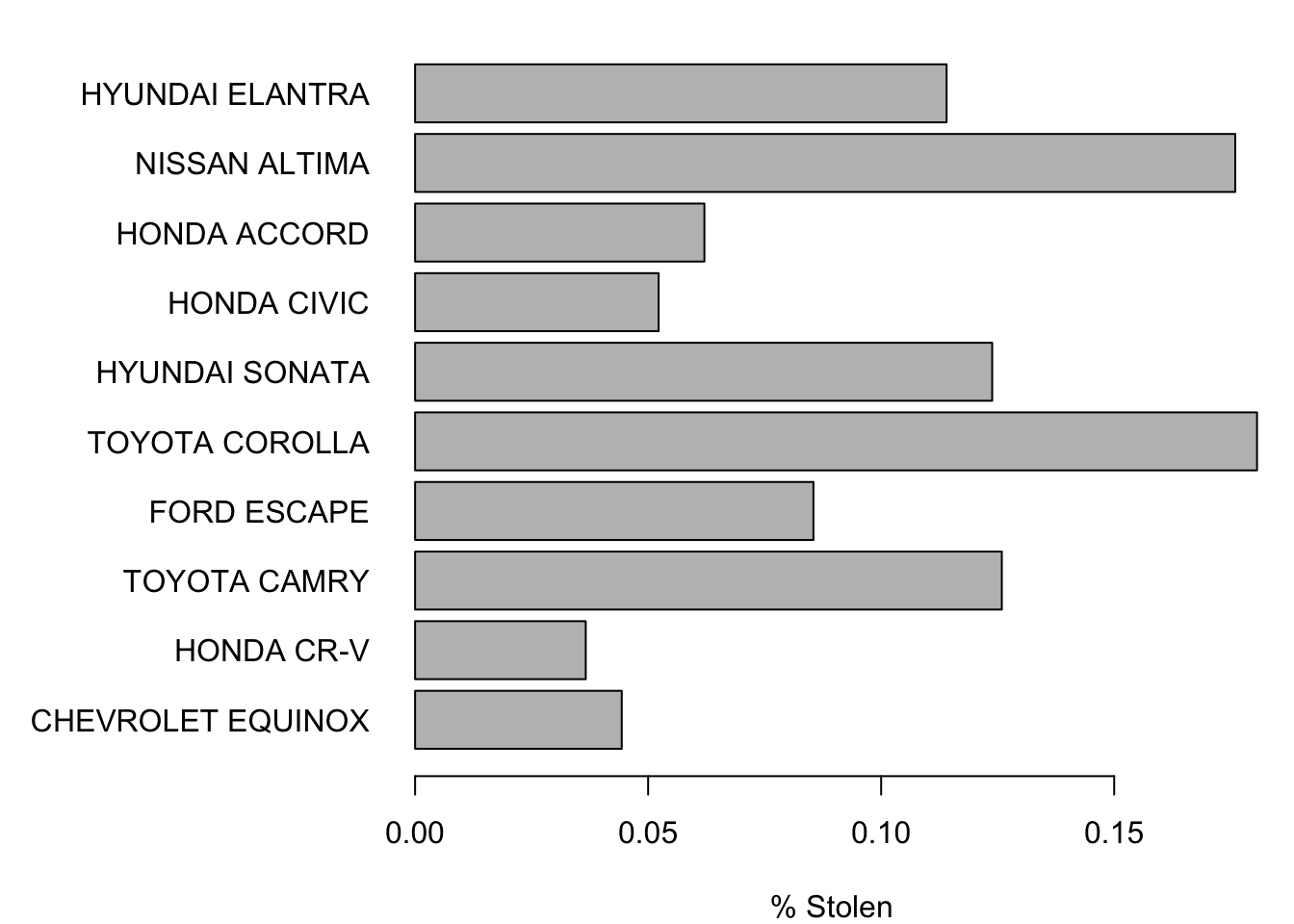
par(savedPar)5.2 Analytics in R: Airline Arrivals
This is another larger data frame. The data give the arrival status of 10,906 flights. Reading a table of this size is not a problem for R.
Arrive <- read.csv("Data/05_4m_arrivals.csv")
dim(Arrive)
## [1] 10906 4Each row of the data frame tells whether the flight was delayed, the name of the airline, the destination of the flight, and the origin of the flight. (In this example, storing the airline names as a factor starts to make sense.)
head(Arrive)## Status Airline Destination Origin
## 1 Delayed Delta Orlando, FL Atlanta, GA
## 2 On time Delta Orlando, FL Atlanta, GA
## 3 On time Delta Boston, MA Atlanta, GA
## 4 On time Delta Orlando, FL Atlanta, GA
## 5 On time Delta Boston, MA Atlanta, GA
## 6 On time Delta San Diego, CA Atlanta, GAThis is a very large collection of flights, so let’s get a quick summary.
summary(Arrive)## Status Airline Destination
## Delayed:2344 American:7651 Boston, MA :3235
## On time:8562 Delta :3255 Orlando, FL :2138
## Philadelphia, PA:4735
## San Diego, CA : 798
##
##
##
## Origin
## Atlanta, GA :1089
## New York, NY :1045
## Charlotte, NC : 856
## Philadelphia, PA: 717
## Washington, DC : 684
## Phoenix, AZ : 543
## (Other) :5972These flights were made by two airlines, American and Delta, flying to four destinations.
The table function creates the contingency table discussed in the first portion of the example in the text. The default contingency table created by R is rather sparse, giving just the cell counts without row and column margins.
table(Arrive$Status, Arrive$Airline)##
## American Delta
## Delayed 1685 659
## On time 5966 2596It is easy using the functions rowSums and colSums to find the marginal totals. First save the table in a variable that we can manipulate, then call these functions.
tab <- table(Arrive$Status, Arrive$Airline)

rowSums(tab)
## Delayed On time
## 2344 8562colSums(tab)## American Delta
## 7651 3255We could use these to find the percentages of cases within rows or columns, but that gets tedious. This is such a common task that there’s an R package that does just what we need. That’s often the case: if you find that the default capability in R lacks what you want, there’s a goods chance someone has built a package that does just what you need. A bit of Googling will often find what you want and save time.
For building tables, the package gmodels includes a function that produces a more complete contingency table. (If this package is not installed on your computer, use the command install.packages("gmodels") to obtain it first. If you are using R-Studio, used the tab labeled “Packages” in the lower right panel.)
require(gmodels)The function that we want from this package is called CrossTable. Whereas the default R contingency table is rather sparse, the CrossTable provides too many values for each cell.
CrossTable(Arrive$Status, Arrive$Airline)##
##
## Cell Contents
## |-------------------------|
## | N |
## | Chi-square contribution |
## | N / Row Total |
## | N / Col Total |
## | N / Table Total |
## |-------------------------|
##
##
## Total Observations in Table: 10906
##
##
## | Arrive$Airline
## Arrive$Status | American | Delta | Row Total |
## --------------|-----------|-----------|-----------|
## Delayed | 1685 | 659 | 2344 |
## | 1.002 | 2.355 | |
## | 0.719 | 0.281 | 0.215 |
## | 0.220 | 0.202 | |
## | 0.155 | 0.060 | |
## --------------|-----------|-----------|-----------|
## On time | 5966 | 2596 | 8562 |
## | 0.274 | 0.645 | |
## | 0.697 | 0.303 | 0.785 |
## | 0.780 | 0.798 | |
## | 0.547 | 0.238 | |
## --------------|-----------|-----------|-----------|
## Column Total | 7651 | 3255 | 10906 |
## | 0.702 | 0.298 | |
## --------------|-----------|-----------|-----------|
##
## In addition to the counts, the table shows every possible percentage from that cell (as a percentage of the row, the column, and the whole table) as well as its contribution to the overall chi-squared statistic. We want to focus on the column percentages since those tell us how often flights on American or Delta are delayed. It is easy (once you read the help information for CrossTable) to turn off some of the default output.
CrossTable(Arrive$Status, Arrive$Airline, prop.r=FALSE, prop.chisq=FALSE, prop.t=FALSE)##
##
## Cell Contents
## |-------------------------|
## | N |
## | N / Col Total |
## |-------------------------|
##
##
## Total Observations in Table: 10906
##
##
## | Arrive$Airline
## Arrive$Status | American | Delta | Row Total |
## --------------|-----------|-----------|-----------|
## Delayed | 1685 | 659 | 2344 |
## | 0.220 | 0.202 | |
## --------------|-----------|-----------|-----------|
## On time | 5966 | 2596 | 8562 |
## | 0.780 | 0.798 | |
## --------------|-----------|-----------|-----------|
## Column Total | 7651 | 3255 | 10906 |
## | 0.702 | 0.298 | |
## --------------|-----------|-----------|-----------|
##
## With the other output removed, it is easy to see that 22.0% of flights on American were delayed compared to 20.2% on Delta.
The issue in this example is that there is a lurking variable in the background, namely the flight destination. Consider this table.
CrossTable(Arrive$Destination, Arrive$Airline, prop.r=FALSE, prop.chisq=FALSE, prop.t=FALSE)##
##
## Cell Contents
## |-------------------------|
## | N |
## | N / Col Total |
## |-------------------------|
##
##
## Total Observations in Table: 10906
##
##
## | Arrive$Airline
## Arrive$Destination | American | Delta | Row Total |
## -------------------|-----------|-----------|-----------|
## Boston, MA | 1826 | 1409 | 3235 |
## | 0.239 | 0.433 | |
## -------------------|-----------|-----------|-----------|
## Orlando, FL | 970 | 1168 | 2138 |
## | 0.127 | 0.359 | |
## -------------------|-----------|-----------|-----------|
## Philadelphia, PA | 4423 | 312 | 4735 |
## | 0.578 | 0.096 | |
## -------------------|-----------|-----------|-----------|
## San Diego, CA | 432 | 366 | 798 |
## | 0.056 | 0.112 | |
## -------------------|-----------|-----------|-----------|
## Column Total | 7651 | 3255 | 10906 |
## | 0.702 | 0.298 | |
## -------------------|-----------|-----------|-----------|
##
## This table shows that more than half of the American flights in this data frame went to Philadelphia whereas fewer than 10% of those on Delta went to Philadelphia. Does the destination matter? Another table reveals that the answer to that question is “yes”.
CrossTable(Arrive$Status, Arrive$Destination, prop.r=FALSE, prop.chisq=FALSE, prop.t=FALSE)##
##
## Cell Contents
## |-------------------------|
## | N |
## | N / Col Total |
## |-------------------------|
##
##
## Total Observations in Table: 10906
##
##
## | Arrive$Destination
## Arrive$Status | Boston, MA | Orlando, FL | Philadelphia, PA | San Diego, CA | Row Total |
## --------------|------------------|------------------|------------------|------------------|------------------|
## Delayed | 615 | 378 | 1230 | 121 | 2344 |
## | 0.190 | 0.177 | 0.260 | 0.152 | |
## --------------|------------------|------------------|------------------|------------------|------------------|
## On time | 2620 | 1760 | 3505 | 677 | 8562 |
## | 0.810 | 0.823 | 0.740 | 0.848 | |
## --------------|------------------|------------------|------------------|------------------|------------------|
## Column Total | 3235 | 2138 | 4735 | 798 | 10906 |
## | 0.297 | 0.196 | 0.434 | 0.073 | |
## --------------|------------------|------------------|------------------|------------------|------------------|
##
## Among these flights, those into Philadelphia have have the lowest on-time arrival rate. The original table that ignores destination is, in a sense, comparing flights on American into Philadelphia to those on Delta to “easier” destinations.
In fact, if we limit the analysis to any one destination, American consistently has a higher proportion of on-time arrivals. The function subset makes it convenient to work with portion of the data in a data frame. For example, here is the comparison of arrival rates in Boston.
with(subset(Arrive, Destination=="Boston, MA"),
     CrossTable(Status, Airline, prop.r=FALSE, prop.chisq=FALSE, prop.t=FALSE))
##
##
## Cell Contents
## |-------------------------|
## | N |
## | N / Col Total |
## |-------------------------|
##
##
## Total Observations in Table: 3235
##
##
## | Airline
## Status | American | Delta | Row Total |
## -------------|-----------|-----------|-----------|
## Delayed | 334 | 281 | 615 |
## | 0.183 | 0.199 | |
## -------------|-----------|-----------|-----------|
## On time | 1492 | 1128 | 2620 |
## | 0.817 | 0.801 | |
## -------------|-----------|-----------|-----------|
## Column Total | 1826 | 1409 | 3235 |
## | 0.564 | 0.436 | |
## -------------|-----------|-----------|-----------|
##
## Among these 3,235 flights, Delta is late more often, 19.9%, compared to 18.3% for American. The same holds for any of the other destinations: that’s Simpson’s paradox.
5.3 Analytics in R: Real Estate
The data frame for this example describes the choice of fuels for heating and cooking appliances in 447 new homes.
Fuel <- read.csv("Data/05_4m_real_estate.csv")
dim(Fuel)
## [1] 447 2head(Fuel)## Cooking Heating
## 1 Electric Electric
## 2 Gas Gas
## 3 Gas Gas
## 4 Electric Electric
## 5 Gas Gas
## 6 Electric GasWe can get the desired contingency table and chi-squared statistic using the CrossTable function as in the previous example. The output also warns us that the counts are small if you plan to use the chi-squared statistic for inference, a topic that we return to later in Chapter 18.
with(Fuel,
    CrossTable(Cooking, Heating, prop.r=FALSE, prop.chisq=FALSE, prop.t=FALSE, chisq=TRUE)
)
## Warning in chisq.test(t, correct = FALSE, ...): Chi-squared approximation
## may be incorrect##
##
## Cell Contents
## |-------------------------|
## | N |
## | N / Col Total |
## |-------------------------|
##
##
## Total Observations in Table: 447
##
##
## | Heating
## Cooking | Electric | Gas | Row Total |
## -------------|-----------|-----------|-----------|
## Electric | 136 | 136 | 272 |
## | 0.913 | 0.456 | |
## -------------|-----------|-----------|-----------|
## Gas | 10 | 162 | 172 |
## | 0.067 | 0.544 | |
## -------------|-----------|-----------|-----------|
## Other | 3 | 0 | 3 |
## | 0.020 | 0.000 | |
## -------------|-----------|-----------|-----------|
## Column Total | 149 | 298 | 447 |
## | 0.333 | 0.667 | |
## -------------|-----------|-----------|-----------|
##
##
## Statistics for All Table Factors
##
##
## Pearson's Chi-squared test
## ------------------------------------------------------------
## Chi^2 = 98.61628 d.f. = 2 p = 3.852539e-22
##
##
## Once we have chi-squared, it is simple to compute Cramer’s V.
sqrt(98.61628/(447*1))## [1] 0.46975.4 Mosaic plots
Mosaic plots were not in these case studies in the text (to save space, alas) but these offer a great way to visualize association in tables. R offers mosaic plots through the aptly named built-in function mosaicplot. We’ll illustrate mosaic plots using data from the examples in this chapter.
mosaicplot works using a table as constructed by the table function. Here’s an example for the heating fuels.
with(Fuel,
     mosaicplot(table(Heating, Cooking), color=TRUE)
)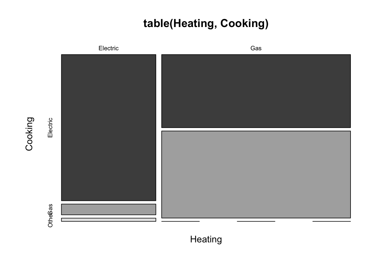
The dramatic difference in vertical shares shows the large association between these categorical variables. Homes with electric heating predominantly use electricity for cooking (left column), whereas those with gas heat are more evenly divided.
The strength of association between heating and cooking fuels is very different from that found for the airline data. The association between airline and delay status is much weaker. You can barely see the difference in shares.
with(Arrive,
     mosaicplot(table(Airline, Status), color=c('lightblue', 'darkblue'))
)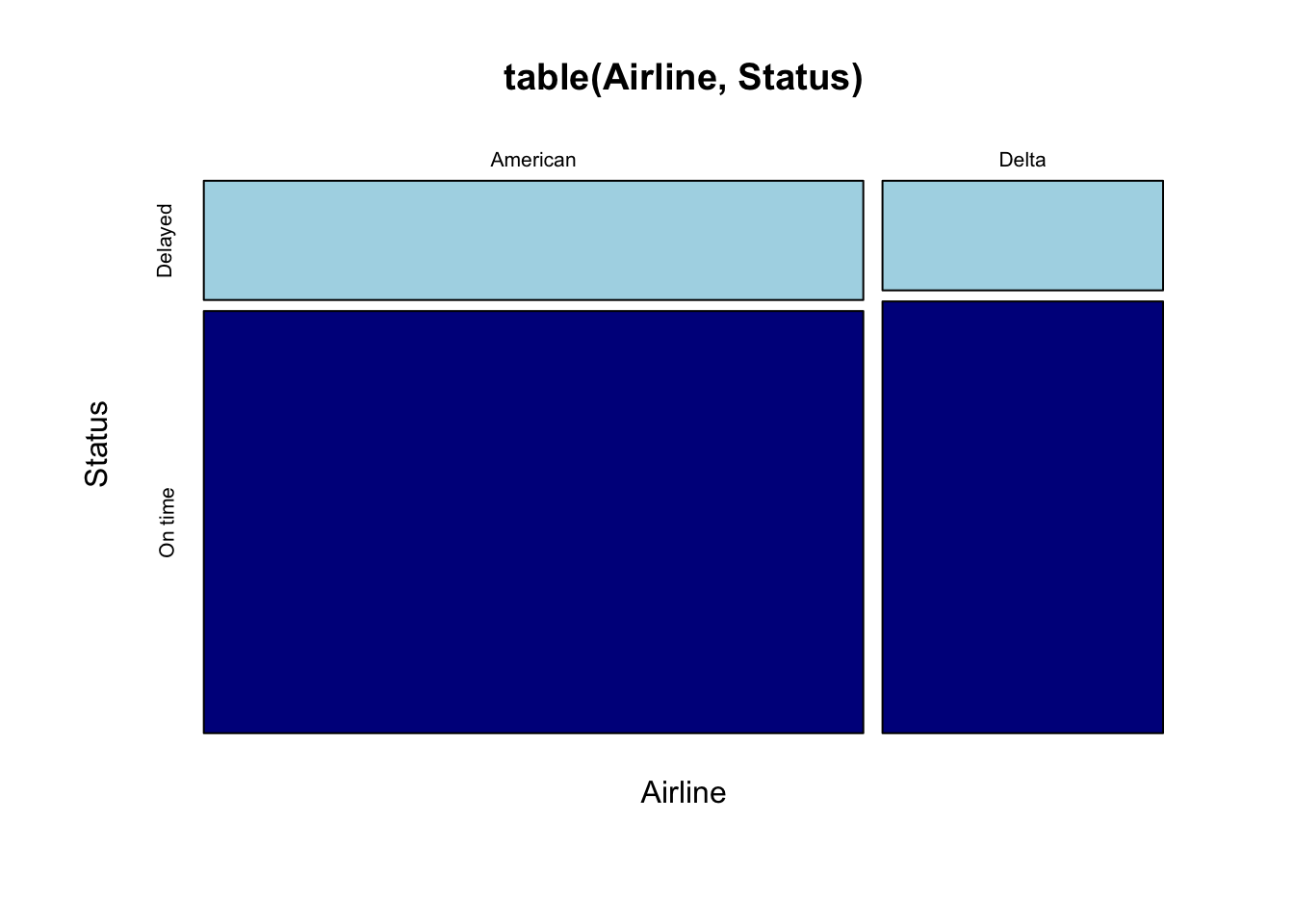
The mosaic plot shows that we have more flights on American than Delta (the width of the column for American is wider) and that Delta is on time more often overall than American. The plot reminds you of the very slight difference in arrival status between the two airlines (the split is almost flat across the two columns of the plot).