25 Categorical Explanatory Variables
The introduction of categorical explanatory variables in regression complicates the interpretation of a regression model, but not the construction of a regression itself. R takes care of building any needed dummy variables; you don’t have to build these variables “by hand”. There are graphical considerations, however, such as assigning different colors to different groups.
plotwill draw points in the colors determined by the optioncollegendadds an explanatory legend to a plotsubsetselects portions of a data frame
25.1 Analytics in R: Priming in Advertising
The data for this example concern whether the effectiveness of a promotion was influenced by priming the targeted customer offices.
Prime <- read.csv("Data/25_4m_priming.csv")
dim(Prime)
## [1] 125 5head(Prime)## Mailings Hours Aware Hours_x_Aware Awareness
## 1 15 0.59 0 0 NO
## 2 49 2.91 0 0 NO
## 3 42 3.45 0 0 NO
## 4 0 0.31 0 0 NO
## 5 26 1.10 0 0 NO
## 6 35 3.38 0 0 NOThe data frame includes redundant columns The variable Aware is a dummy variable constructed from the categorical variable Awareness. The variable Hours_x_Aware is the product of the dummy variable times the variable Hours; this is the interaction variable. We don’t need these for the regression modeling in R; R will build these as needed.
It is very helpful when building regression models that involve categorical variables to use colors to identify the subsets associated with the different categories. The function ifelse makes that easy to do. The following command makes a vector that has value 'green' for the cases in which Awareness is "YES" and the value 'red' if not. (Put this variable into the data frame with the other information about the offices; that keeps the variables for these cases neatly together.)
Prime$color <- ifelse(Prime$Awareness=="YES", 'green', 'red')This vector makes it easy to produce a scatterplot with the two subsets identified by color. The function legend adds a legend to the plot as shown. You will need to experiment with placing the legend on the plot to avoid covering data.
plot(Mailings ~ Hours, data=Prime, col=Prime$color, pch=19)  # pch=19: solid points show color better
legend('topleft', c("Aware", "Unaware"), col=c('green', 'red'), pch=19)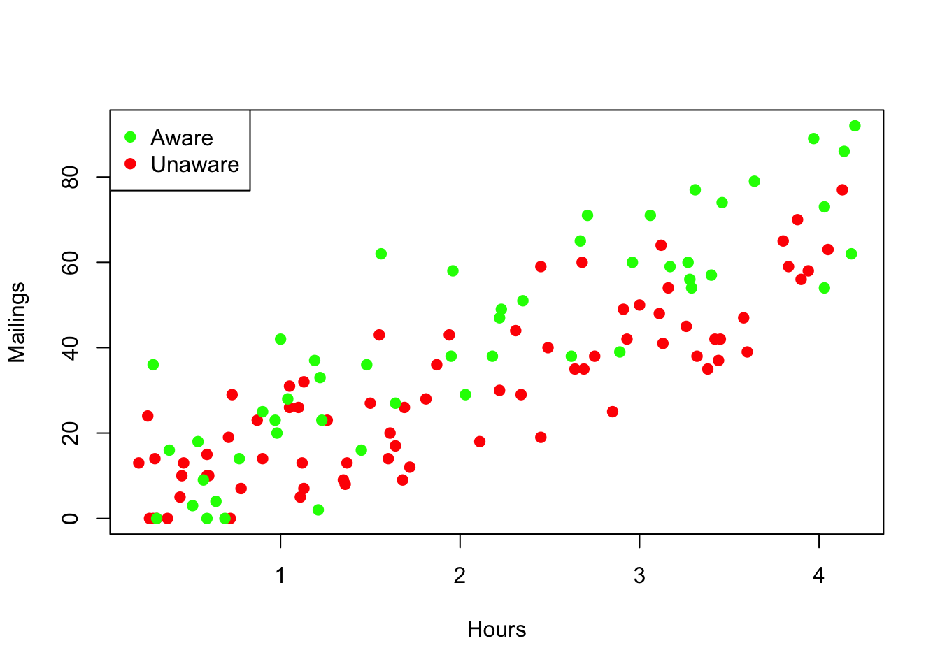
It is easy to add regression lines that are colored to match the subsets. Use the function subset to build data frames that are subsets of the original, and then use these to fit simple regressions to the separate groups. Use informative names to avoid losing track of which data belong to which group.
regr_aware <- lm(Mailings ~ Hours, data=subset(Prime, Awareness=="YES"))
regr_aware
##
## Call:
## lm(formula = Mailings ~ Hours, data = subset(Prime, Awareness ==
## "YES"))
##
## Coefficients:
## (Intercept) Hours
## 4.161 18.129regr_unaware <- lm(Mailings ~ Hours, data=subset(Prime, Awareness=="NO"))
regr_unaware##
## Call:
## lm(formula = Mailings ~ Hours, data = subset(Prime, Awareness ==
## "NO"))
##
## Coefficients:
## (Intercept) Hours
## 2.454 13.821Now use abline with the color option set appropriately. The first two lines of the following commands repeat those used to generate the initial plot.
plot(Mailings ~ Hours, data=Prime, col=Prime$color, pch=19)  # solid points show color better
legend('topleft', c("Aware", "Unaware"), col=c('green', 'red'), pch=19)
abline(regr_aware, col='green')
abline(regr_unaware,col='red')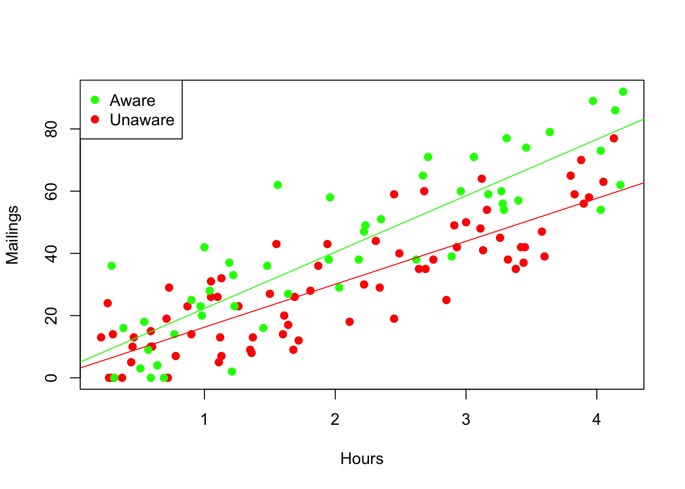
By combining these two simple regressions into one multiple regression, we can test for the statistical significance of differences between the fits seen in the graph. The syntax X1 * X2 in the formula of a linear model tells R to include X1, X2 and their interaction in the fitted equation. The summary of this multiple regression tells us that the interaction is indeed statistically significant, provided the assumptions of the MRM hold.
mult_regr <- lm(Mailings ~ Hours * Awareness, data=Prime)
summary(mult_regr)
##
## Call:
## lm(formula = Mailings ~ Hours * Awareness, data = Prime)
##
## Residuals:
## Min 1Q Median 3Q Max
## -24.097 -8.121 -0.747 7.399 29.558
##
## Coefficients:
## Estimate Std. Error t value Pr(>|t|)
## (Intercept) 2.454 2.502 0.981 0.3286
## Hours 13.821 1.088 12.705 <2e-16 ***
## AwarenessYES 1.707 3.991 0.428 0.6697
## Hours:AwarenessYES 4.308 1.683 2.560 0.0117 *
## ---
## Signif. codes: 0 '***' 0.001 '**' 0.01 '*' 0.05 '.' 0.1 ' ' 1
##
## Residual standard error: 11.16 on 121 degrees of freedom
## Multiple R-squared: 0.7665, Adjusted R-squared: 0.7607
## F-statistic: 132.4 on 3 and 121 DF, p-value: < 2.2e-16The usual diagnostic plots do not show a problem. (That there are more green points at the far right is not a problem; it’s the result of this group having larger fitted values.)
plot(residuals(mult_regr) ~ fitted.values(mult_regr), col=Prime$color, pch=19)
abline(h=0, col='gray')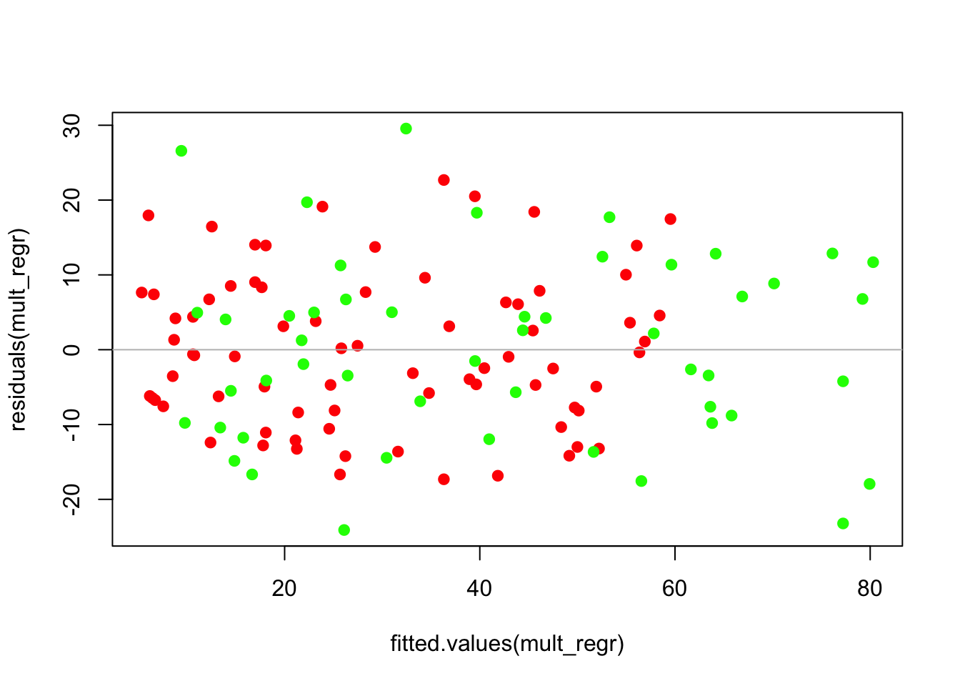
The comparison boxplots of the residuals have similar IQRs, so the variance appears similar in the two groups. Notice the use of a formula to have separate boxplots drawn for the two groups. (The groups are drawn in alphabetical order determined by the values of the factor, so choose the colors appropriately.)
boxplot(residuals(mult_regr) ~ Prime$Awareness, col=c('red', 'green'))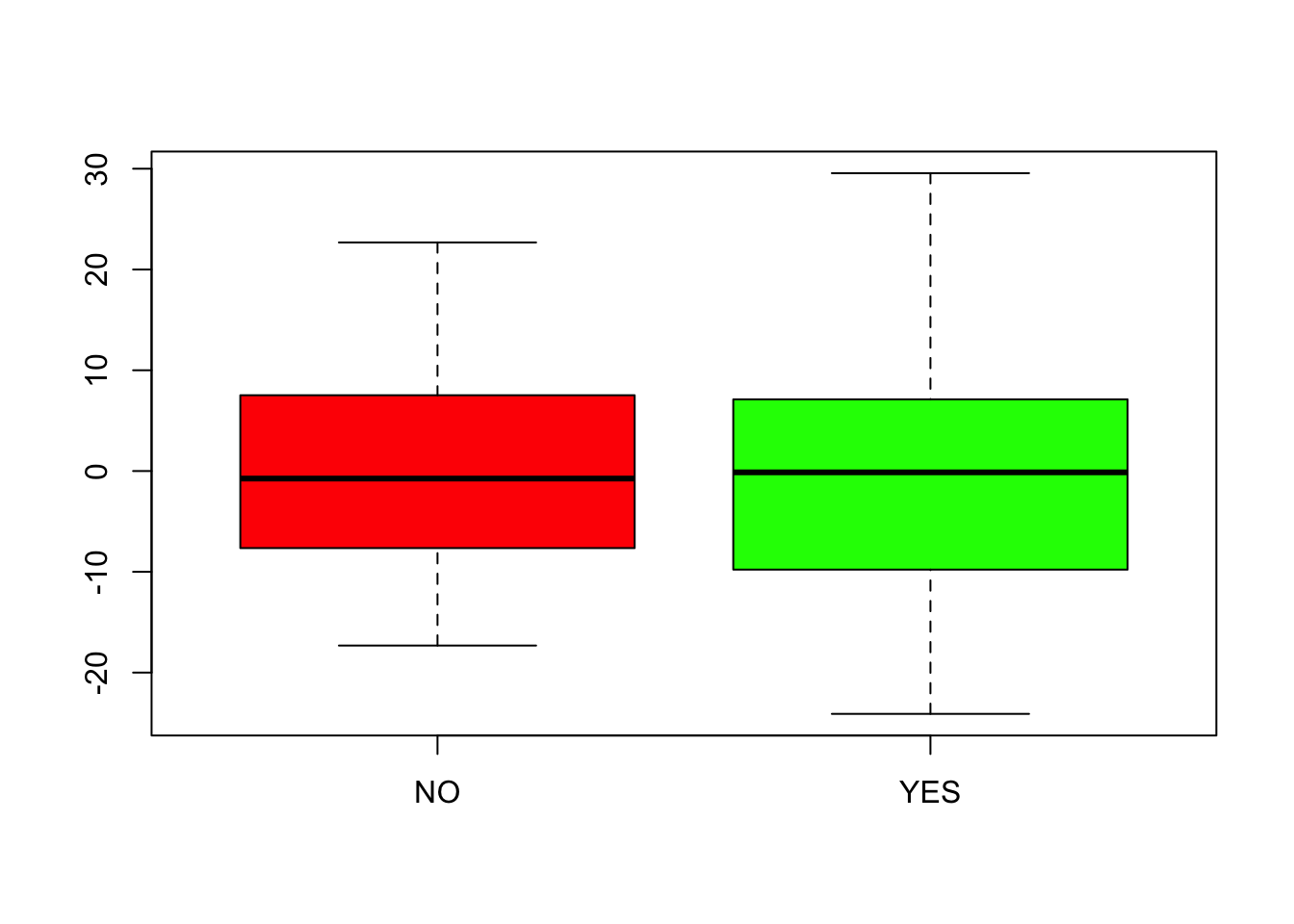
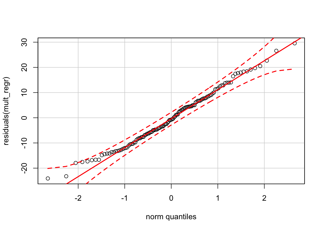
Finally, the normal quantile plot appears okay. (As noted in other chapters, the normal QQ plot drawn by the function qqPlot from car produces bounds that appear too tight compared to our reference software.)
require(car)
qqPlot(residuals(mult_regr))