14 Sampling Variation and Quality Control
You can find a variety of packages for building control charts in R, but it is so easy to do ourselves that we will build our own here. Doing so also illustrates some important computing methods in R that you might need for other projects. The functions covered in this chapter are:
tapplycomputes a summary statistic on subsetsablineadds horizontal lines to a plot (as well as other line types shown previously)
14.1 Analytics in R: Monitoring a Call Center
Begin by building the data frame. The data give the day of the call to the center and the length of the call in minutes for 1000 calls.
Calls <- read.csv("Data/14_4m_call_center.csv")
dim(Calls)
## [1] 1000 2head(Calls)## Day Call.Length
## 1 1 3.8
## 2 1 2.3
## 3 1 3.1
## 4 1 6.4
## 5 1 1.7
## 6 1 4.3Here’s a plot of the call lengths versus the day of the call. The data appear skewed, so before we use a normal distribution to describe the variation among sample averages, we need to check the kurtosis/sample size condition.
plot(Call.Length ~ Day, data = Calls)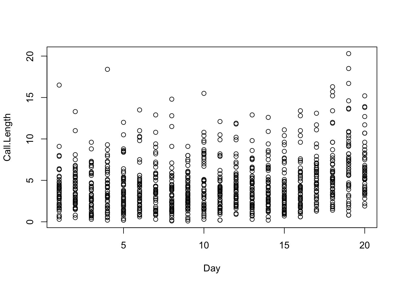
You need to compute the kurtosis for checking this condition during a stable period when the process is under control. That seems to be the case for the first 5 days. Nothing seems to change visually until after day 10 or so.
Here’s the histogram and boxplot of the call lengths on the first 5 days, ignoring the day of the call. (We illustrated this type of display that adds a boxplot to the histogram back in Chapter 6.)
hist(Calls$Call.Length[1:250], ylim=c(0,105))
boxplot(Calls$Call.Length[1:250], add=TRUE, horizontal=TRUE, at=95, boxwex=10)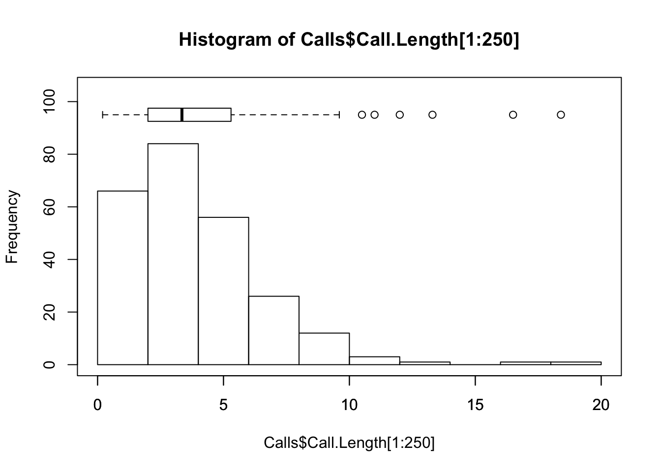
The distribution of the call lengths is right-skewed. We can compute the kurtosis of the sample directly, but it is easier to rely on a package such as moments that comes with this statistic. (As always, you need to install this package in your copy of R before using it.)
require(moments)    # require loads the package as needed

kurtosis(Calls$Call.Length[1:250])
## [1] 7.73484This is not quite the correct version of the kurtosis, however. The version of kurtosis used in the textbook is commonly known as the excess kurtosis. The excess kurtosis is 3 less than the “regular” kurtosis. You can recognize that the version of kurtosis from the moments package is different by computing the kurtosis of a large sample from a normal distribution; the value you will get is close to 3.
kurtosis(rnorm(1000)) # kurtosis of normal sample with n=1000## [1] 3.006662Hence the relevant kurtosis for checking the kurtosis condition requires that we subtract 3 from the result computed by kurtosis.
kurtosis(Calls$Call.Length[1:250]) - 3## [1] 4.73484We need \(47 < n\) to satisfy the sample size condition, so the daily samples of 50 calls in this example are just barely adequate.
Next build the x-bar control chart. This chart shows a graph of the average call length on each day. That sounds like it might be hard to do, but R has just the function we need for this calculation. The function tapply computes a function on subsets of the data identified by a factor. For example, this calculation yields the sequence of daily averages, one for each day.
xbar <- tapply(Calls$Call.Length, Calls$Day, mean) # data, factor, statisticA plot of these averages shows that the average length of calls starts to grow around Day 16.
plot(1:20, xbar, ylim=c(2.5,7.5))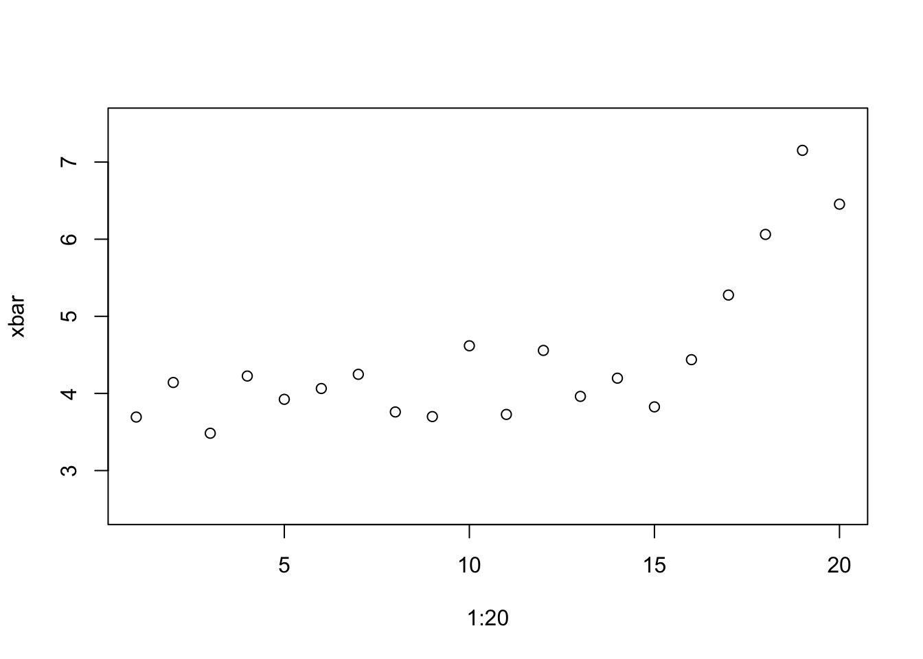
To complete the x-bar chart, we need to add the control limits. These require the process parameters given in the problem description.
mu <- 4; sigma <- 3    # process characteristics
n <- 50;

ucl <- mu + 3 * sigma/sqrt(n)
lcl <- mu - 3 * sigma/sqrt(n)
To finish the chart, add the LCL and UCL to the prior plot. abline with the option “h” draws a horizontal line in a plot at the chosen position on the y-axis.
plot(1:20, xbar, ylim=c(2.5,7.5), xlab="Day", type='b')

abline(h=mu, col='green')         # population target mean

abline(h=ucl, col='red', lty=2)   # lty 2 is a dashed line
abline(h=lcl, col='red', lty=2)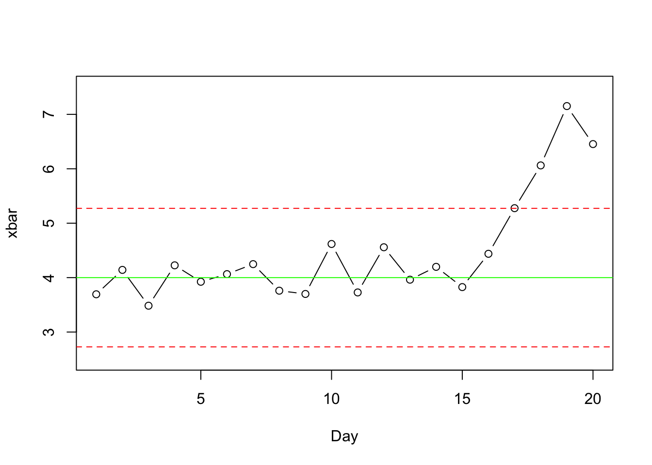
The mean crosses the upper control limit (UCL) on Day 17. The process should have been corrected then, but being an active call center, corrective action is not immediate. They cannot “stop the factory” to check the process.
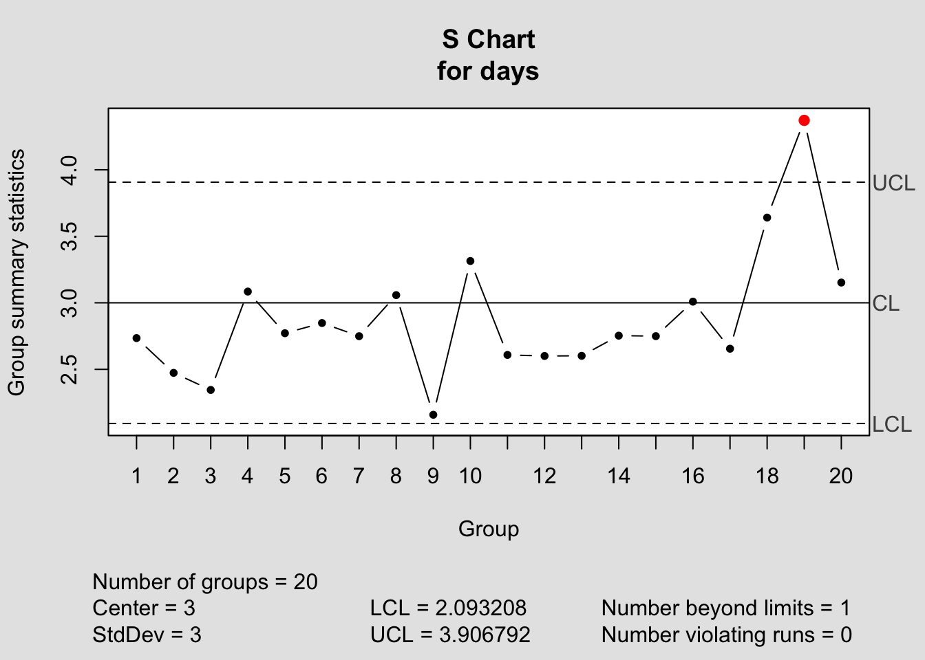
Creating the S-chart is similar, but we need an expression for the standard error of a sample standard deviation. Unfortunately, expressions for the standard error of the standard deviation typically assume that the data are sampled from a normal distribution. Under those conditions, the standard error of the standard deviation of a sample of size \(n\) is approximately \(\mbox{se}(s_n) \approx \sigma/(2 \sqrt{n-1})\). Packages such as JMP typically use a more precise expression and also correct for bias. The expected value of the sample standard deviation is slightly smaller than \(\sigma\), but this bias is small for moderate values of \(n\).
If you’re willing to ignore the small amount of bias and use the simplified version of the expression for the standard error, then we can build an S-chart in the same way we constructed the X-bar chart.
estSD <- tapply(Calls$Call.Length, Calls$Day, sd)

plot(1:20, estSD, ylim=c(2,5), xlab="Day", ylab="Sample SD", type='b')

abline(h=sigma, col='green')

ucl <- sigma + 3 * sigma/sqrt(2*(n-1))
lcl <- sigma - 3 * sigma/sqrt(2*(n-1))

abline(h=ucl, col='red', lty=2)   # lty 2 is a dashed line
abline(h=lcl, col='red', lty=2)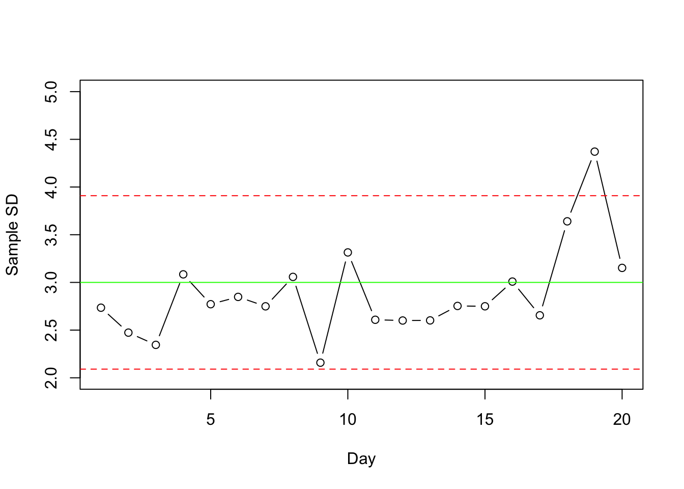
If you compare this approximate S-chart to the exact version in the textbook, you can see that they are virtually identical and reach the same conclusion. (For example, the figure in the textbook indicates that the expected value of the sample SD when the process is under control is about 2.985, slightly less than the \(\sigma=3\).)
14.1.1 Using the qcc package
If you’d prefer to use a package rather than build the chart yourself, then consider the package named qcc.
require(qcc)First define the groups of data to be summarized, in this example, the call lengths grouped by day.
days <- qcc.groups(Calls$Call.Length, Calls$Day)By default, the control charts uses the \(\pm 3 \mbox{SE}\) rule for the limits.
xbar_chart <- qcc(days, type='xbar', center=mu, std.dev=sigma) 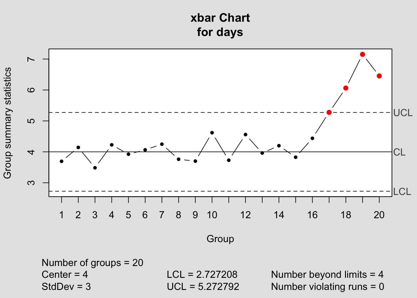
The values of the control limits and group statistics are collected in the result of the command.
summary(xbar_chart)##
## Call:
## qcc(data = days, type = "xbar", center = mu, std.dev = sigma)
##
## xbar chart for days
##
## Summary of group statistics:
## Min. 1st Qu. Median Mean 3rd Qu. Max.
## 3.4840 3.8095 4.1700 4.4757 4.5730 7.1520
##
## Group sample size: 50
## Number of groups: 20
## Center of group statistics: 4
## Standard deviation: 3
##
## Control limits:
## LCL UCL
## 2.727208 5.272792A very similar command produces the S-chart.
s_chart <- qcc(days, type='S', center=sigma, std.dev=sigma)