23 Multiple Regression
Multiple regression uses the same function lm that fits simple regression models. All that changes is that the formula that describes the model has several explanatory variables rather than just one. New functions introduced in this chapter, or used in new ways, are:
lmfits multiple regression modelspairsdraws a scatterplot matrixcorcomputes a correlation matrixresidualsextracts residuals from a fitted modelfitted.valuesextracts the estimated values (\(\hat{y}_i\))plotshows several diagnostic plots of a regressionpararranges the diagnostic plots of a regression
23.1 Analytics in R: Subprime Mortgages
The observations in this data set record the interest rate, loan-to-value ratio, and sizes of 372 home mortgages, together with the credit score and stated income of the borrower.
Mortgage <- read.csv("Data/23_4m_subprime.csv")
dim(Mortgage)
## [1] 372 5head(Mortgage)## APR LTV Credit_Score Stated_Income Home_Value
## 1 9.83 0.662 600 70 118
## 2 10.85 0.703 580 60 450
## 3 11.18 0.854 500 80 100
## 4 11.78 0.926 540 40 171
## 5 12.99 0.787 600 60 100
## 6 11.66 0.854 530 40 133The pairs function generates a scatterplot matrix. I like to arrange the data in this plot to have the response be shown on the y-axis of the plots in the first row. That works conveniently here because the response is the first variable in the data frame (otherwise use indexing to rearrange the order of the columns). (This plot will render better on a screen with higher resolution.)
pairs(Mortgage)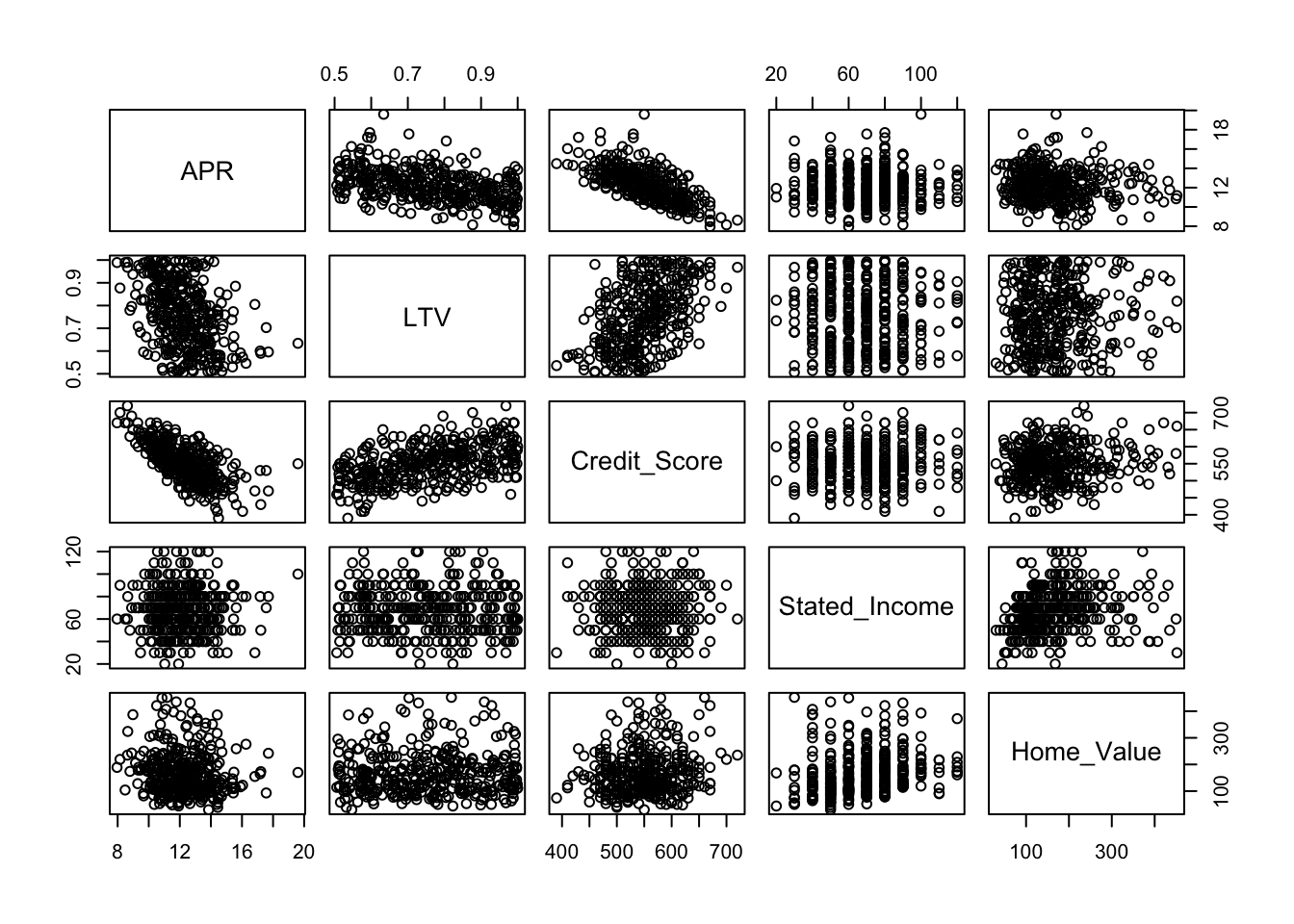
Because of the redundancy of this plot (the lower half is the mirror image of the upper half), it is common to replace half of the scatterplots by other information, such as the correlation between the pair of variables. The documentation for pairs defines the function panel.cor, which is included in the file “functions.R”. For example, the correlation between APR and Credit_Score is about 0.67.
source("functions.R")
pairs(Mortgage, lower.panel = panel.cor)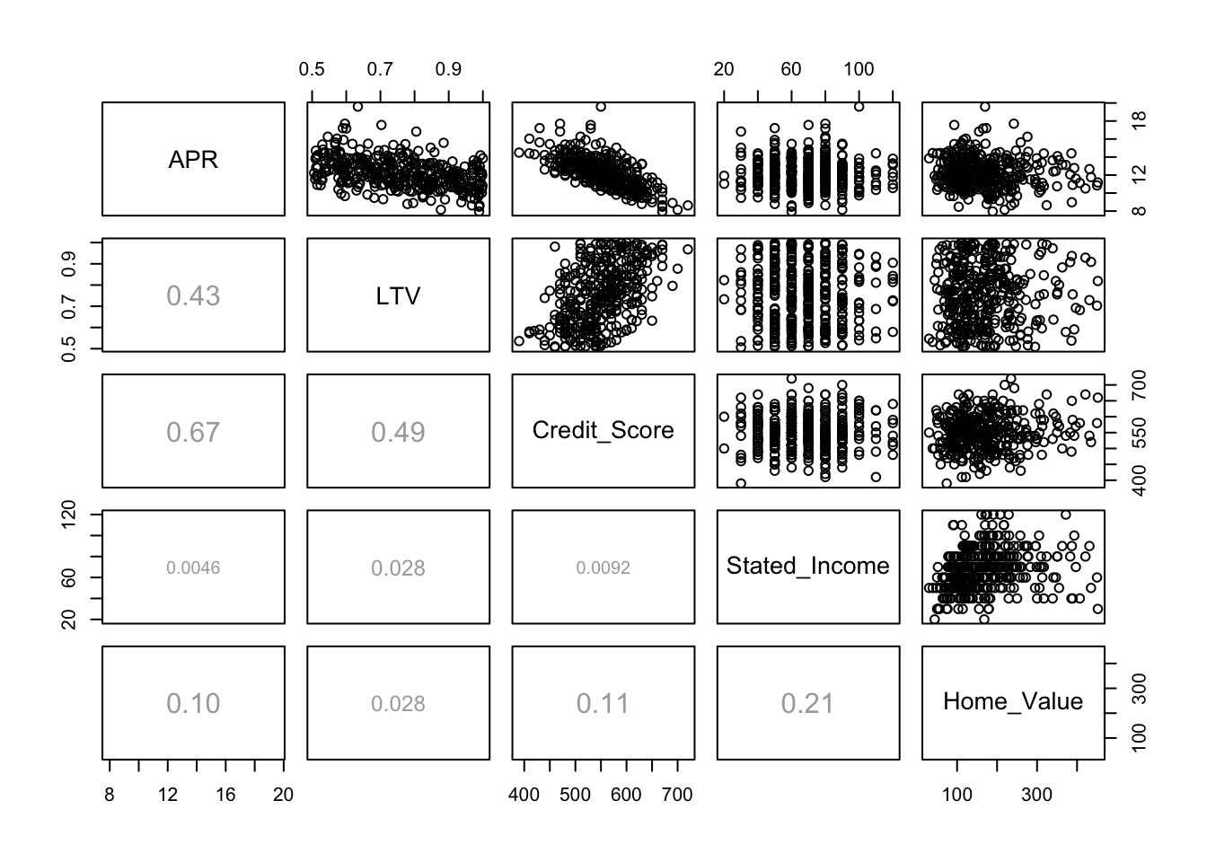
If you feel there is too much going on at once, then you can limit the plot to fewer variables or get a table with just the correlations directly from the cor function. A little bit of rounding helps.
round(cor(Mortgage),4)## APR LTV Credit_Score Stated_Income Home_Value
## APR 1.0000 -0.4265 -0.6696 -0.0046 -0.1043
## LTV -0.4265 1.0000 0.4853 -0.0282 0.0280
## Credit_Score -0.6696 0.4853 1.0000 0.0092 0.1088
## Stated_Income -0.0046 -0.0282 0.0092 1.0000 0.2096
## Home_Value -0.1043 0.0280 0.1088 0.2096 1.0000The function lm fits a multiple regression. Just specify more than one explanatory variable to the right of the symbol ~ in the formula, with their names separated by a +.
regr <- lm(APR ~ LTV + Credit_Score + Stated_Income + Home_Value, data=Mortgage)
summary(regr)
##
## Call:
## lm(formula = APR ~ LTV + Credit_Score + Stated_Income + Home_Value,
## data = Mortgage)
##
## Residuals:
## Min 1Q Median 3Q Max
## -2.1392 -0.8797 -0.2024 0.6258 7.1070
##
## Coefficients:
## Estimate Std. Error t value Pr(>|t|)
## (Intercept) 23.7253652 0.6859028 34.590 <2e-16 ***
## LTV -1.5888430 0.5197123 -3.057 0.0024 **
## Credit_Score -0.0184318 0.0013502 -13.652 <2e-16 ***
## Stated_Income 0.0004032 0.0033266 0.121 0.9036
## Home_Value -0.0007521 0.0008186 -0.919 0.3589
## ---
## Signif. codes: 0 '***' 0.001 '**' 0.01 '*' 0.05 '.' 0.1 ' ' 1
##
## Residual standard error: 1.244 on 367 degrees of freedom
## Multiple R-squared: 0.4631, Adjusted R-squared: 0.4573
## F-statistic: 79.14 on 4 and 367 DF, p-value: < 2.2e-16The function residuals works for multiple regression as for a simple regression, extracting the residuals from the object created by lm. In place of the plot of the residuals on the single explanatory variable, in multiple regression plot the residuals on the fitted values.
plot(fitted.values(regr), residuals(regr))
abline(h=0, col='gray')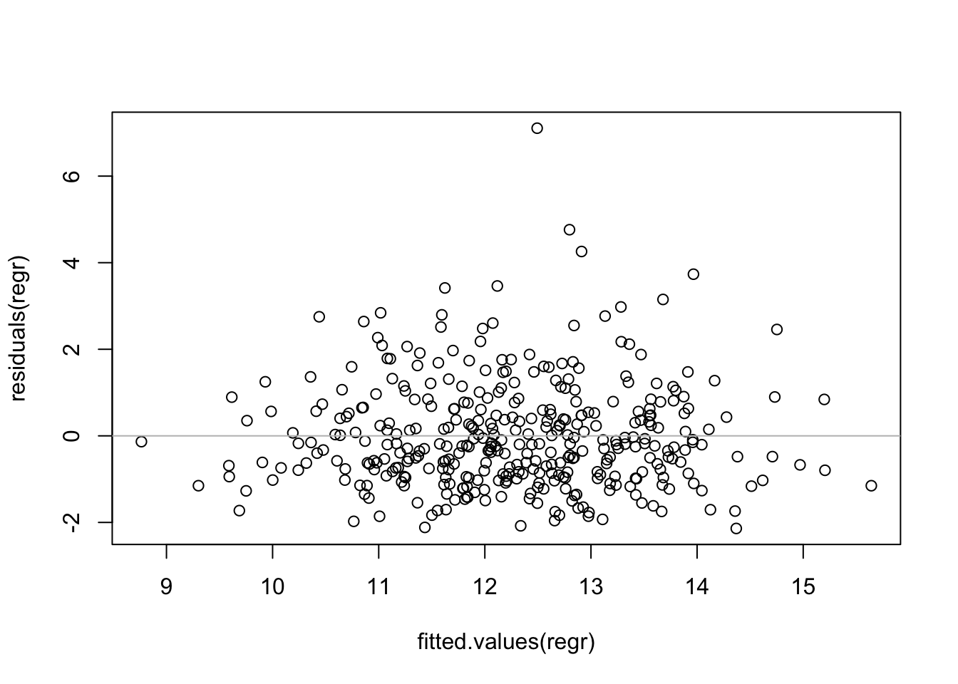 The horizontal line at \(y=0\) is not located at the center of the y-axis, suggesting some skewness to the residuals. The positive residuals are more spread out than the negative residuals. We can see this more clearly in the histogram of the residuals.
hist(residuals(regr), breaks=30)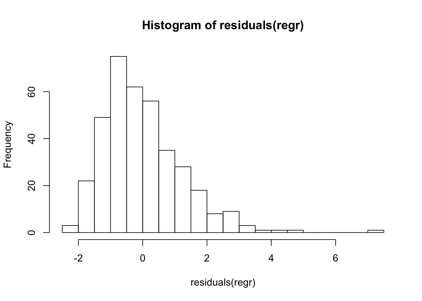
These residuals are not “nearly normal”, implying that prediction intervals from this model are not reliable.
require(car)
qqPlot(residuals(regr))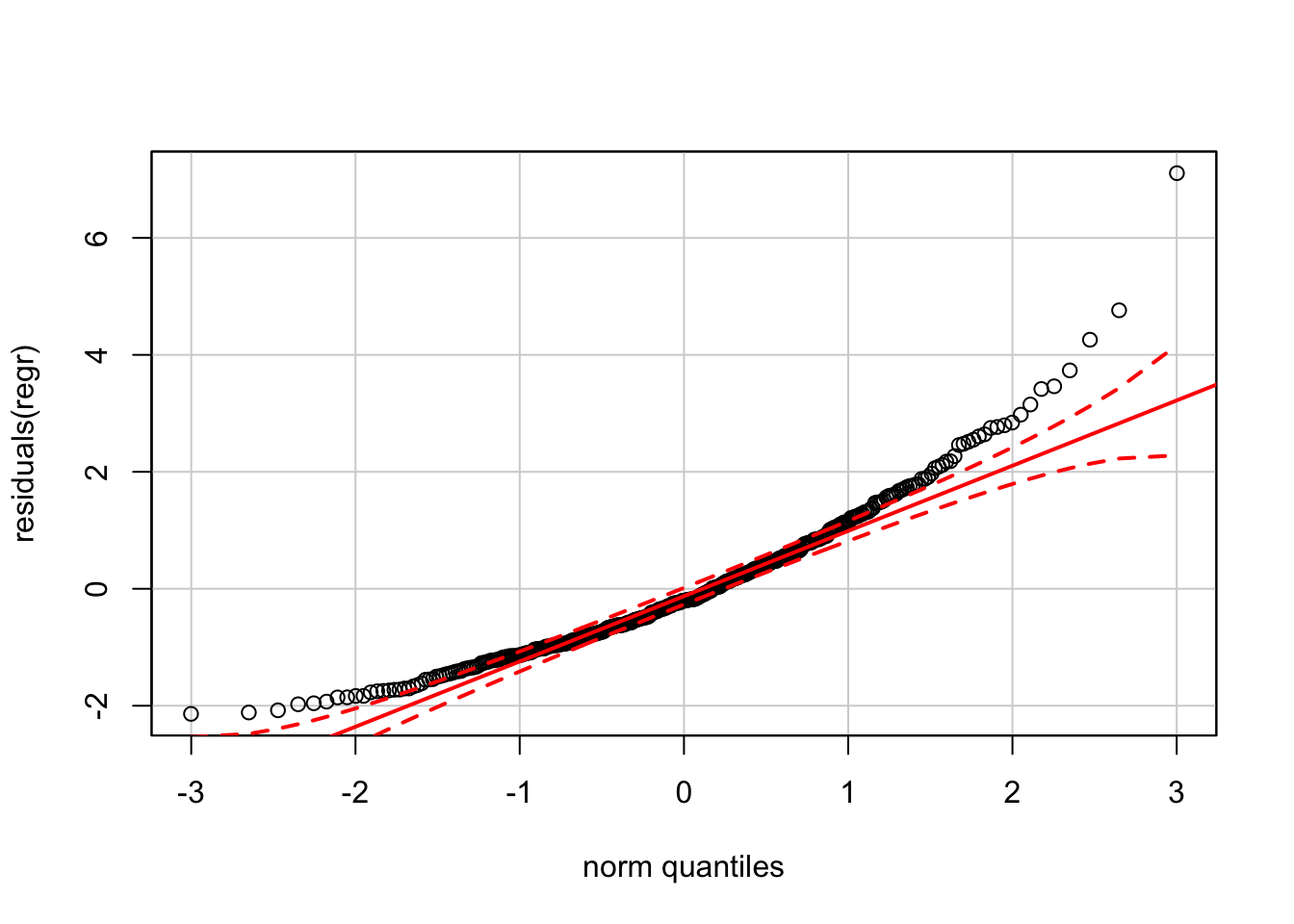
23.2 Plotting a regression model
The function plot produces several displays that summarize properties of a regression model. These are overkill for a simple regression, but are useful for a multiple regression. By default plot(regr) produces 4 plots. (As for the scatterplot matrix, this grid of plots will appear more clearly on a screen with higher resolution.)
save <- par(mfrow=c(2,2))
  plot(regr)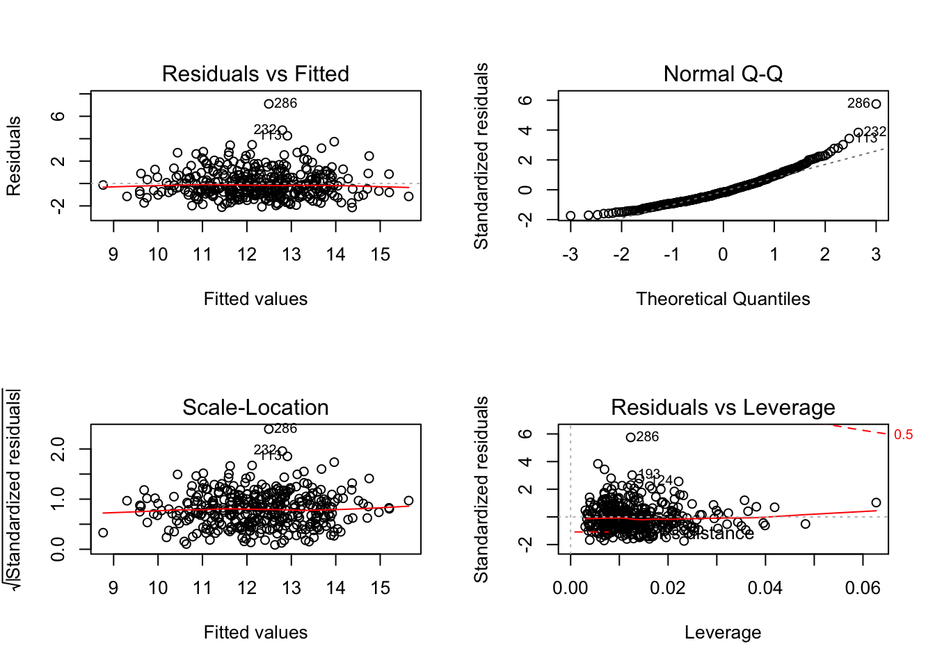
par(save)The first two of these on the top row should be familiar. The first is a plot of the residuals on the fitted values. Residuals that are relatively far from 0 are identified by the row name (here an index) in this plot. The second plot is the normal quantile-quantile plot, albeit lacking the confidence bands.
The third plot in this quartet (on the left of the second row) graphs the square root of the standardized residuals versus the fitted values. This variation on the usual plot of residuals on fitted values emphasizes the possibility of heteroscedasticity. Even if the underlying model errors have constant variance, residuals from most regression models do not. It can be shown that residuals from highly leveraged points have smaller variance than those from locations that are less leveraged. (Why? Basically, regression works very hard to fit leveraged points, reducing the variation of the residuals at those locations.) Standardized residuals have mean zero and standard deviation 1, correcting for the effects of leverage. A horizontal red “line” as in this example (a smooth curve estimated by averaging adjacent values of the response rather than a line fit by least squares) indicates homoscedastic data.
The last of these plots also shows the the standardized residuals and is a personal favorite. The degree to which a single point influences a regression (in the sense that the fit will change if this point is removed) is essentially the product of its standardized residual (the y-axis here) times its leverage (the x-axis). Points along the upper and lower fringes at the right side of this plot are those with large influence (called Cook’s distance).