19 Linear Patterns
Most of the R commands used in this chapter, particularly plot and lm, were introduced in Chapter 6 when we considered association between numerical variables. The main difference in this chapter is that we will pay closer attention to the object created by the lm command. Not only does that object (a list with named elements) hold a numerical summary of the fitted equation, it also stores the information needed for finding residuals and fitted values. The key functions used in this chapter are:
mdycreates dates suitable for plotspastecombines several strings into oneplotproduces a scatterplot of datapmaxdoes an element by element calculation of the maximumablineadds the least squares line to a plotlmcomputes the least squares lineresidualsextract the fitted values and residuals from the object created bylmsummaryadds additional properties to a regression object, such as \(r^2\)
19.1 Analytics in R: Estimating Consumption
Read the data from the CSV file into a data frame.
Consume <- read.csv("Data/19_4m_gas_consumption.csv")
dim(Consume)
## [1] 48 4Each row of data gives the amount of natural gas (measured in hundreds of cubic feet, CCF) consumed for a month during this four-year period and the average temperature for that month (degrees Fahrenheit).
head(Consume)## Month Year Gas_CCF Average_Temp
## 1 Jan 2004 256 33
## 2 Feb 2004 267 28
## 3 Mar 2004 150 40
## 4 Apr 2004 142 49
## 5 May 2004 38 63
## 6 Jun 2004 33 70We can get a nicely labeled plot of the data over time by using the function mdy from the package lubridate to make a single date variable. This function expects a string, such as “Jan/1/2010” that gives the month, day, and year. We can use paste to make strings like this one from the columns Month and Year. Here’s an example that shows the first 5 dates. (The function mdy requires that the date include the day, so this command inserts the string “/1/” between each month label and year.
paste(Consume$Month,"/1/",Consume$Year, sep='')[1:5]## [1] "Jan/1/2004" "Feb/1/2004" "Mar/1/2004" "Apr/1/2004" "May/1/2004"The mdy function works with both abbreviations such as “Jan” or “Feb” as well as numbers (e.g. 1 for January).
require(lubridate)
date <- mdy(paste(Consume$Month,"/1/",Consume$Year, sep=''))
Both the gas consumption and temperature show a strong seasonal pattern.
plot(date, Consume$Gas_CCF, type='b')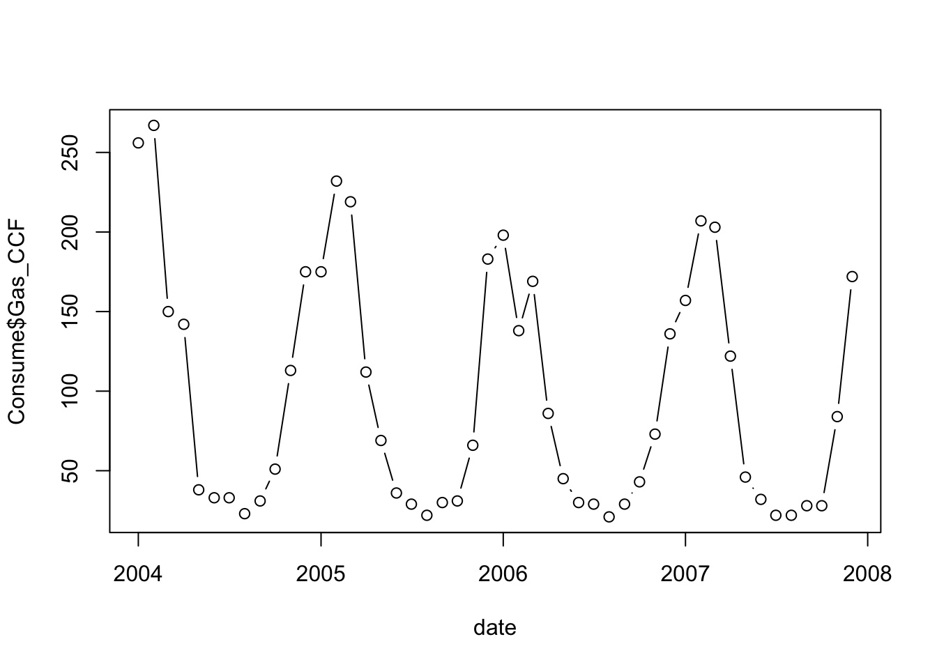
plot(date, Consume$Average_Temp, type='b')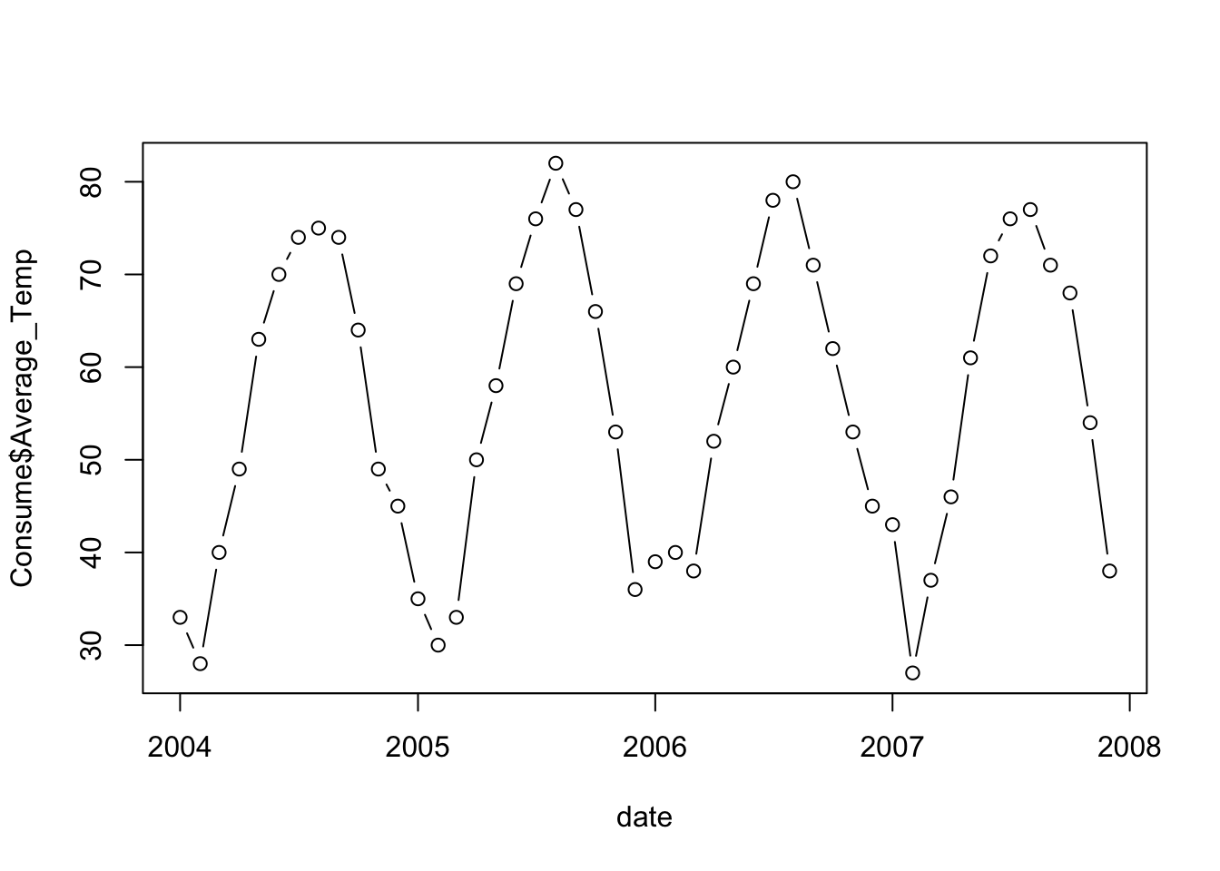
A plot of the gas consumption on the temperature shows strong negative association. The association is not linear, however. Once the temperature reaches the mid 60s, gas consumption no longer decreases. Some consumption remains because this household uses natural gas for cooking and/or water heating.
plot(Gas_CCF ~ Average_Temp, data=Consume)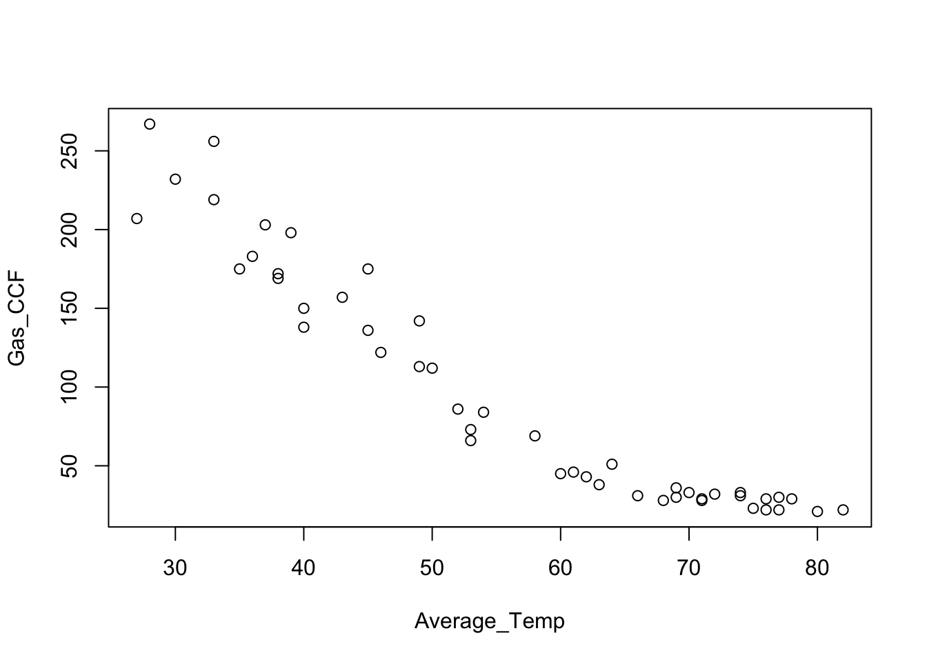
A single line is a poor summary of the association over this range of temperatures.
plot(Gas_CCF ~ Average_Temp, data=Consume)
regr <- lm(Gas_CCF ~ Average_Temp, data=Consume)   # save the result from lm
abline(regr, col='red')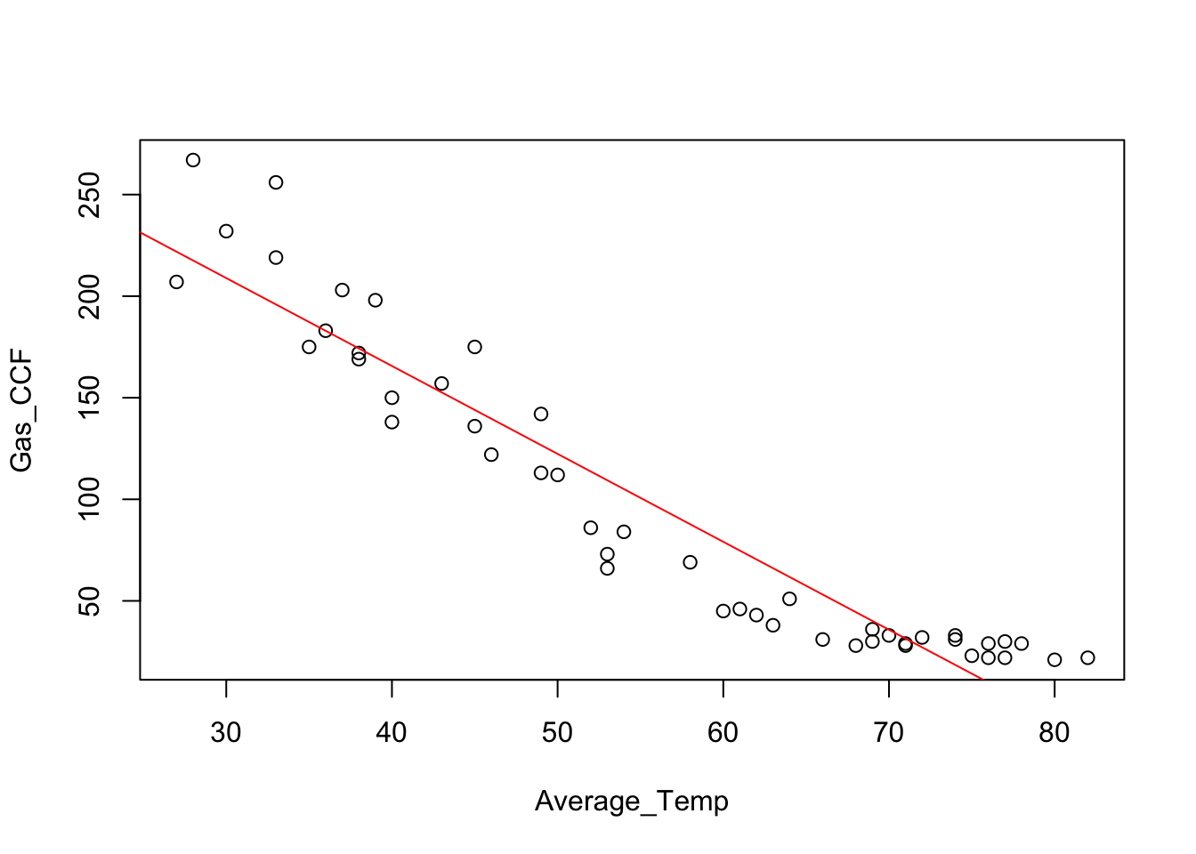
A plot of the residuals from this regression shows the problem more clearly. The horizontal line at 0 provides a visual cue; the residuals should be randomly scattered around this line, lacking any pattern.
plot(Consume$Average_Temp, residuals(regr))
abline(h=0, col='gray')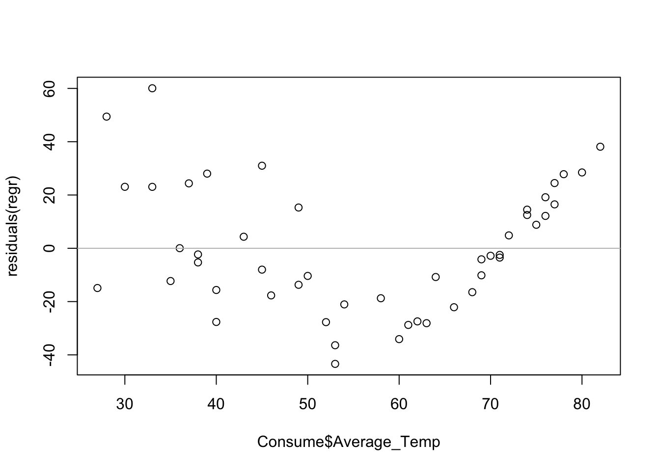
The pattern in this plot – the increasing linear trend on the right – seems rather obvious, but nonetheless this is a good chance to remind you about the visual test for association (Chapter 6). There’s a function in the supplied collection of R functions that will draw the needed plots for you. This function wants a formula and data frame, so the residuals need to be added to the data frame. (If you want to see how this function works, just type the name of the function with no arguments. R will print the definition of the function; it’s not very elaborate. Reading the definitions of functions is a good way to learn more about R.)
source("functions.R")
Consume$residuals <- residuals(regr)
visual_test_for_association(residuals ~ Average_Temp, Consume)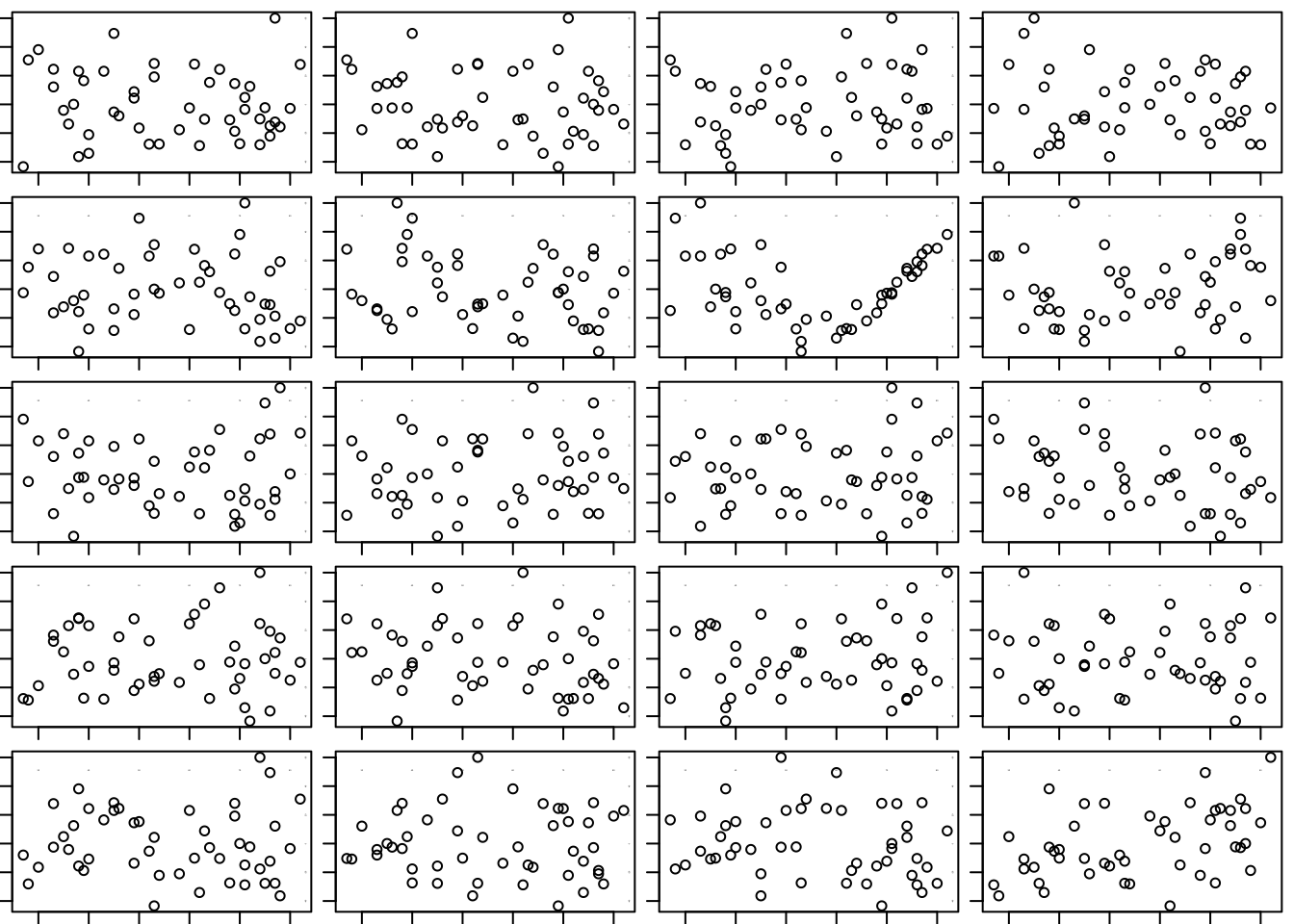
## [1] 2 3It is very easy to spot the original scatterplot of the residuals on the explanatory variable. It is the third plot in the second row. Our ease in finding that plot among this collection is a sure sign of a pattern in the residual plot.
To remedy this regression, we need to isolate how temperature influences the use of gas. Here’s the idea. Once the temperature outside is above the setting of the home’s thermostat, no more gas will be used for heating. I will use a variable that measures the degrees below 65, which is roughly where this homeowner seems to set the thermostat.
This new variable has positive association with gas consumption. The farther the temperature goes below 65, the more gas is used for heating. By adding this variable to the data frame, we can continue using the “formula” method for defining the plot. (If you use max here rather than pmax, then DegreesBelow will be a constant. Also notice how the $ form of indexing can be used to assign a variable in a data frame, not just access one.)
Consume$Degrees_Below_65 <- pmax(65-Consume$Average_Temp, 0)  # add to Consume data frame

plot(Gas_CCF ~ Degrees_Below_65, data=Consume)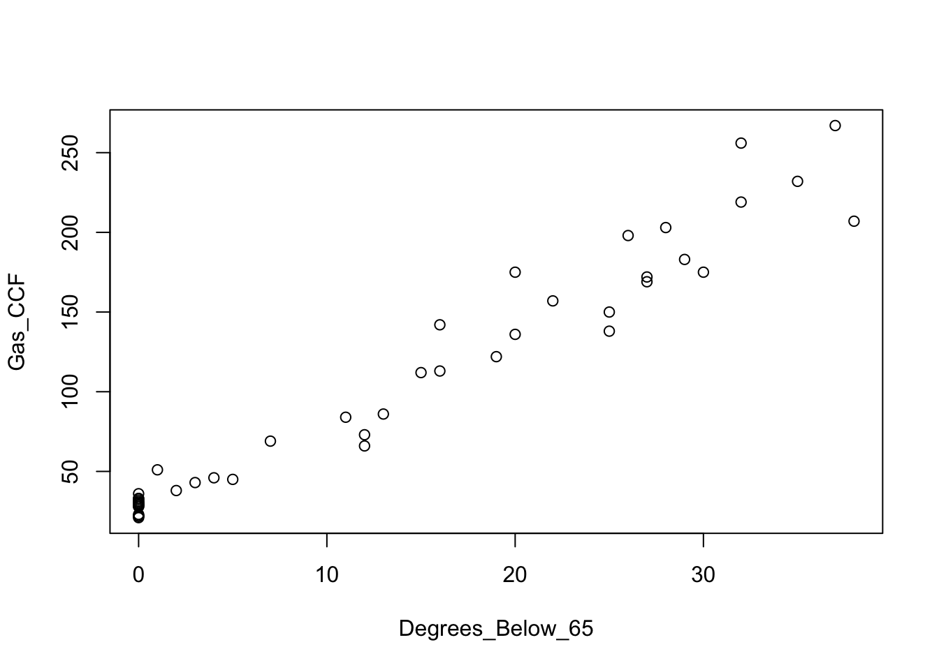
This plot looks more linear; we’ve squeezed that flat portion into a cluster of points at \(x=0\). The least squares line is a pretty good summary of the association for this pair of variables.
plot(Gas_CCF ~ Degrees_Below_65, data=Consume)
regr <- lm(Gas_CCF ~ Degrees_Below_65, data=Consume)
abline(regr, col='red')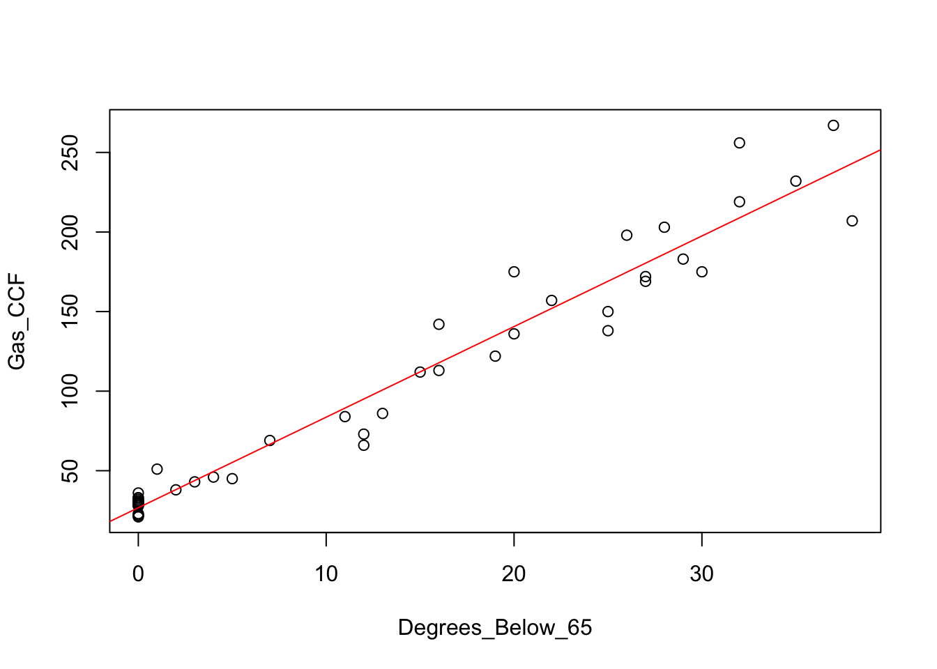
By saving the result of lm in the object regr, we can see the equation of this line.
regr##
## Call:
## lm(formula = Gas_CCF ~ Degrees_Below_65, data = Consume)
##
## Coefficients:
## (Intercept) Degrees_Below_65
## 26.727 5.693The fitted line is \(y = 26.727 + 5.693\;x\).
For fun, let’s try the visual test for association again. I will replace the residuals from the initial model by those from this model. Here’s the residual plot from this regression. The residuals might be a bit more varied at the right of the plot than where they are clustered at the left.
Consume$residuals <- residuals(regr)

plot(residuals ~ Degrees_Below_65, data=Consume)
abline(h=0, col='gray')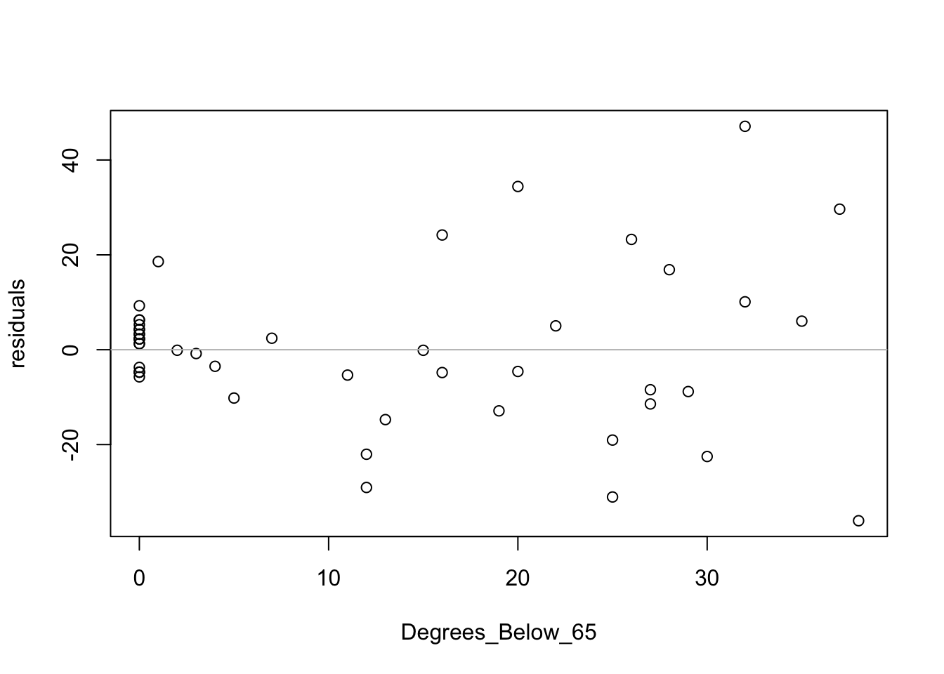
Let’s see if we can find the original among these.
If you look carefully – and remember the comment offered above about the variation – you can eventually find the original. It’s the second plot in the fourth row. A bit of a pattern remains in the residuals, but it is much more subtle. We will discuss this particular problem (changing variation) in Chapter 22.
visual_test_for_association(residuals ~ Degrees_Below_65, data=Consume)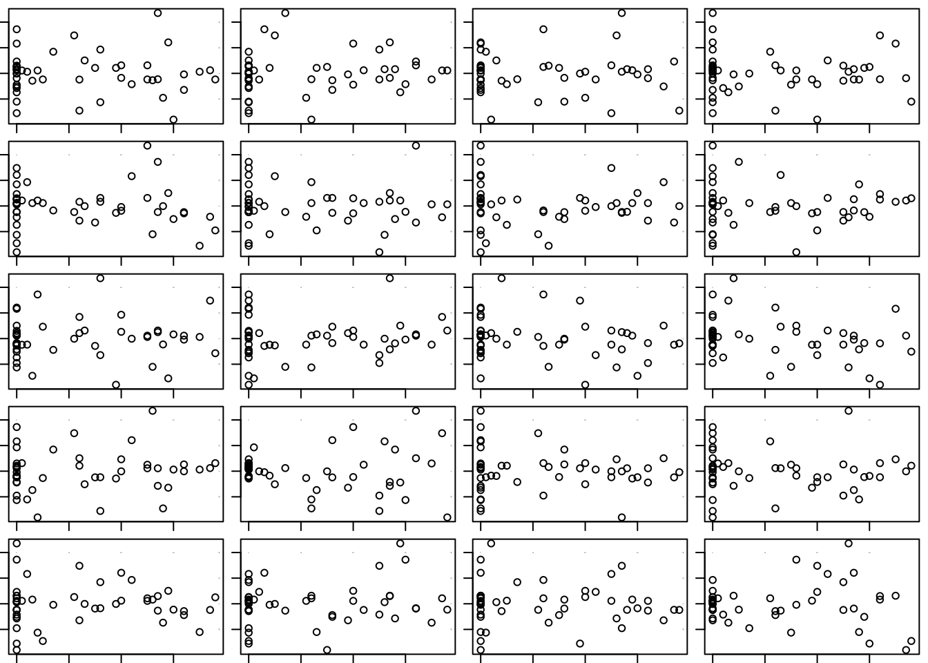
## [1] 4 219.2 Analytics in R: Lease Costs
Read the data into a data frame.
BMW <- read.csv("Data/19_4m_used_bmw.csv")
dim(BMW)
## [1] 153 3Each line of the file summarizes the advertised selling price of a certified, used BMW car and indicates the model year and mileage of the car.
head(BMW)## Year Price Mileage
## 1 2016 38999 985
## 2 2015 39481 8
## 3 2015 44140 2630
## 4 2015 37999 2942
## 5 2015 37999 4583
## 6 2015 36998 5592A scatterplot of the prices on the ages shows the effect of depreciation and longer use. First compute the age of the car in years and add this variable to the data frame using the $ method of assignment.
BMW$Age <- 2016 - BMW$Year
plot(Price ~ Age, data = BMW)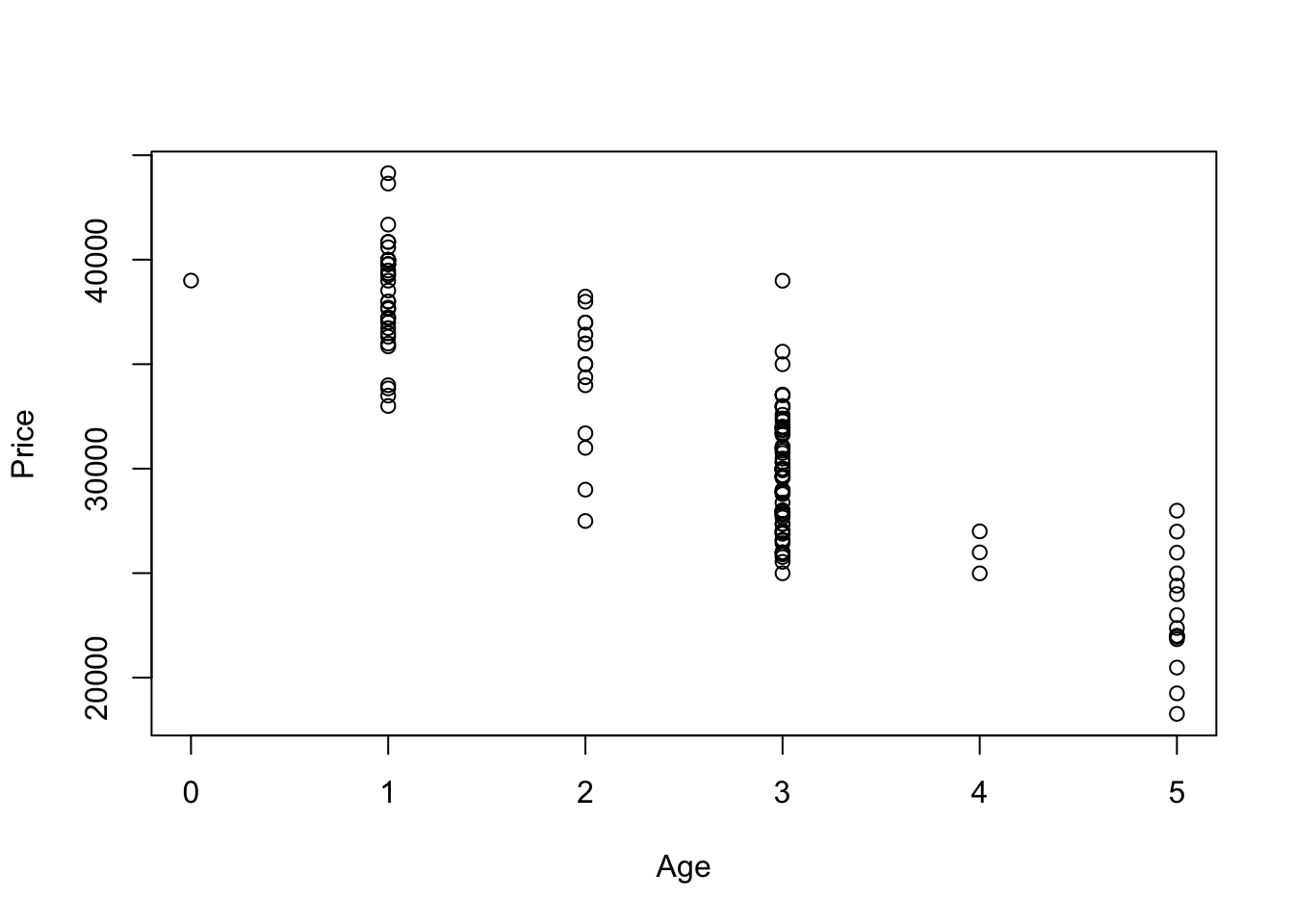
The association looks linear, so add the least squares line.
plot(Price ~ Age, data = BMW)

regr <- lm(Price ~ Age, data = BMW)
abline(regr, col='red')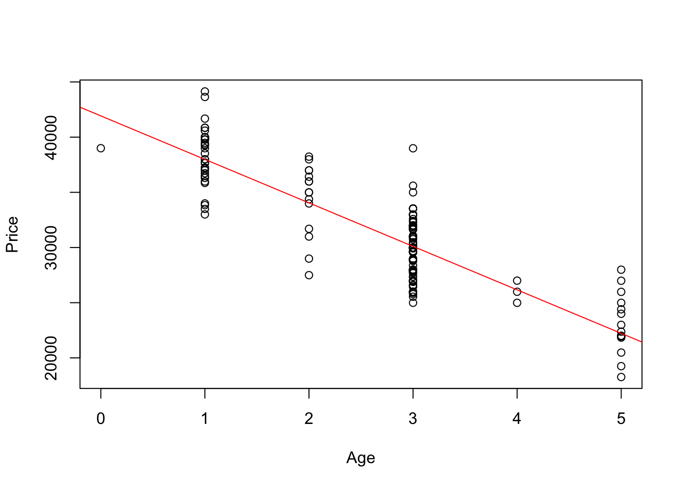
The equation of the line is found by printing the regression object.
regr##
## Call:
## lm(formula = Price ~ Age, data = BMW)
##
## Coefficients:
## (Intercept) Age
## 41935 -3942The plot of the residuals does not show any particular pattern, other than that we have a lot more cars that are 1 and 3 years old than cars that are 2 and 4 years old.
plot(BMW$Age, residuals(regr))
abline(h=0, col='gray')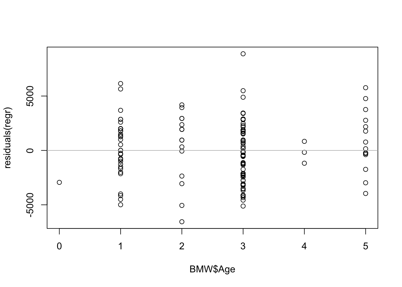
We can get the \(r^2\) statistic and residual SD, or \(s_e\), from a summary of the regression object. The command summary(regr) returns an object that holds a collection of summary information about the least squares regression.
summary(regr)$r.squared## [1] 0.7532949The SD of the residuals is found in the sigma field in the summary of the regression, a bit of a misnomer (the returned value estimates \(\sigma\) and is not the population value).
summary(regr)$sigma## [1] 2660.699