12 The Normal Probability Model
R includes functions for computing the density, cumulative probabilities, and quantiles (percentiles) of a normal random variable. These make it easy to compute \(P(X ≤ x)\) for any normally distributed random variable, \(X \sim N(\mu, \sigma^2\)). R also includes normal quantile plots, and a very useful package that we will see in several chapters on regression modeling (car) supplies a version that adds the confidence bands. The functions covered in this chapter include:
dnorm,pnormandqnormcompute the density, cumulative probability and quantiles of a normal random variableseqbuilds a sequence of values (used for plotting here)polygondraws shapes in a plot that can be filled with a colortextadds a label to a plotpastecombines strings and numbers into a single stringrnormgenerates a random sample from a normally distributed population (r.v.)qqnormdraws a normal quantile plot, andqqlineadds a diagonal reference lineqqPlot(from thecarpackage) draws a normal quantile plot with confidence bandsrexpgenerates a sample from the right-skewed exponential distribution
12.1 Analytics in R: SATs and Normality
The design of the original SAT scores sought to have the scores normally distributed with mean value \(\mu=500\) and standard deviation \(\sigma = 100\). The probability distribution of a normal r.v. with these parameters is shown here. We draw this continuous function by first creating a vector of closely spaced values along the x-axis, and then evaluate the density at these points. Connecting these points with a line (type='l') does the rest. The range from \(\mu - 3.5 \sigma\) to \(\mu + 3.5 \sigma\) covers virtually all of the support of the normal density.
mu    <- 500
sigma <- 100

x   <- seq(mu-3.5*sigma, mu+3.5*sigma, length.out=100)   # 100 points in the shown range
p_x <- dnorm(x, mean=mu, sd=sigma)                       # evaluate normal dens at these points

plot(x, p_x, type='l', ylab="Normal Density")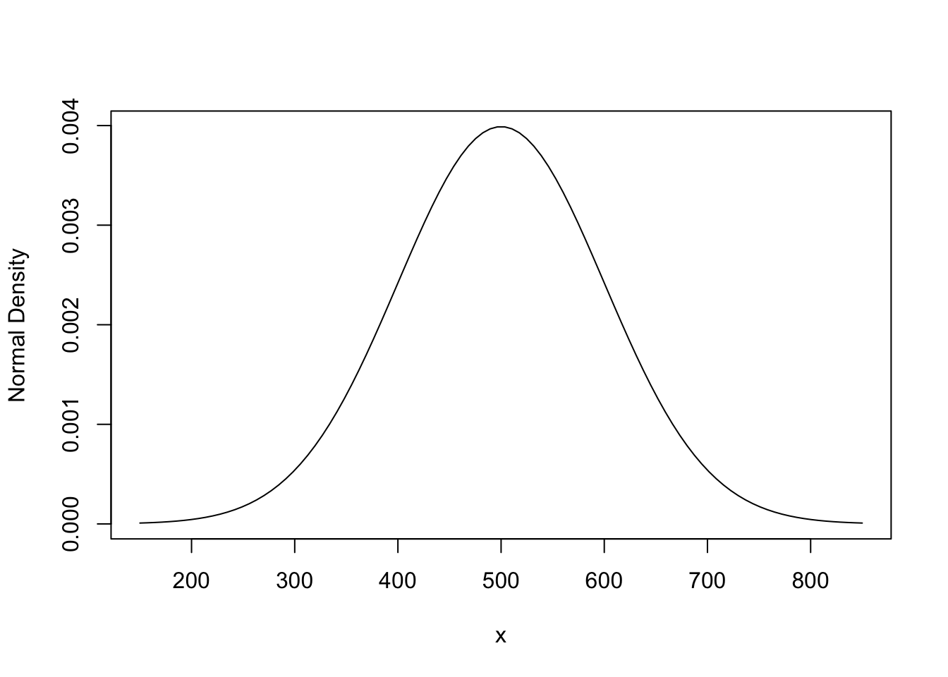
To find the probability of a score above 600 is easy for R. We know from the Empirical Rule that the probability is close to 1/6. The exact value is slightly smaller. To get the exact value use the function pnorm that computes \(P(X \le x)\) for a normal random variable \(X \sim N(\mu,\sigma^2)\). We then have to subtract the result of pnorm from 1 because pnorm gives the area under the normal density to the left of 600, but we need the area to the right.
1 - pnorm(600, mean=mu, sd=sigma)## [1] 0.1586553To finish this example, let’s highlight the area we just found by shading the area in the plot of the normal density. polygon fills a region in a plot identified by points along the boundary of the region.
x   <- seq(mu-3.5*sigma, mu+3.5*sigma, length.out=100)      # 100 points in the shown range
p_x <- dnorm(x, mean=mu, sd=sigma)                          # normal density at these points
plot(x, p_x, type='l', ylab="Normal Density")

x <-seq(600, mu+3.5*sigma, length.out = 50)                 # grid in region to highlight
xx <- c(600,        x                   , mu+3.5*sigma)     # duplicate values at ends
px <- c(  0, dnorm(x, mean=mu, sd=sigma),   0)              # put zeros at the ends

polygon(xx,px,col='lightblue')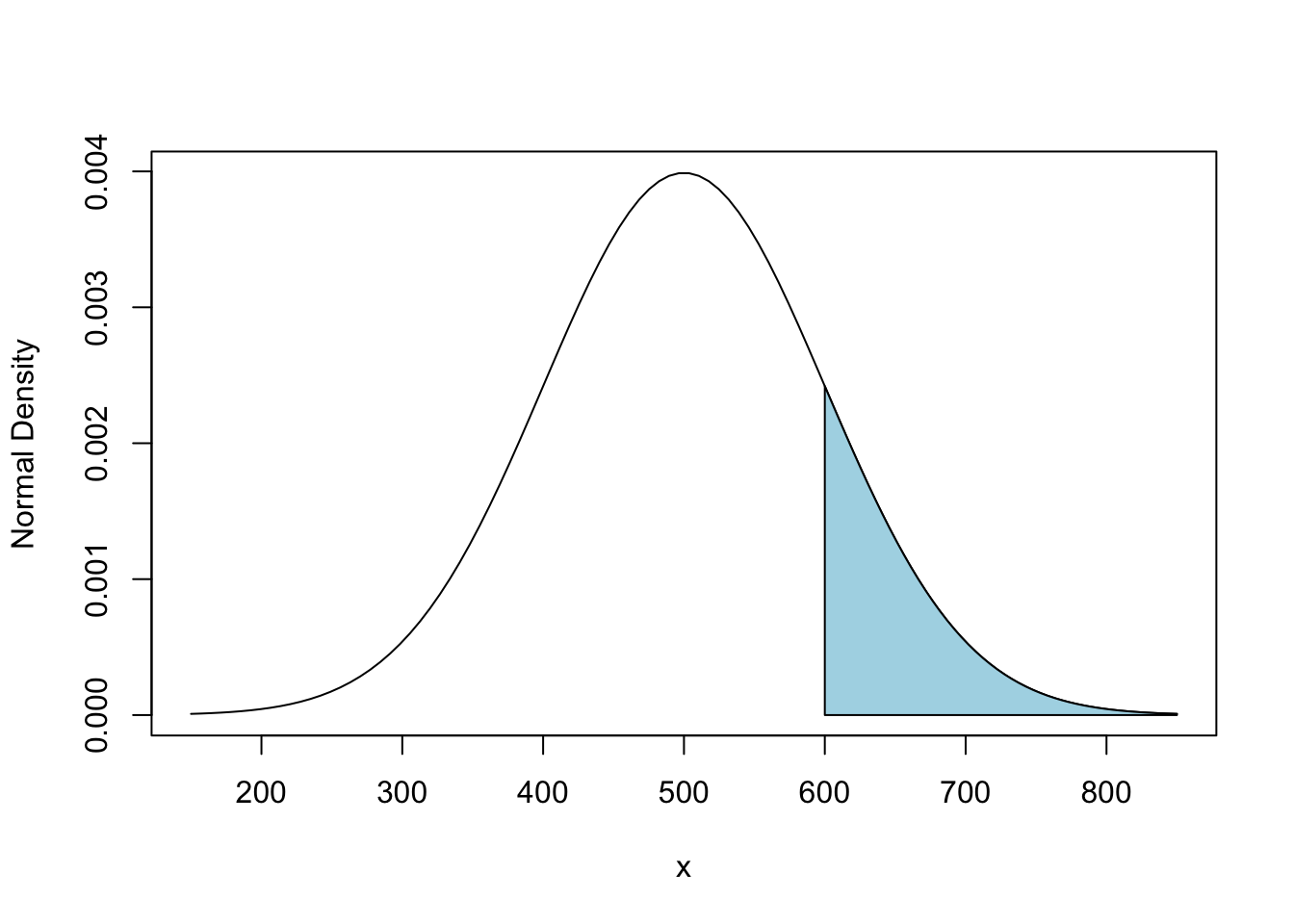
Here’s a plot of the points that define the shaded region. You can see now why I added those a 0 at the end of the vector px. (If not, remove the end values and see what happens.)
plot(xx, px, type='b')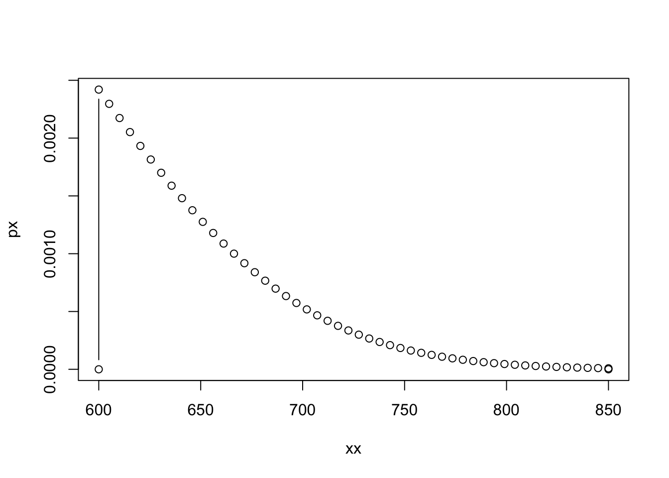
12.2 Analytics in R: Value at Risk
In this example, the return on an asset is modeled as being normally distributed with \(\mu = 10\%\) and \(\sigma = 30\%\). The 5% VaR is the percentile that excludes the worst 5% of possible returns. In other words, it’s the 5th percentile of this distribution. qnorm finds these percentiles.
qnorm(0.05, mean=10, sd=30)## [1] -39.34561That’s a drop of about 39.3% of the amount invested. We can show this in a plot, along with the values that are excluded using the method illustrated in the first example of this chapter. Start with a plot of the normal density, and then use polygon to fill the region “avoided” in the VaR calculation. The VaR is the upper limit of this region. We label the VaR in the plot using the function text.
mu <- 10
sigma <- 30

x   <- seq(mu-3.5*sigma, mu+3.5*sigma, length.out=100)
p_x <- dnorm(x, mean=mu, sd=sigma)
plot(x, p_x, type='l', xlab="Return", ylab="Density of Asset")

VaR <- qnorm(0.05, mean=mu, sd=sigma)

x <-seq(VaR, mu-3.5*sigma, length.out = 50)
xx <- c(VaR, x , mu-3.5*sigma)
px <- c( 0 , dnorm(x, mean=mu, sd=sigma),     0       )

polygon(xx,px,col='red')

text(x=VaR+25, y=0.002, labels=paste("VaR =", round(VaR,1), "%"))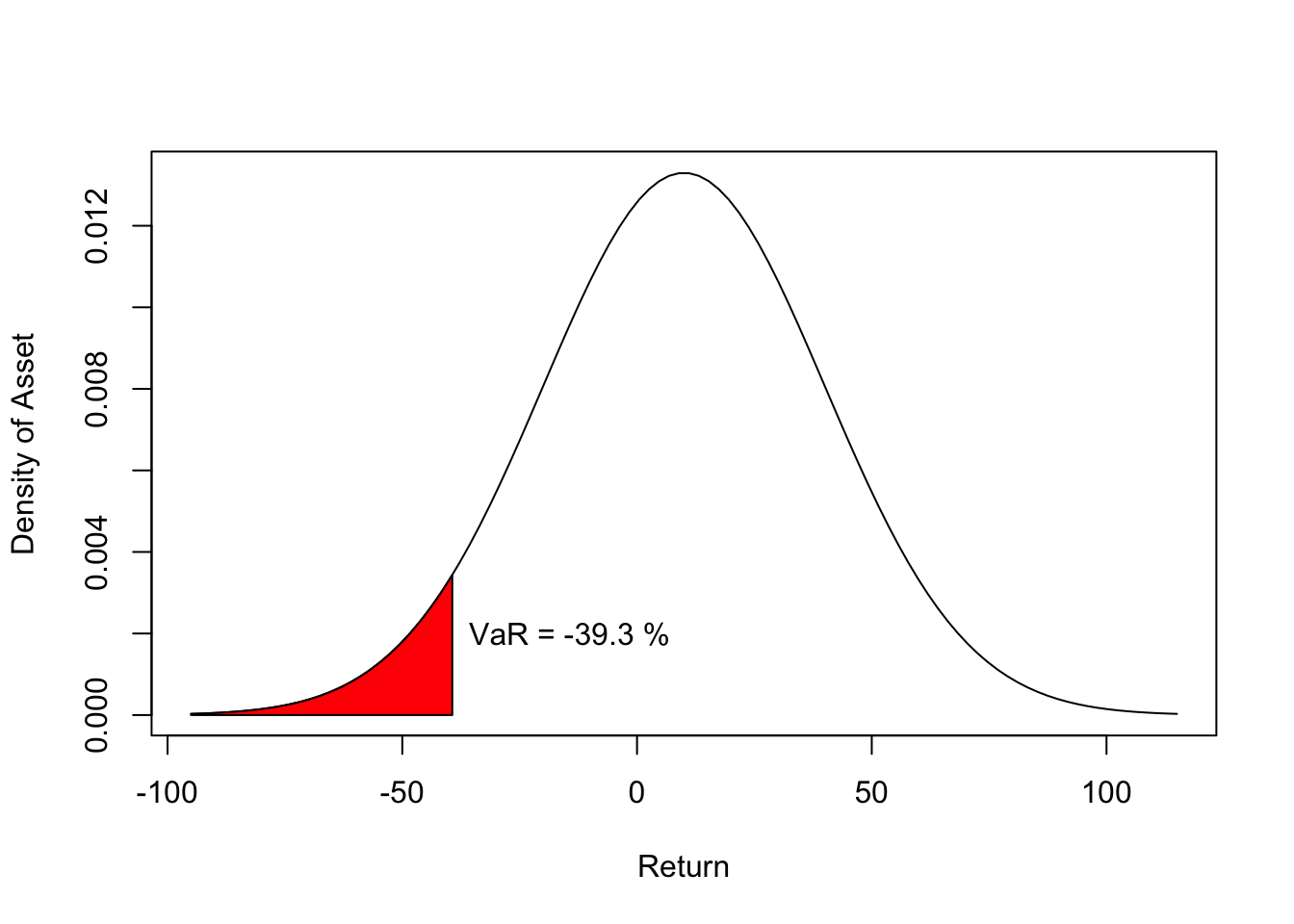
12.3 Normal Quantile Plots in R
These are important diagnostic plots that we will see much more of in regression models. It is useful to introduce these in this chapter before we see them again in regression analysis.
Let’s start with a sample that we know is normally distributed. How do we know? We use the software to simulate drawing a sample from a normal random variable. Here’s the histogram of a sample of 50 observations. It’s useful to run the following commands several times to see how much the histogram changes from sample to sample. The population is the same, but the histogram fluctuates from sample to sample.
data <- rnorm(50 , mean=100, sd = 10)   # the first argument is the sample size
hist(data, main="Histogram of Normal Sample")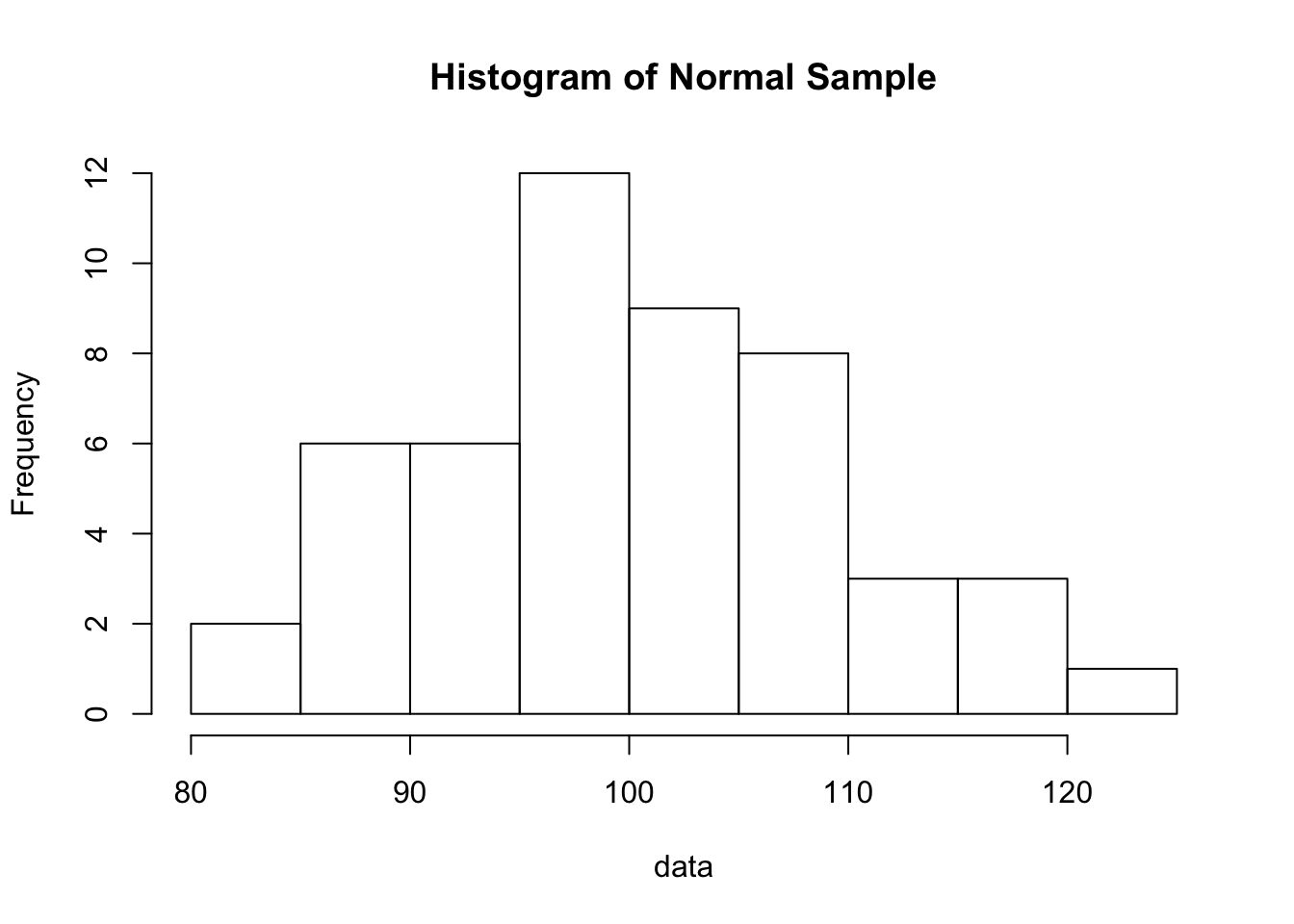
Hopefully the erratic shapes of those histograms will convince you that it is hard to recognize from a histogram that a sample was drawn from a normal population. Quantile plots are more useful and focus on this task. qqnorm is the built-in R function for producing a normal quantile plot, and qqline adds the diagonal reference line to the plot.
qqnorm(data)
qqline(data)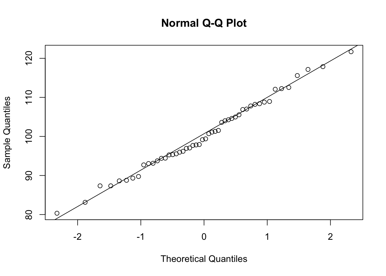
What’s missing are the confidence bands that indicate whether the data stay close enough to the diagonal line to be considered looking like normally distributed data. We can get these bands by using the function qqPlot from the package car. We will use this package again in regression analysis, so you should install this package now if it is not on your computer. For this sample, the data stay inside the confidence bands, as they should.
require(car)    # require loads a package if not already loaded

qqPlot(data)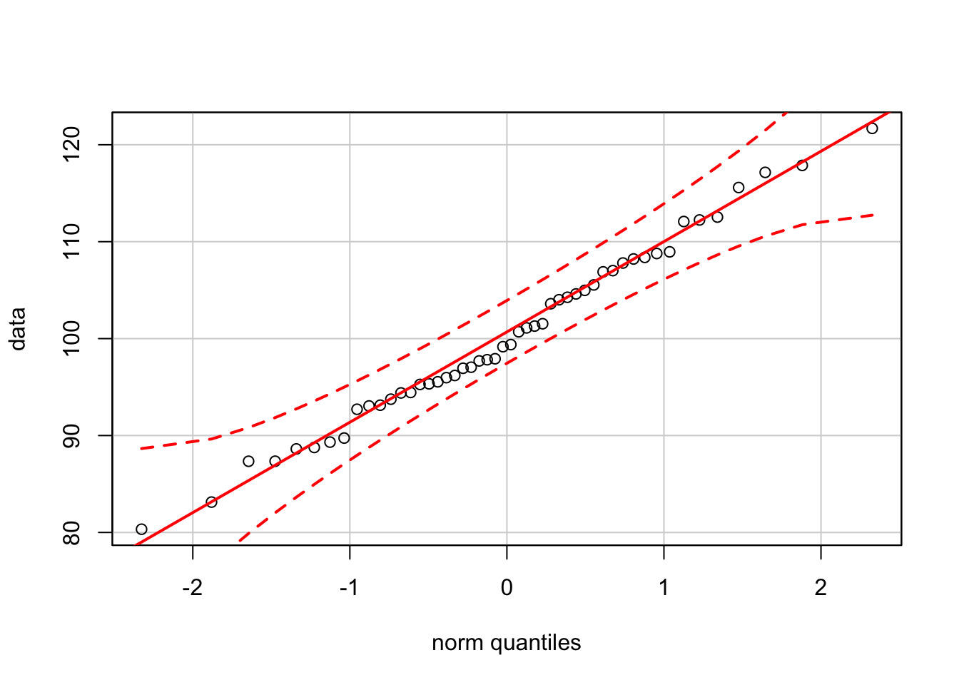
Since it is easy to generate random samples in R, you can explore how the confidence bands change as the sample size changes. For instance, the bands become much tighter as the sample size increases to \(n = 500\).
data <- rnorm(500, mean=mu, sd=sigma)

qqPlot(data)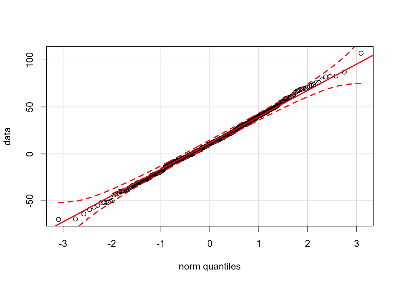
To see what happens when the data are not normally distributed, let’s start with the QQ-plot for a sample from an exponential distribution. The exponential distribution is right-skewed.
expData <- rexp(100, rate=1/mu)
hist(expData)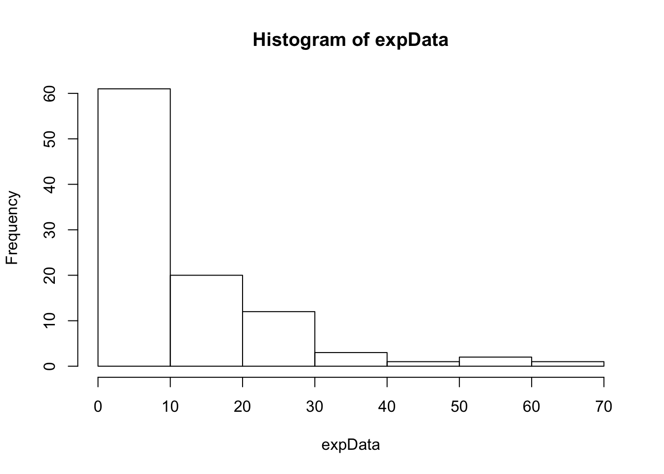
The QQ-plot shows the characteristic convex curve produced by right-skewed data.
qqPlot(expData)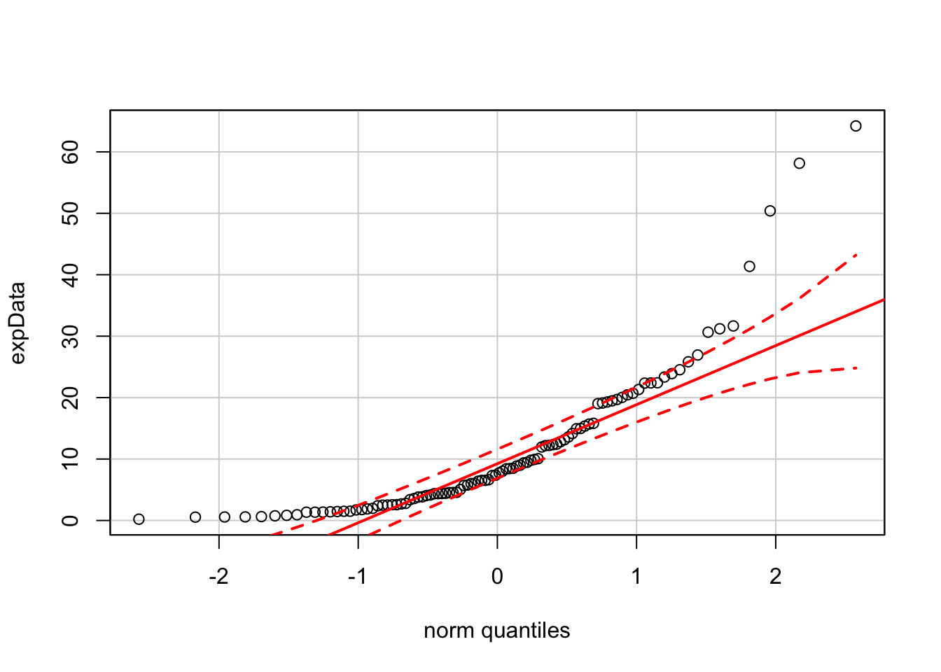
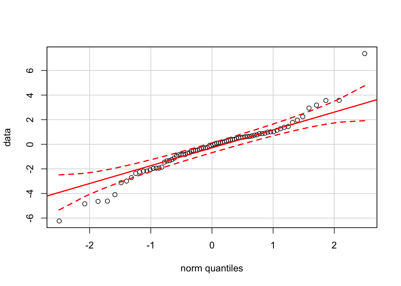
To see the effect of outliers, we will combine two normal samples. One sample has 50 values drawn from a standard normal population (\(\mu=0\) and \(\sigma=1\)); the second sample has 30 observations from a “contaminating” normal distribution with \(\mu=0\) and larger SD \(\sigma=3\).
data <- c( rnorm(50, mean=0, sd=1), rnorm(30, mean=0, sd=3) )
hist(data)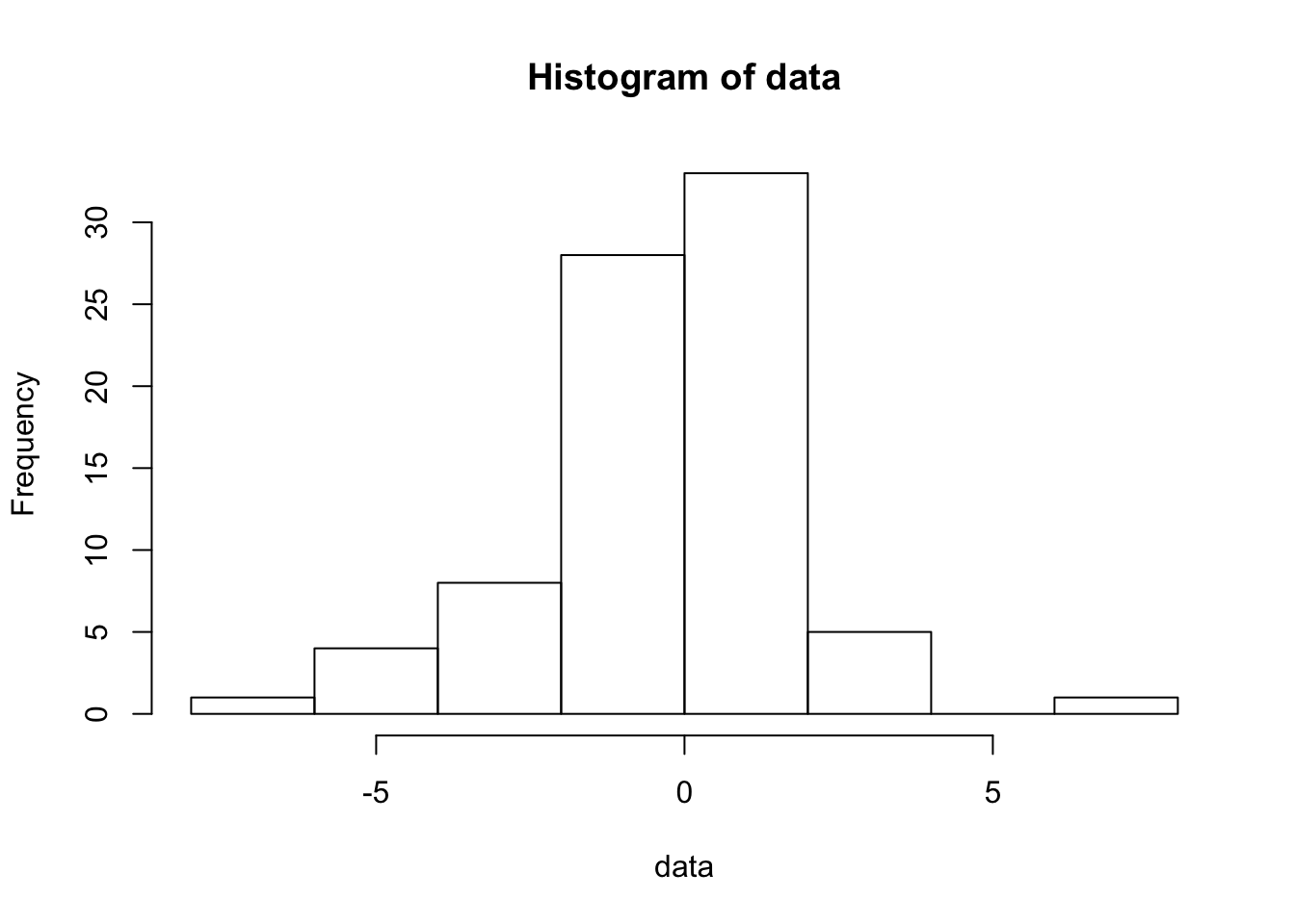
The QQ-plot for these shows how outliers (a.k.a. “fat tails” in Finance) produce bends at the left and right sides of the plot.
qqPlot(data)