4 Describing Numerical Data
Numerical data not only have their own plot for showing the distribution (a histogram in place of a bar chart), but also many more summary statistics, such as the mean or median. The key functions and tasks illustrated in this chapter are (in order of appearance):
headshows the first rows of a data framehistdraws a histogramrughighlights the point locations summarized by the histogrammeancomputes the average of a samplesdcomputes the standard deviationboxplotshows the boxplot of numerical datamedianfinds the median valueIQRcomputes the interquartile rangesummarycomputes the extremes and quartilesquantilecomputes an arbitrary percentile
4.1 Analytics in R: Making M&Ms
Start by reading the CSV data file. This file has 72 rows and 3 columns.
MM <- read.csv("Data/04_4m_mandm.csv")
dim(MM)
## [1] 72 3Each row identifies the bag from which the candy was chosen, its color, and its weight (in grams). The function head shows the first six rows of the data frame.
head(MM)## Bag Color Weight
## 1 1 Brown 0.98
## 2 1 Brown 0.90
## 3 1 Brown 0.90
## 4 1 Yellow 0.88
## 5 1 Yellow 0.89
## 6 1 Yellow 0.80It’s not part of the text example, but let’s see a histogram of the weights.
hist(MM$Weight) 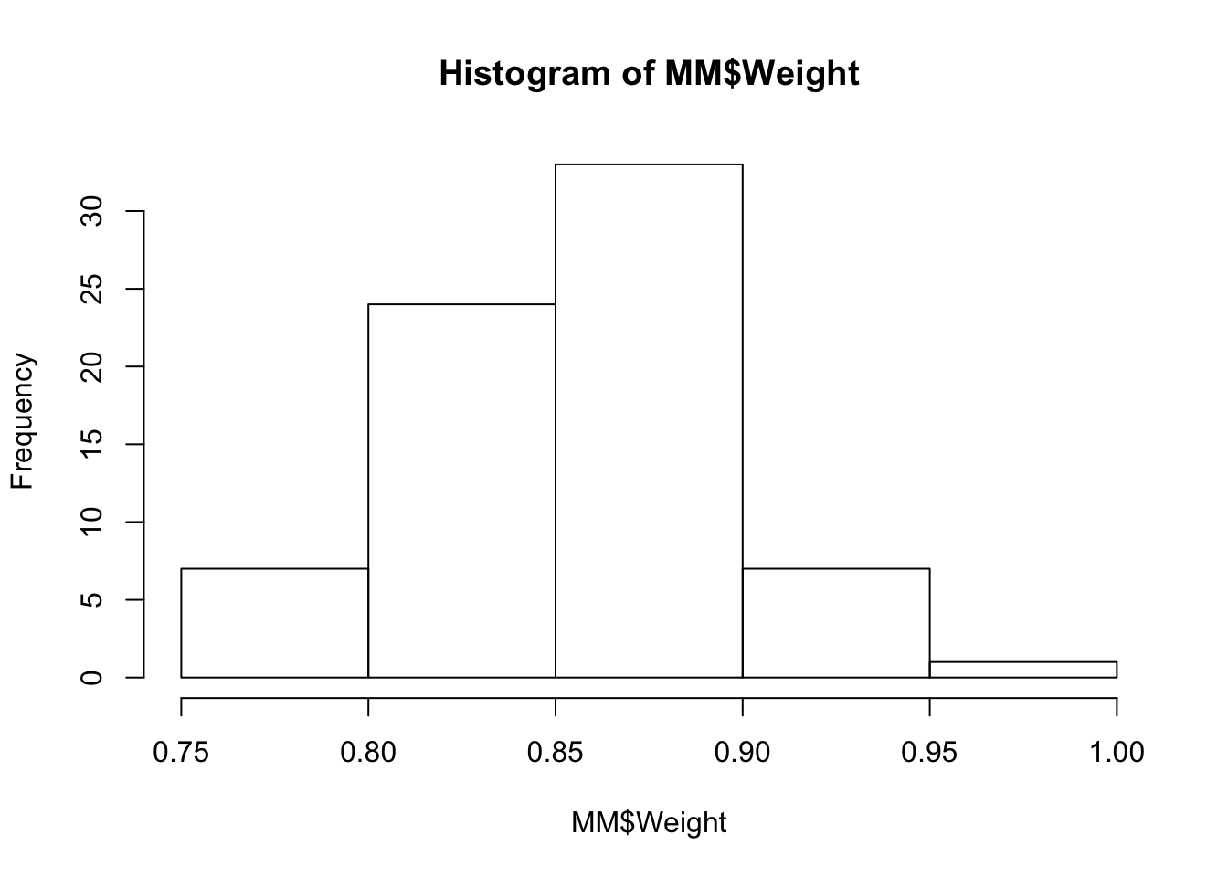
I prefer to see a few more bins in the histogram. The function rug shows you where the actual values occur.
hist(MM$Weight, breaks=10)   # breaks determines how many bins (5 in this case is the default)
rug(MM$Weight, col='darkred')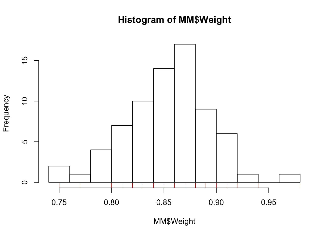
The coefficient of variation is the ratio of the sample standard deviation to the mean. That’s easy.
sd(MM$Weight)/mean(MM$Weight)## [1] 0.0483351If you compare this to the answer in the text, you’ll see the effect of rounding. By rounding in order to show the mean and SD separately in the textbook, the coefficient of variation gets changed by more than you might have expected. That said, by the time you get to the conclusion, the coefficient of variation is still about 5%.
Since the data include the color, it’s irresistible to use that property in a plot. The colors in the data frame are capitalized, but R only recognizes names of colors in lower case. The function tolower takes care of that.
tolower(MM$Color)## [1] "brown" "brown" "brown" "yellow" "yellow" "yellow" "red"
## [8] "red" "red" "orange" "orange" "orange" "blue" "blue"
## [15] "blue" "green" "green" "green" "brown" "brown" "brown"
## [22] "yellow" "yellow" "yellow" "red" "red" "red" "orange"
## [29] "orange" "orange" "blue" "blue" "blue" "green" "green"
## [36] "green" "brown" "brown" "brown" "yellow" "yellow" "yellow"
## [43] "red" "red" "red" "orange" "orange" "orange" "blue"
## [50] "blue" "blue" "green" "green" "green" "brown" "brown"
## [57] "brown" "yellow" "yellow" "yellow" "red" "red" "red"
## [64] "orange" "orange" "orange" "blue" "blue" "blue" "green"
## [71] "green" "green"Now we can plot the weights versus the bag from which they were drawn, or just show them in order if you prefer.
with(MM,
     plot(Bag, Weight, col=tolower(Color), pch=19))   # solid rather than hollow circle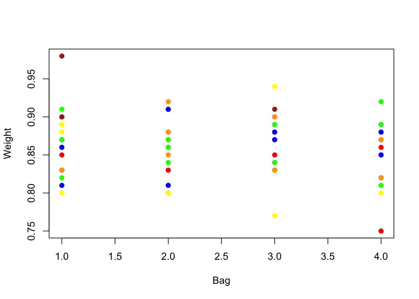
with(MM,
     plot(Weight, col=tolower(Color), pch=19))   # solid rather than hollow circle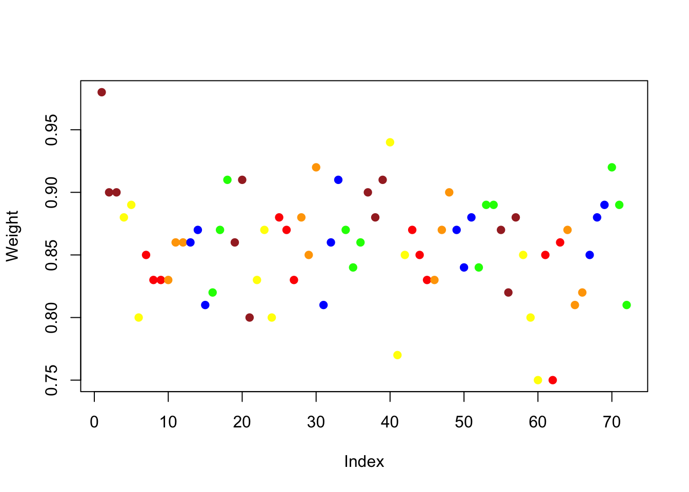
4.2 Analytics in R: Executive Compensation
We meet a larger data table in this example. The data give salaries of the Chief Executive Officers of 1,766 firms in 2010. The salaries are recorded in millions of dollars, so 1 = $1,000,000.
Comp <- read.csv("Data/04_4m_exec_comp_2010.csv")
dim(Comp)
## [1] 1766 3names(Comp) # names of the variables in the data frame## [1] "Company" "CEO" "Salary"Before reproducing the analysis in the text, you might find it interesting to use View to poke around the data to see which CEOs were paid the most and those that were paid the least.
A histogram shows that salary amounts are very right-skewed, typical in data that measure incomes.
hist(Comp$Salary, breaks=20,         # breaks allows you to control how many bins
     xlab="Salary (millions of $)",  # a better label than the default
     main="Executive Compensation")  # a better title too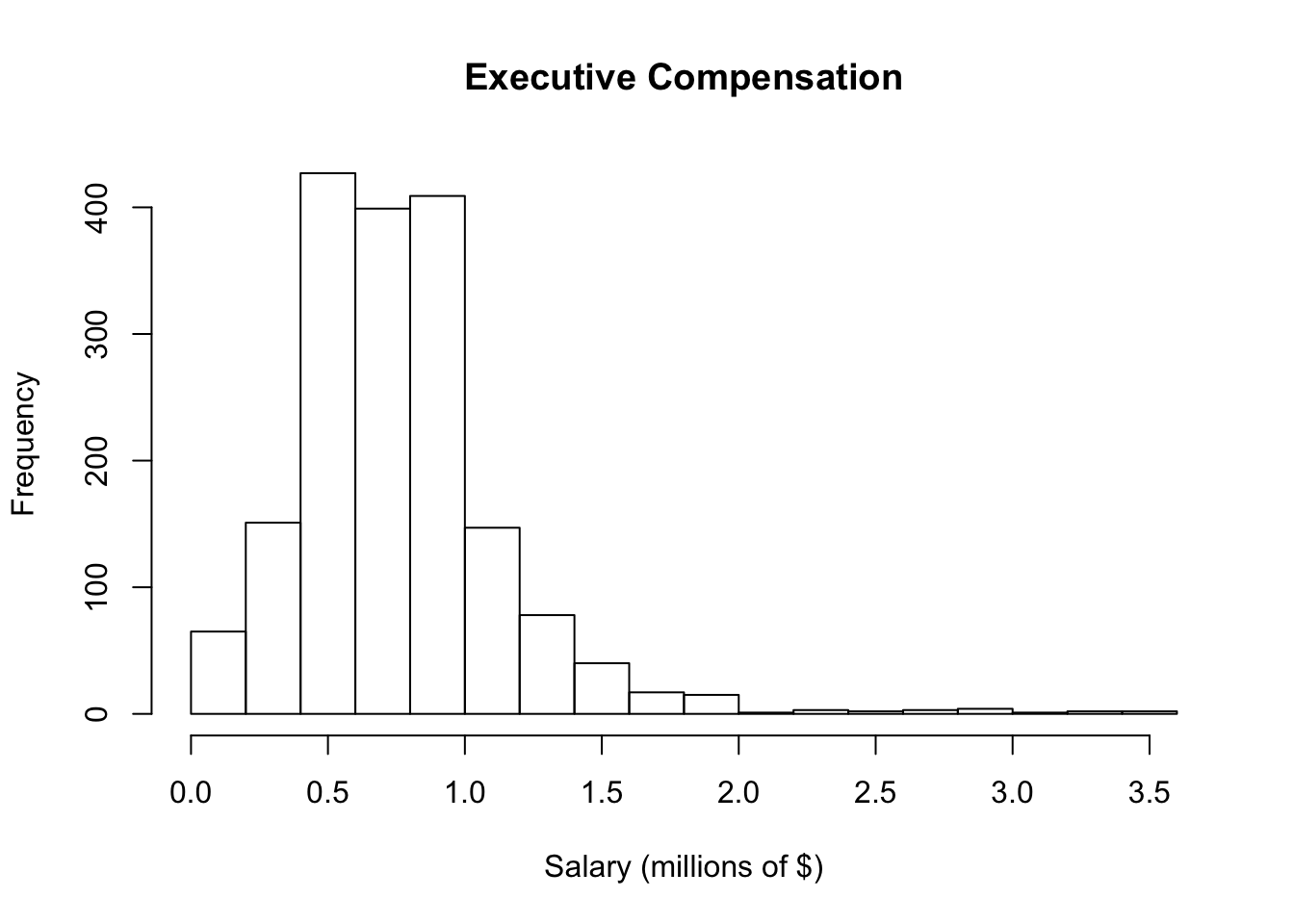
We can also inspect the boxplot of salaries, but it’s not very interesting by itself.
boxplot(Comp$Salary)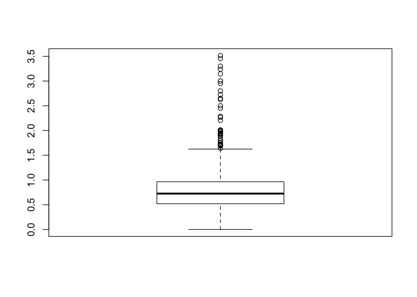
The boxplot of a single variable is much more visually useful if we add it to the histogram. The location of the median and middle 50% of the data are more apparent. You can experiment with colors as well to decide how much to emphasize the boxplot in the figure relative to the histogram.
hist(Comp$Salary, breaks=20, ylim=c(0,500),  # leave room for boxplot
     xlab="Salary (millions of $)", main="Executive Compensation")

boxplot(Comp$Salary, add=TRUE, at=475,       # at controls the position along the y-axis
        horizontal=TRUE, boxwex=50,          # horizontal perspective, boxwex widens box
        border='darkblue')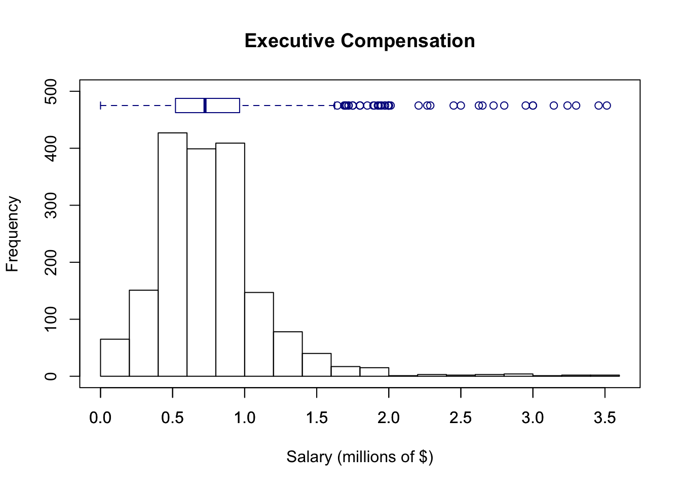
The function median computes the median, and the function IQR finds the interquartile range.
median(Comp$Salary)## [1] 0.725IQR(Comp$Salary)## [1] 0.445summary of a variable shows the extremes, quartiles and mean.
summary(Comp$Salary)## Min. 1st Qu. Median Mean 3rd Qu. Max.
## 0.0000 0.5200 0.7250 0.7727 0.9650 3.5130To find any percentile, use the function quantile.
quantile(Comp$Salary, 0.5) # the 50th percentile (aka, median)## 50%
## 0.725quantile(Comp$Salary, 0.9) # 90th percentile## 90%
## 1.2