22 Regression Diagnostics
The R examples in this chapter make use of the same tools as in prior chapters dealing with simple regression, so these examples offer more practice rather than new things. The key functions in this chapter have been introduced several times: plot and lm.
A couple of other miscellaneous things illustrated here that have not appeared previously (or if they do appear somewhere, I have forgotten where) are
orderedmakes a factor with ordered categories (you get to pick the order)textadds labeling within a plotbquoteallows you to include subscripts and superscripts in text labels of plots
22.1 Analytics in R: Estimating Home Prices
The data for this example give the sizes (in square feet) and prices (in dollars) for 94 homes. The data frame also includes two transformations of these data, the reciprocal of the sizes and the price per square foot. Rather than use these variables, we will create them directly so that you can see how to add your own variables to a data frame.
Homes <- read.csv("Data/22_4m_home_prices.csv")
dim(Homes)
## [1] 94 5head(Homes)## Square_Feet Price Size_Range Recip_SquareFeet Price_SquareFoot
## 1 868 225000 less than 1500 0.00115207 259.22
## 2 1021 212000 less than 1500 0.00097943 207.64
## 3 1164 210000 less than 1500 0.00085911 180.41
## 4 1598 330000 1500 to 2500 0.00062578 206.51
## 5 888 165000 less than 1500 0.00112613 185.81
## 6 1210 300000 less than 1500 0.00082645 247.93These extra columns are needed in this example because the simple regression model does not apply to these data. The prices rise linearly with the sizes of the homes, but the variation also grows with the size.
plot(Price ~ Square_Feet, data=Homes)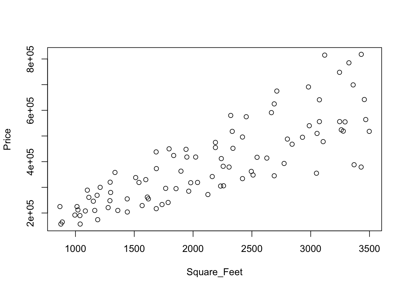
You can confirm the growth in the variation by examining the boxplots of prices. The medians grow, but so does the variation. (To get the boxplots to be in the order of size, convert the factor Size_Range into an ordered factor; by default, the boxplots would be ordered alphabetically, not by size.)
Homes$Size_Range <- ordered(Homes$Size_Range,
                            levels=c("less than 1500", "1500 to 2500", "more than 2500"))

boxplot(Price ~ Size_Range, data=Homes)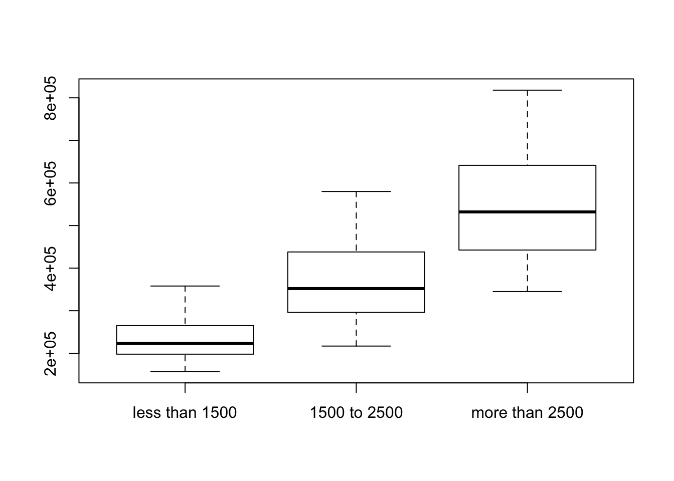
We stabilize the variation by working with the price per square foot. The fitted equation explains much less variation, but the SRM holds after this transformation. Don’t be concerned about the reduction in the \(r^2\) statistic: You should not compare \(r^2\) between models with different responses. It is a lot harder to explain the variation in the price per square foot (which here is basically differences in fixed costs) than it is to explain the prices themselves.
Rather than use the variables Price_SquareFoot and Recip_SquareFeet that come in the data file, let’s make them directly, as if they had not been present. I will name the new variables similarly, but use the abbreviation SqFt in the name.
The within function is handy for adding several variables to a data frame. It saves having to type the name of the data frame repeatedly. The function within creates a new data frame, so I have replaced the original with the expanded version. (Alternatively, can the new variables to the data frame by using the $ operator. You can also use the $ operator to remove variables. See the R documentation.)
Homes <- within(Homes, {
       Price_SqFt <- Price/Square_Feet;
       Recip_SqFt <- 1/Square_Feet
})
names(Homes)
## [1] "Square_Feet" "Price" "Size_Range"
## [4] "Recip_SquareFeet" "Price_SquareFoot" "Recip_SqFt"
## [7] "Price_SqFt"plot(Price_SqFt ~ Recip_SqFt, data=Homes)
regr <- lm(Price_SqFt ~ Recip_SqFt, data=Homes)
abline(regr, col='red')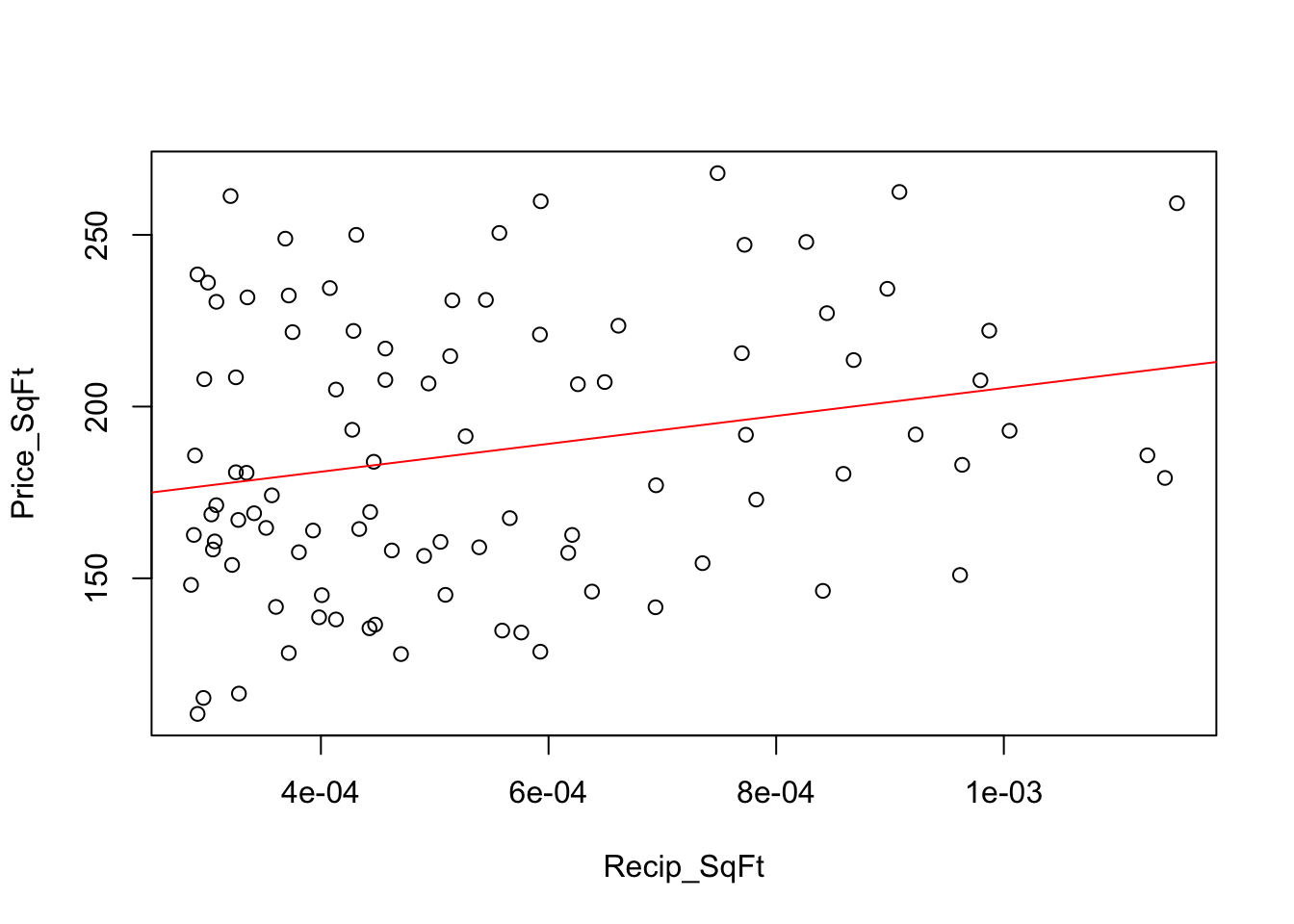
After the transformation to the price per square foot, the residuals appear to have constant variance.
plot(Homes$Recip_SqFt, residuals(regr))
abline(h=0, col='gray')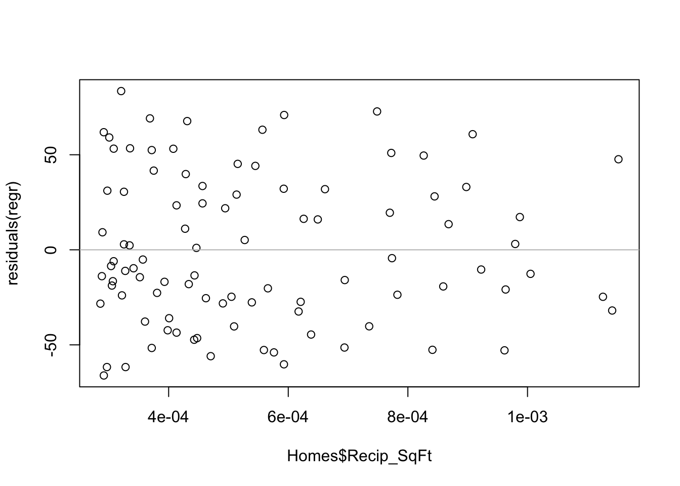
The residuals deviate more from normality than we would want if forming prediction intervals.
require(car)
qqPlot(residuals(regr))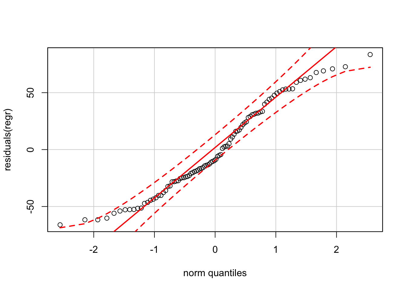
For inference about the estimated fixed and variable costs, however, the model is okay.
summary(regr)##
## Call:
## lm(formula = Price_SqFt ~ Recip_SqFt, data = Homes)
##
## Residuals:
## Min 1Q Median 3Q Max
## -66.104 -28.056 -9.121 31.697 83.492
##
## Coefficients:
## Estimate Std. Error t value Pr(>|t|)
## (Intercept) 164.79 10.45 15.769 <2e-16 ***
## Recip_SqFt 40617.02 17648.12 2.301 0.0236 *
## ---
## Signif. codes: 0 '***' 0.001 '**' 0.01 '*' 0.05 '.' 0.1 ' ' 1
##
## Residual standard error: 39.37 on 92 degrees of freedom
## Multiple R-squared: 0.05444, Adjusted R-squared: 0.04416
## F-statistic: 5.297 on 1 and 92 DF, p-value: 0.0236222.2 Analytics in R: Cell Phone Subscribers
The data in this example give the number of cellular (or mobile phone) connections in the US, dating back to the late 1990s. The data were recorded every 6 months.
Cell <- read.csv("Data/22_4m_cellular.csv")
dim(Cell)
## [1] 32 3head(Cell)## Calendar_Date Date Connections
## 1 30Jun1997 1997.5 48.70555
## 2 31Dec1997 1998.0 55.31229
## 3 30Jun1998 1998.5 60.83143
## 4 31Dec1998 1999.0 69.20932
## 5 30Jun1999 1999.5 76.28475
## 6 31Dec1999 2000.0 86.04700Rather than use the numerical column of dates in the file, I illustrate using the function dmy (for day, month, year) from the R-package lubridate to convert the text of the dates into R dates that are suitable for plotting.
require(lubridate)
Cell$Calendar_Date <- dmy(Cell$Calendar_Date)
Here’s a sequence plot of the connections including a fitted trend line; the trend looks remarkably linear. I added the R-squared statistic, formatted as \(r^2\), to the plot. The function bquote is rather special and you’ll need a lot of practice to get good with this one. Notice also that once you start using dates for an axis, you have to continue to use dates. For example, take a close look at how text positions the label. (Try the plot with the text located at position 2000 on the x-axis instead.)
plot(Connections ~ Calendar_Date, data=Cell)
regr <- lm(Connections ~ Calendar_Date, data=Cell)

r2 <- round(summary(regr)$r.squared, 4)

abline(regr, col='red')
text(dmy("1Jan2000"), 250, bquote(r^2 == .(r2))) 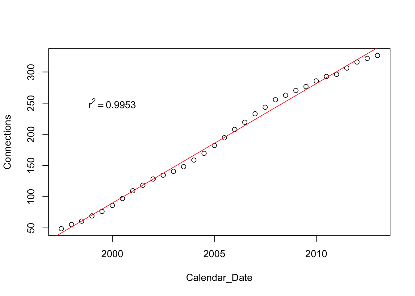
Although the fit of this trend has a large \(r^2\) which is close to 1, the residuals however show a strong pattern. For this example, I added the residuals to the data frame, this time using the $ operator rather than within.
Cell$resids <- residuals(regr)

plot(resids ~ Calendar_Date, data=Cell)
abline(h=0, col='gray')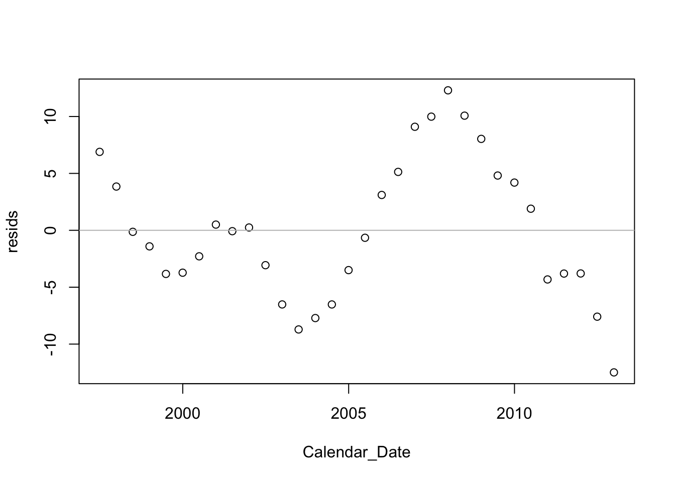
This model does not meet the conditions of the SRM. There’s a strong pattern in the residuals. It is very easy to pick out the original version from the collection of choices offered by the visual test for association (Chapter 6).
source("functions.R")   # holds the definition of this function
visual_test_for_association(resids~Date, data=Cell, mfrow=c(2,3))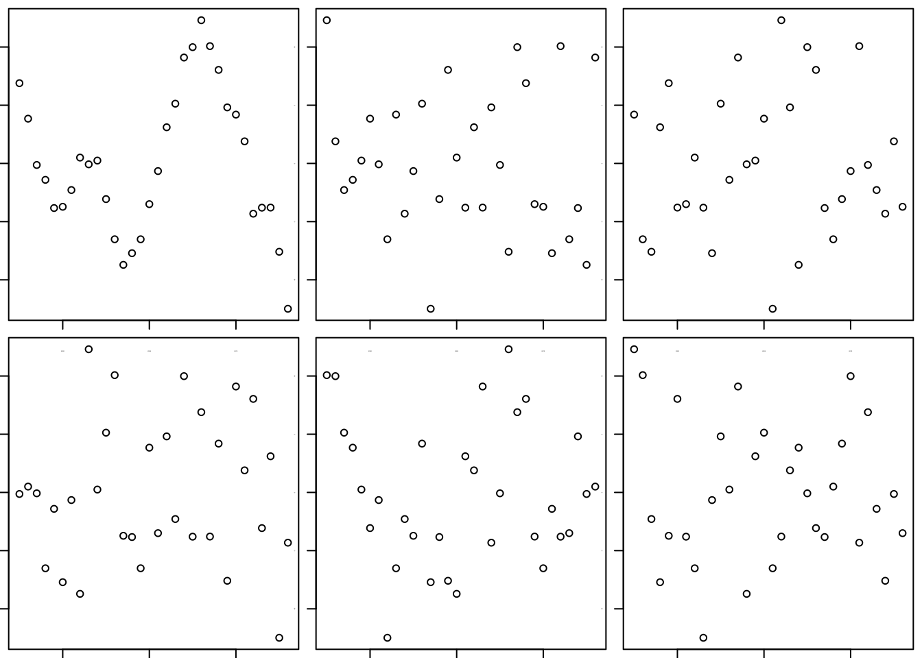
## [1] 1 1The plot of the actual residuals over time suggests that were we to use the linear trend to predict the next few values, we’d likely over-predict. The last 5 residuals are all negative. Given the way that the residuals were tracking, I’d guess the next ones – the prediction errors – would be negative as well. Chapter 27 shows how to model data like these.