27 Time Series
Previous chapters cover all but a few of the functions that appear in this final chapter. The examples in this chapter will not use all of the provided data in the sample files. The provided data tables include lagged variables; the examples shown here avoid do not use those in order to show how to make lagged variables as needed. Something else comes up in this chapter: missing values. The presence of lagged variables as explanatory variables introduces missing values if the prior values are unknown. Missing values require the use of the na.action option in lm. The novel functions illustrated here include:
subsetto use a portion of a data frame in a regressiondurbinWatsonTest(fromcar) computes this common diagnostic statistic
27.1 Analytics in R: Predicting Sales of New Cars
These data report quarterly counts of domestic sales of cars and light trucks in the US (in thousands) since 1990. The file includes a numerical date for plots.
Sales <- read.csv("Data/27_4m_car_sales.csv")
dim(Sales)
## [1] 105 4head(Sales)## Year Quarter Car_Sales Light_Truck_Sales
## 1 1990.167 Q1 2310.1 1151.3
## 2 1990.417 Q2 2531.8 1258.6
## 3 1990.667 Q3 2358.2 1156.5
## 4 1990.917 Q4 2100.1 993.1
## 5 1991.167 Q1 1906.4 909.4
## 6 1991.417 Q2 2231.9 1119.4The first rule when dealing with time series is to inspect the sequence plot, or timeplot, of the data. In this example, there’s a strong seasonal pattern in both series. Interesting trends are present as well, such as the sharp rise in “truck” sales; the most popular vehicle in many years sold in the US is often the Ford F-150 truck. The truck category also includes many SUVs as well.
plot(Car_Sales ~ Year, data=Sales, type='l', col='blue', ylab="Sales in 1000s")
lines(Light_Truck_Sales ~ Year, data=Sales, col='red')
legend(2001, 1400, legend=c("Car", "Truck"), pch=19, col=c('blue', 'red'))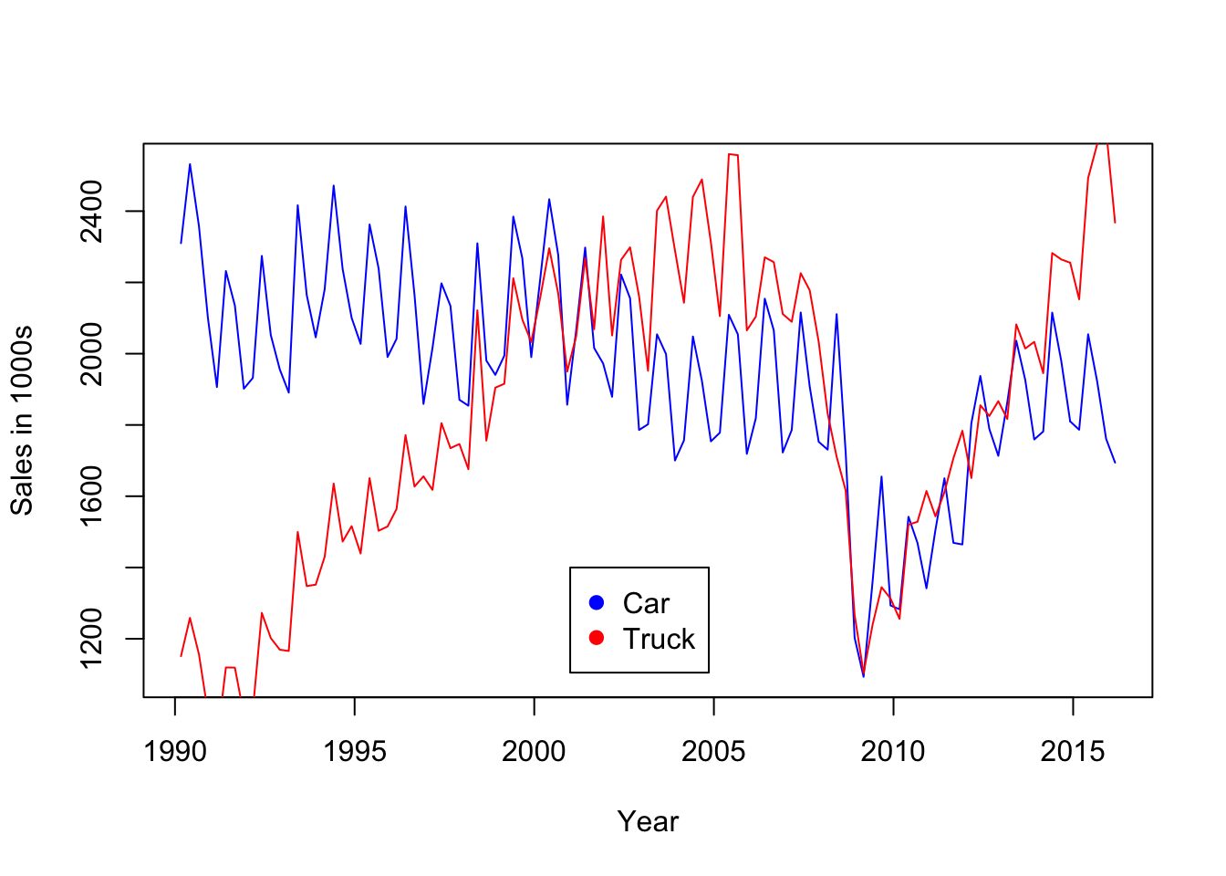
The analysis in the text extrapolates the pattern in car sales through the recession that began in 2008. The idea is to extrapolate the trend before the recession to estimate the loss in car sales that might be attributed to the economic downturn.
Multiple regression provides an initial model, one that needs some improvement. A linear trend with a quarterly seasonal factor fits well and captures much of the pattern in car sales prior to 2008. The regression is fit using the data prior to 2008. (Notice in the summary of the regression that R omits the dummy variable for the first quarter rather than the fourth quarter as in the textbook version of this example.)
regr <- lm(Car_Sales ~ Year + Quarter, data=Sales[Sales$Year<2008,])
summary(regr)
##
## Call:
## lm(formula = Car_Sales ~ Year + Quarter, data = Sales[Sales$Year <
## 2008, ])
##
## Residuals:
## Min 1Q Median 3Q Max
## -186.797 -66.222 -1.583 59.563 279.053
##
## Coefficients:
## Estimate Std. Error t value Pr(>|t|)
## (Intercept) 37901.011 4791.555 7.910 3.50e-11 ***
## Year -17.983 2.397 -7.501 1.91e-10 ***
## QuarterQ2 325.474 35.184 9.251 1.36e-13 ***
## QuarterQ3 169.231 35.200 4.808 8.99e-06 ***
## QuarterQ4 -54.863 35.225 -1.557 0.124
## ---
## Signif. codes: 0 '***' 0.001 '**' 0.01 '*' 0.05 '.' 0.1 ' ' 1
##
## Residual standard error: 105.5 on 67 degrees of freedom
## Multiple R-squared: 0.7518, Adjusted R-squared: 0.737
## F-statistic: 50.74 on 4 and 67 DF, p-value: < 2.2e-16The residuals show substantial autocorrelation, so the inferences in this summary are not reliable.
plot(residuals(regr) ~ Sales$Year[Sales$Year<2008], type='b')
abline(h=0, col='gray')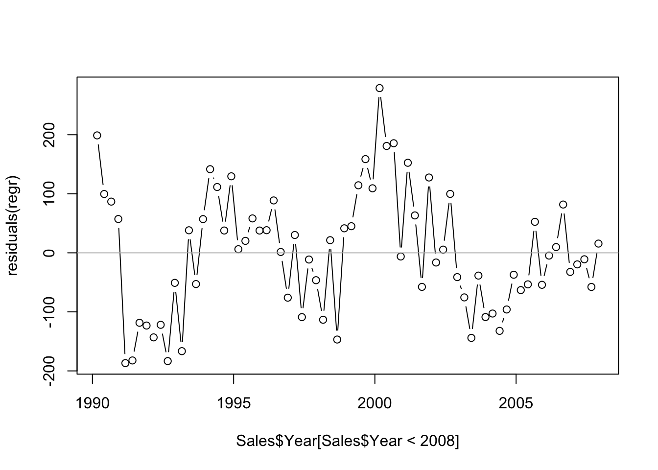
We can test for the presence of autocorrelation using the Durbin-Watson test from the package car. This implementation uses a fast simulation (fast for this regression – it is slow for larger models) to compute a p-value. The test rejects \(H_0: \rho=0\) with a very small p-value near zero.
require(car)
durbinWatsonTest(regr)
## lag Autocorrelation D-W Statistic p-value
## 1 0.5365565 0.8735341 0
## Alternative hypothesis: rho != 0Although the model is inadequate for inference because of the presence of autocorrelation, we can nonetheless use it to extrapolate this simple trend through the recession. Since the subset will be needed for the plot that follows, it is saved explicitly. I added the predictions to the subset to keep the data together.
Subset <- Sales[2008 <= Sales$Year,]

Subset$preds <- predict(regr, newdata=Subset)
Subset$preds
## [1] 1787.481 2108.458 1947.719 1719.131 1769.497 2090.475 1929.736
## [8] 1701.147 1751.514 2072.492 1911.753 1683.164 1733.531 2054.508
## [15] 1893.769 1665.181 1715.547 2036.525 1875.786 1647.197 1697.564
## [22] 2018.542 1857.803 1629.214 1679.581 2000.558 1839.819 1611.231
## [29] 1661.597 1982.575 1821.836 1593.247 1643.614This plot contrasts the predictions obtained from the subset of data (connected points) with the actual sales during the recession.
plot(Car_Sales ~ Year, data=Subset)
lines(preds ~ Year, col='blue', data=Subset)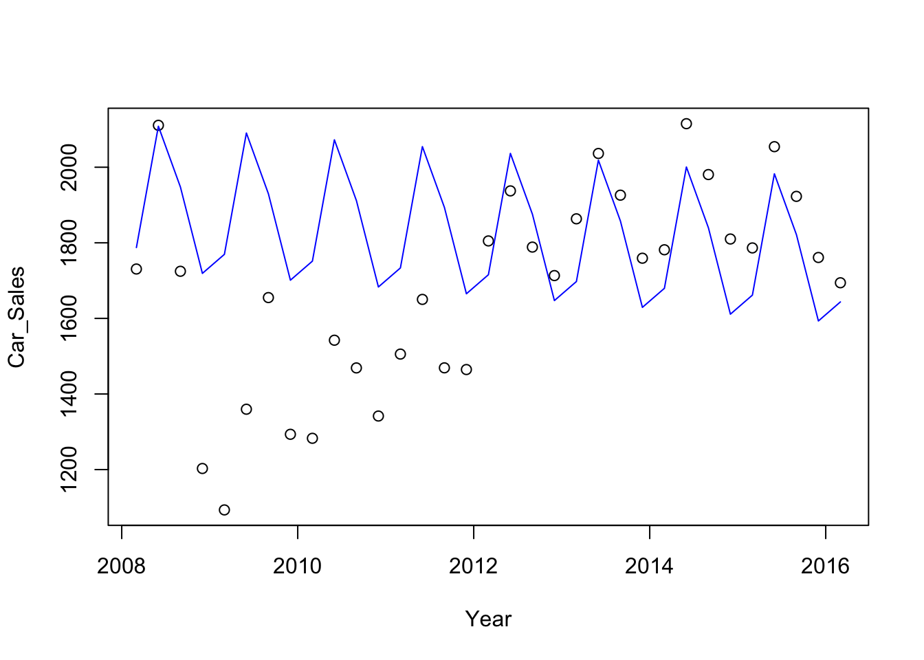
With the predictions in the same data frame, it is easy to get a table that compares the pre-recession trend to the observed values.
Subset[,c("Year", "Car_Sales", "preds")]## Year Car_Sales preds
## 73 2008.167 1730.7 1787.481
## 74 2008.417 2110.9 2108.458
## 75 2008.667 1724.7 1947.719
## 76 2008.917 1202.9 1719.131
## 77 2009.167 1093.3 1769.497
## 78 2009.417 1359.7 2090.475
## 79 2009.667 1655.1 1929.736
## 80 2009.917 1293.4 1701.147
## 81 2010.167 1282.8 1751.514
## 82 2010.417 1542.3 2072.492
## 83 2010.667 1469.0 1911.753
## 84 2010.917 1341.7 1683.164
## 85 2011.167 1505.6 1733.531
## 86 2011.417 1650.3 2054.508
## 87 2011.667 1469.2 1893.769
## 88 2011.917 1464.7 1665.181
## 89 2012.167 1805.0 1715.547
## 90 2012.417 1937.4 2036.525
## 91 2012.667 1788.7 1875.786
## 92 2012.917 1713.3 1647.197
## 93 2013.167 1863.5 1697.564
## 94 2013.417 2036.4 2018.542
## 95 2013.667 1926.1 1857.803
## 96 2013.917 1759.3 1629.214
## 97 2014.167 1781.6 1679.581
## 98 2014.417 2115.2 2000.558
## 99 2014.667 1980.6 1839.819
## 100 2014.917 1810.1 1611.231
## 101 2015.167 1786.5 1661.597
## 102 2015.417 2054.4 1982.575
## 103 2015.667 1922.9 1821.836
## 104 2015.917 1761.2 1593.247
## 105 2016.167 1694.3 1643.61427.2 Analytics in R: Forecasting Unemployment
The data in this example record the monthly civilian unemployment rate in the US, dating back to January 1948. These are the unemployment rates that you might hear mentioned in the news. The data frame includes several lags of unemployment that we will not use in this example; rather, we will make them directly. The unemployment data are heavily rounded to a single decimal place.
Unemp <- read.csv("Data/27_4m_unemployment.csv")
dim(Unemp)
## [1] 819 4head(Unemp)## Date Unemployment_Rate Lag_Unemployment_Rate Lag_6_Unemployment_Rate
## 1 1/1/1948 3.4 NA NA
## 2 2/1/1948 3.8 3.4 NA
## 3 3/1/1948 4.0 3.8 NA
## 4 4/1/1948 3.9 4.0 NA
## 5 5/1/1948 3.5 3.9 NA
## 6 6/1/1948 3.6 3.5 NANext, remember the first rule of time series analysis: inspect the sequence plot. To do that, convert the date string in the first column into an R date using the function mdy from lubridate. That conversion provides a nice variable for the time axis in plots.
require(lubridate)
Unemp$Date <- mdy(Unemp$Date)plot(Unemployment_Rate ~ Date, data=Unemp, pch=20) # pch=20 picks a smaller filled point than pch=19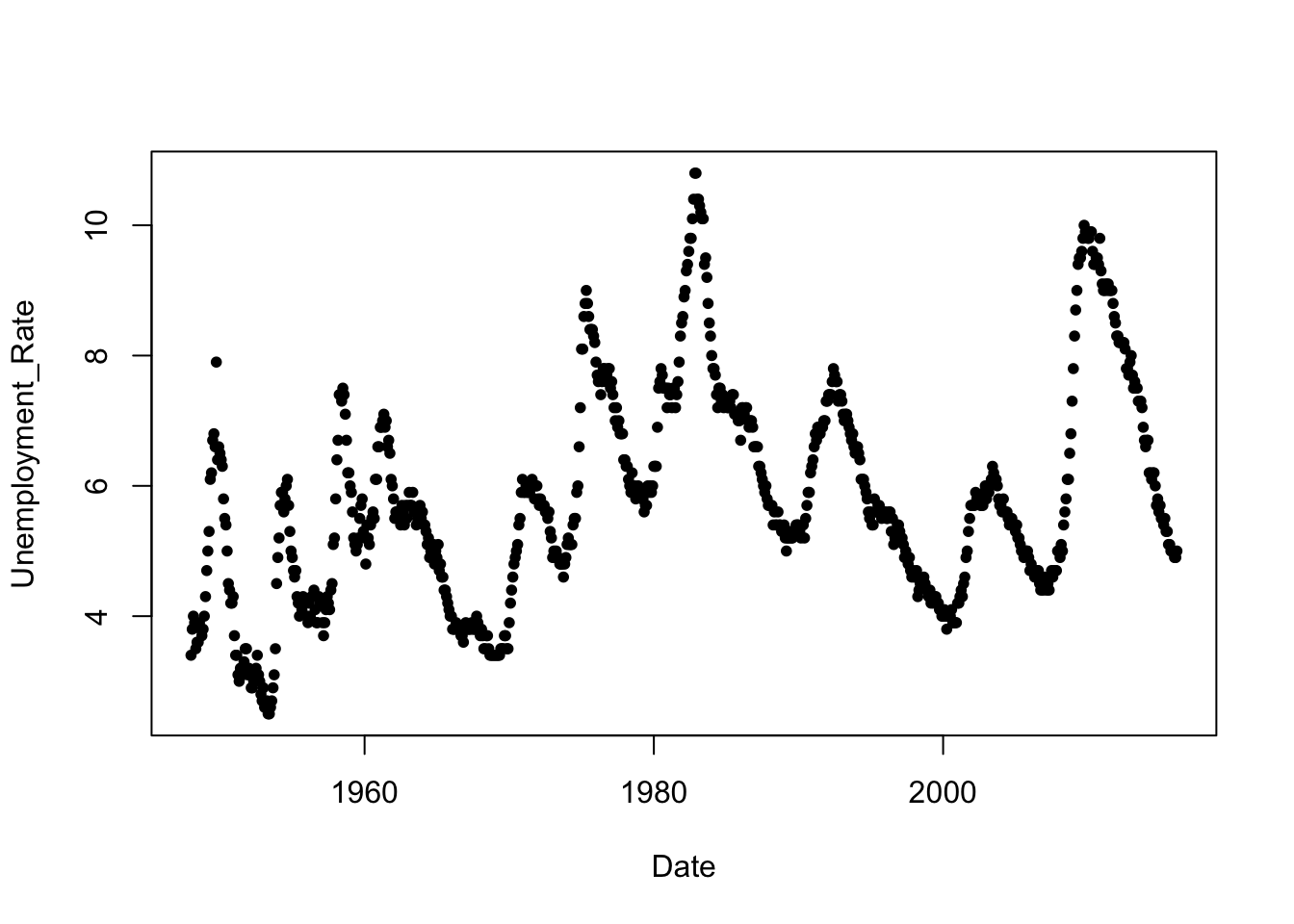
R includes the function lag for building lagged variables, but this function is made to work with a special type of time series data that is not compatible with regular R vectors. Instead, we will build the lagged variables by simply adding missing values to the start of a vector and trimming an equal number of values from the other end.
n <- nrow(Unemp)

Unemp$Lag_1_Un <- c(NA,        Unemp$Unemployment_Rate[-n])
Unemp$Lag_2_Un <- c(NA, NA,    Unemp$Unemployment_Rate[-c(n-1,n)])
Unemp$Lag_6_Un <- c(rep(NA,6), Unemp$Unemployment_Rate[-((n+1)-(1:6))])
Now we can fit the autoregression of the current unemployment on its lags using the same subset of data as in the text. Notice that this code uses a condition that concerns a date to pick out cases. You need to convert “constant” date strings (e.g.,“1/1/1980”) into date objects for that comparison to work.
Subset <- Unemp[ (mdy("1/1/1980")<=Unemp$Date) & (Unemp$Date < mdy("1/1/2016")), ]

regr <- lm(Unemployment_Rate ~ Lag_1_Un + Lag_6_Un, data=Subset)
summary(regr)
##
## Call:
## lm(formula = Unemployment_Rate ~ Lag_1_Un + Lag_6_Un, data = Subset)
##
## Residuals:
## Min 1Q Median 3Q Max
## -0.61522 -0.10000 -0.00871 0.10009 0.56066
##
## Coefficients:
## Estimate Std. Error t value Pr(>|t|)
## (Intercept) 0.07709 0.03185 2.420 0.0159 *
## Lag_1_Un 1.11761 0.01472 75.904 <2e-16 ***
## Lag_6_Un -0.12978 0.01477 -8.785 <2e-16 ***
## ---
## Signif. codes: 0 '***' 0.001 '**' 0.01 '*' 0.05 '.' 0.1 ' ' 1
##
## Residual standard error: 0.1595 on 429 degrees of freedom
## Multiple R-squared: 0.9904, Adjusted R-squared: 0.9904
## F-statistic: 2.212e+04 on 2 and 429 DF, p-value: < 2.2e-16As when you first encounter a time series, always inspect the residuals from a time series regression for a time trend. In a pinch, if you omit the date, R plots a single vector in order. That’s handy if you’re just checking and want the sequence plot and don’t need the dates. There do seem to be some small “curves” of several adjacent points. These local patterns are artifacts of the rounded nature of the unemployment rate.
plot(residuals(regr) ~ Subset$Date, pch=20)
abline(h=0,col='gray')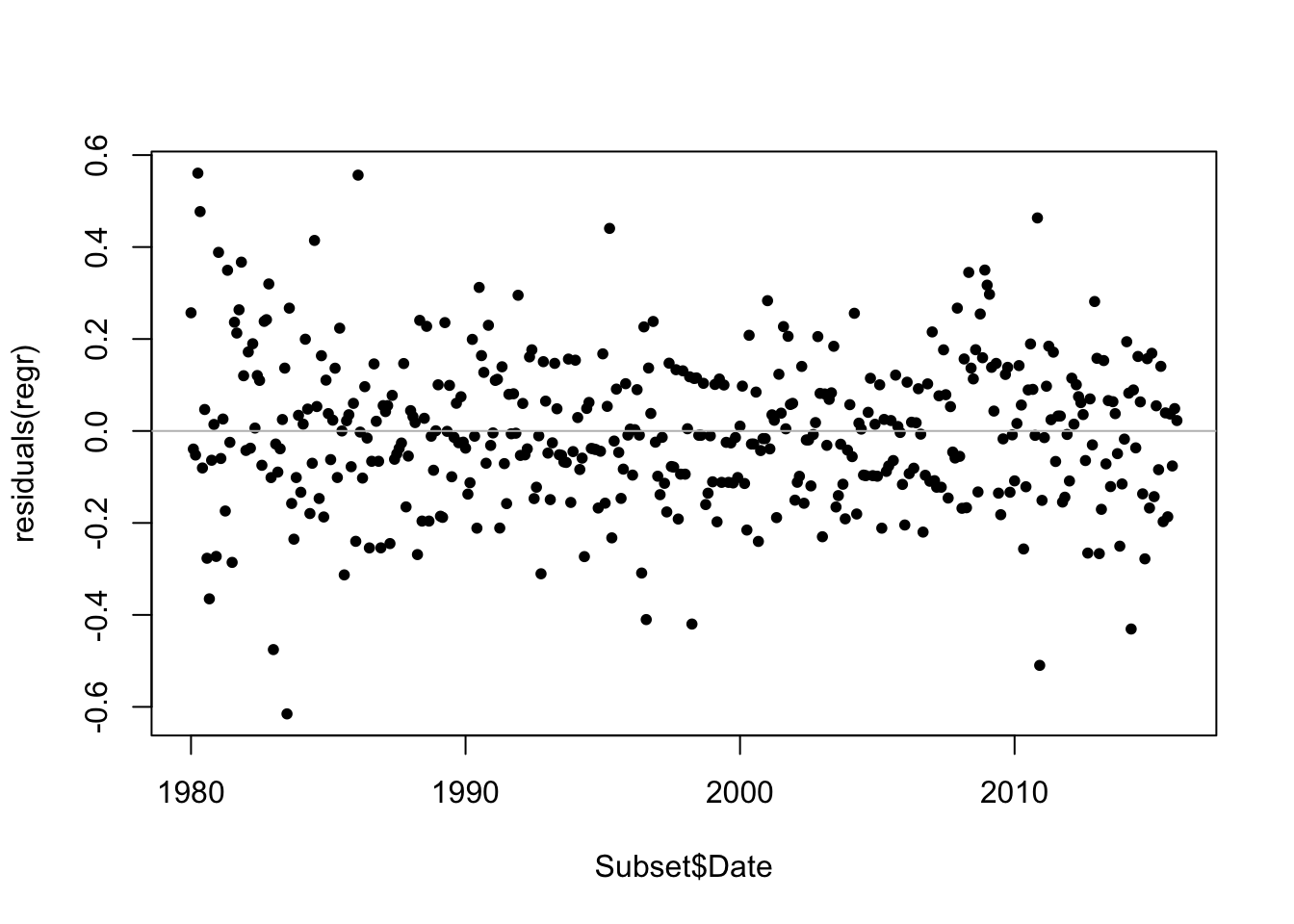
The Durbin-Watson statistic (from car) is not valid because this regression uses lagged versions of the response as explanatory variables. You can still use the function which is handy for computing the residual autocorrelation, but it virtually always says everything is okay when applied in this context (that is, to residuals from a regression that uses the lag of the response as an explanatory variable). In this case, it finds some small bit of remaining autocorrelation. Again, because of the model, the test is not conclusive.
require(car)
durbinWatsonTest(regr)
## lag Autocorrelation D-W Statistic p-value
## 1 -0.1126248 2.219147 0.024
## Alternative hypothesis: rho != 0The D-W statistic shows the autocorrelation, but its also good to plot the residuals on their lag. Just like we like to see a scatterplot of \(Y\) on \(X\) when relying on the correlation of two variables, this is the plot that goes with an autocorrelation. Note the use of missing values (NA) to shift the variables. (The diagonal lines are another artifact of the rounding mentioned previously.)
plot(c(NA, residuals(regr)), c(residuals(regr),NA),
     xlab="Lagged Residual", ylab="Residual")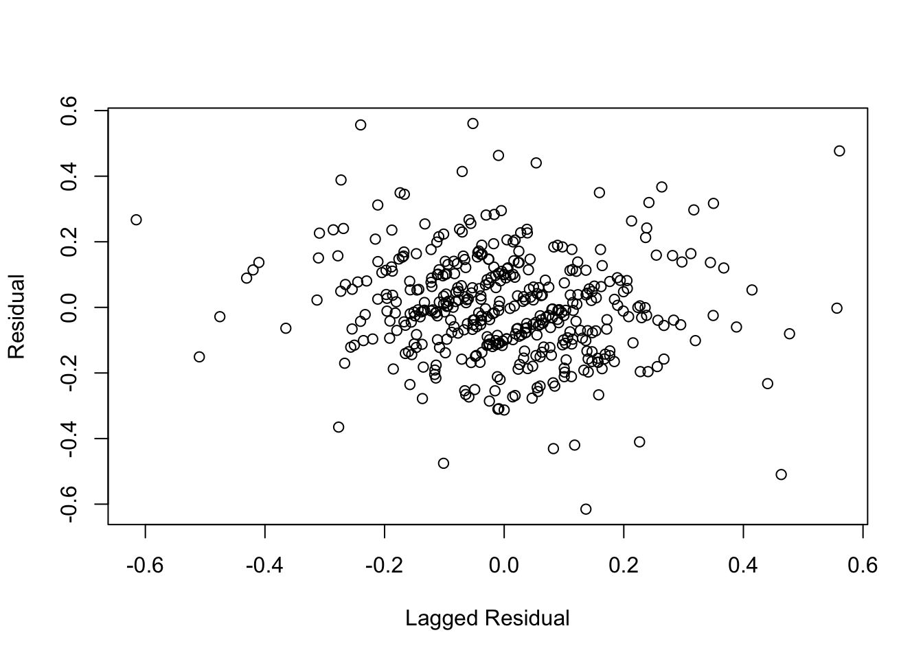
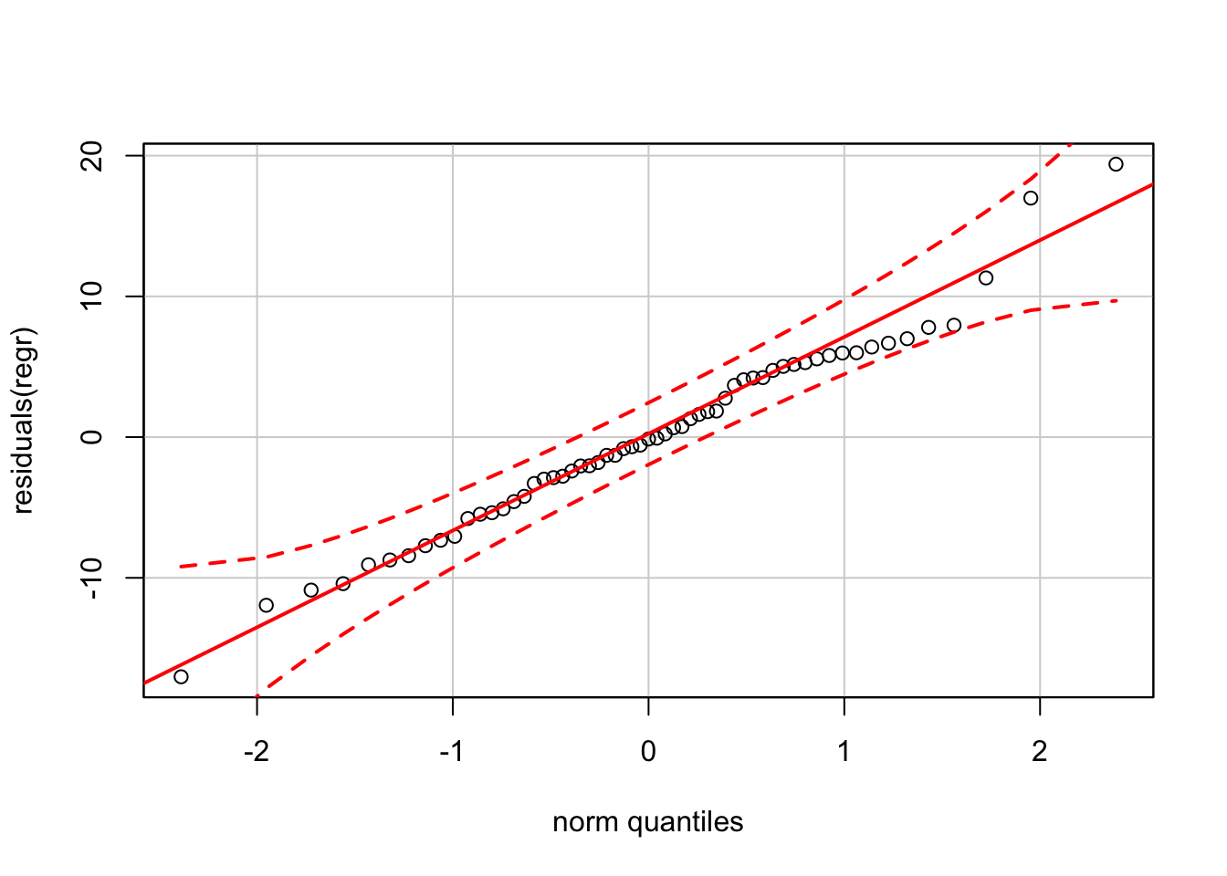
The plot of residuals on fitted values appears okay, as does the normal quantile plot (at least until you get far into the tails).
plot(residuals(regr) ~ fitted.values(regr))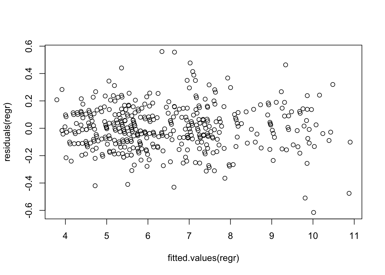
require(car)
qqPlot(residuals(regr))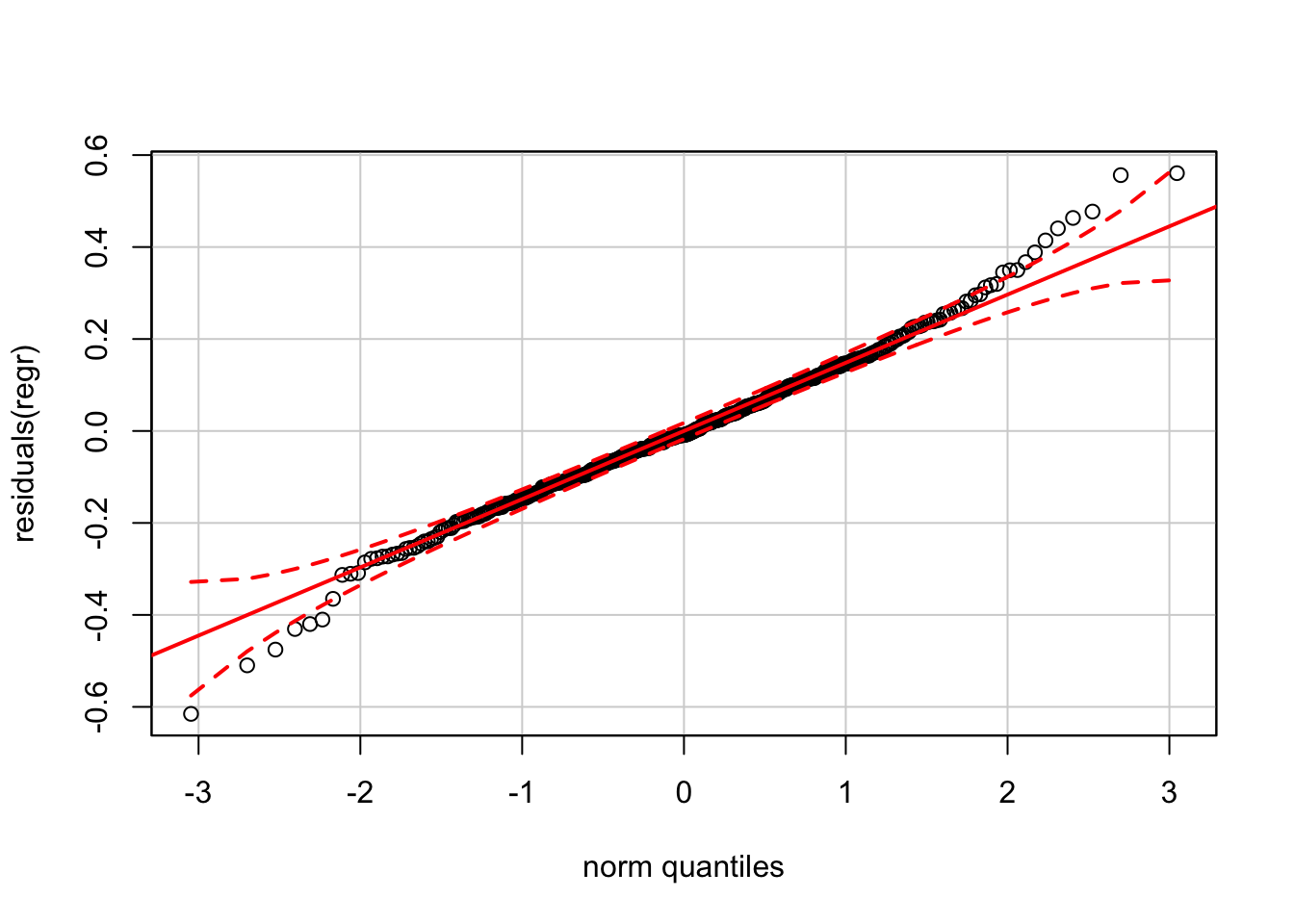
Again, the version of the normal QQ plot from car claims much tighter confidence bands than our reference software (JMP).
We can compare the one-step-ahead predictions and intervals to the actual data in 2016.
preds <- predict(regr, newdata=Unemp[mdy("1/1/2016") <= Unemp$Date,],
                 interval='prediction')
preds
## fit lwr upr
## 817 4.977295 4.663174 5.291416
## 818 4.891490 4.577373 5.205607
## 819 4.891490 4.577373 5.205607The actual values are at the low side of these intervals, but well inside these prediction intervals.
Unemp[mdy("1/1/2016") <= Unemp$Date,"Unemployment_Rate"]## [1] 4.9 4.9 5.027.3 Analytics in R: Forecasting Profits
The data for the final case in this chapter record quarterly financial sales for retailer Best Buy.
BB <- read.csv("Data/27_4m_bestbuy.csv")
dim(BB)
## [1] 85 13head(BB)## Time Date Cal_Year Quarter Revenue Cost_Goods_Sold Gross_Profit
## 1 1995.083 19950228 1995 1 1947.11 1679.99 267.12
## 2 1995.333 19950531 1995 2 1274.70 1079.65 195.05
## 3 1995.583 19950831 1995 3 1437.91 1228.08 209.83
## 4 1995.833 19951130 1995 4 1929.28 1672.05 257.23
## 5 1996.083 19960229 1996 1 2575.56 2246.24 329.32
## 6 1996.333 19960531 1996 2 1637.18 1387.49 249.69
## Pct_Change Lag_Pct_Change Lag_2_Pct_Change Lag_3_Pct_Change
## 1 NA NA NA NA
## 2 NA NA NA NA
## 3 NA NA NA NA
## 4 NA NA NA NA
## 5 23.284 NA NA NA
## 6 28.014 23.28 NA NA
## Lag_4_Pct_Change Lag_5_Pct_Change
## 1 NA NA
## 2 NA NA
## 3 NA NA
## 4 NA NA
## 5 NA NA
## 6 NA NASales at Best Buy grew rapidly prior to 2010, even through the recession. The following plot also shows increasing variation before leveling off and then declining in the more recent data (probably due to increased competition from on-line retailers like Amazon).
plot(Gross_Profit ~ Time, type='b', pch=20, data=BB)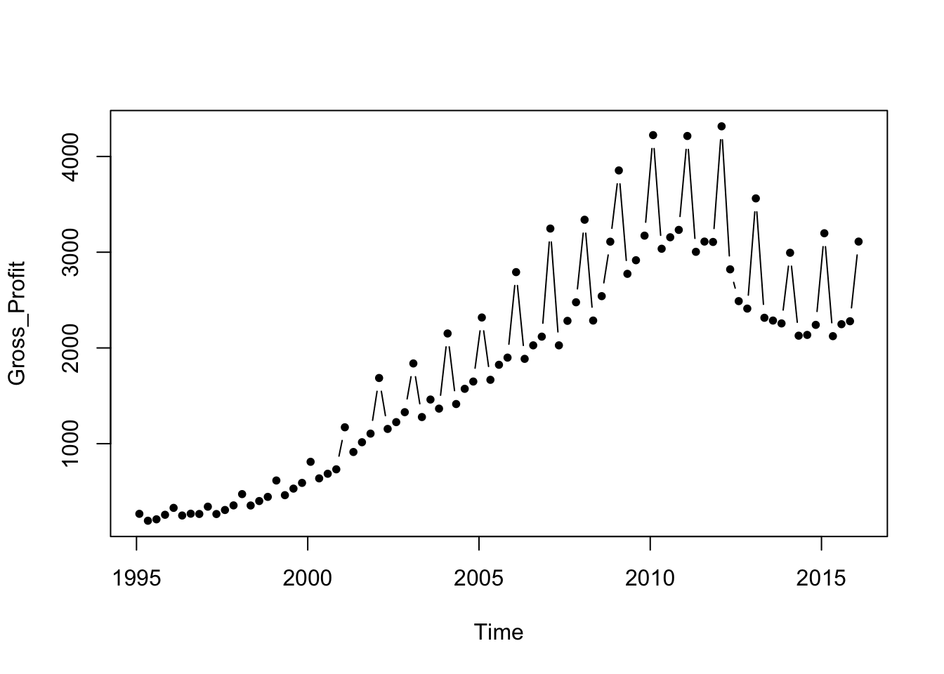
The exercise in this case is to predict gross profits of Best Buy in 2012 from the prior data using the year-over-year percentage changes. Percentage changes are often simpler to model than the trend itself.
Subset <- BB[BB$Time<2012,]

plot(Pct_Change ~ Time, type='b', data=Subset)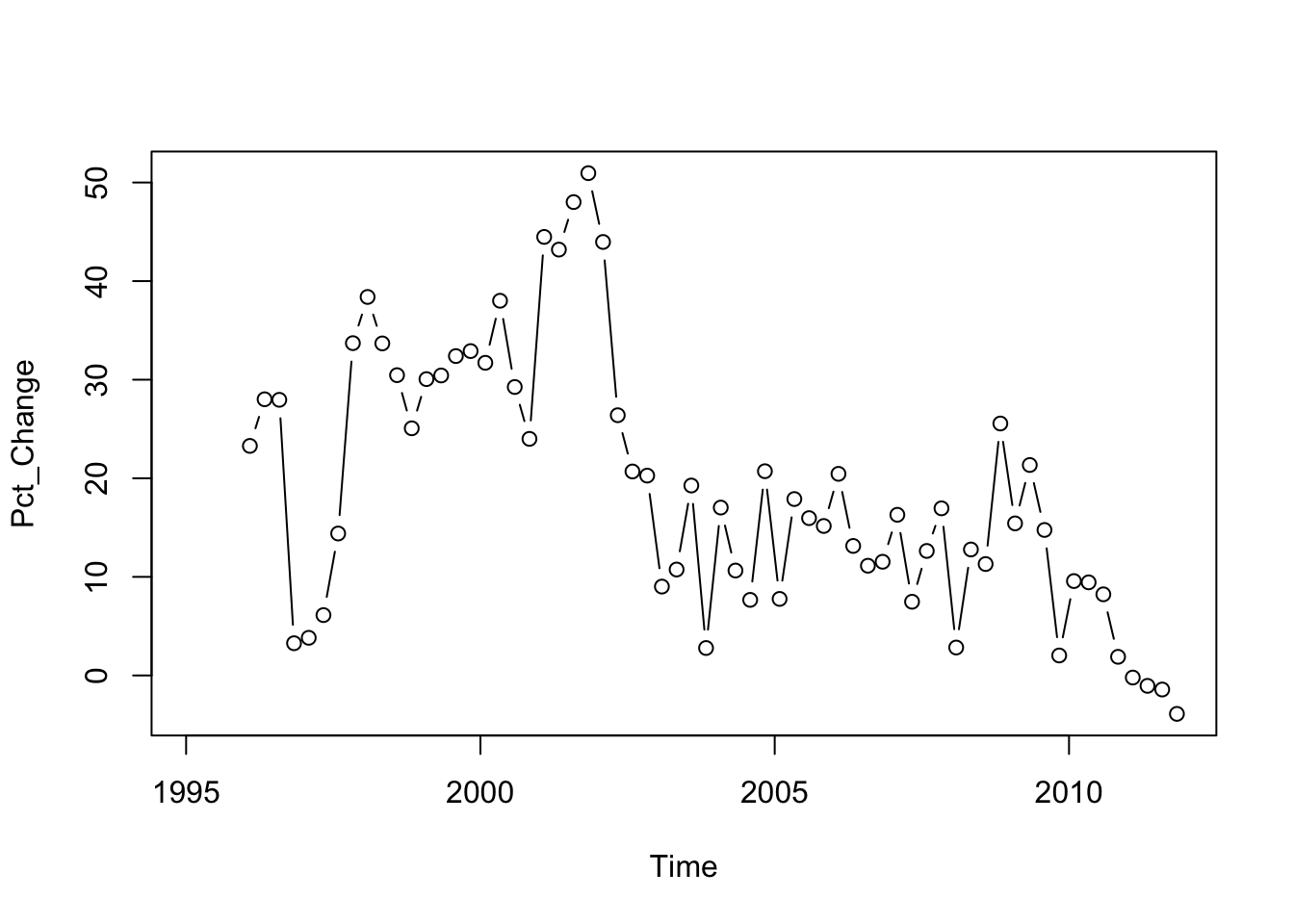
The plot of the percentage change on its lag shows substantial autocorrelation; the coefficient in the first order autoregression is about 0.80.
plot(Pct_Change ~ Lag_Pct_Change, data=Subset)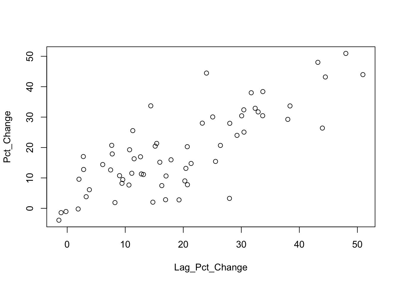
lm(Pct_Change ~ Lag_Pct_Change, data=Subset)##
## Call:
## lm(formula = Pct_Change ~ Lag_Pct_Change, data = Subset)
##
## Coefficients:
## (Intercept) Lag_Pct_Change
## 3.2492 0.8086The eventual regression uses several lags and a time trend. It is important that the construction of this regression includes the na.action=na.exclude option. That’s because of missing values caused by taking lags of the variables. If you don’t use this option, you will have trouble aligning the residuals in later plots.
regr <- lm(Pct_Change ~ Lag_Pct_Change + Lag_4_Pct_Change + Lag_5_Pct_Change + Time,
           data=Subset, na.action=na.exclude)
summary(regr)
##
## Call:
## lm(formula = Pct_Change ~ Lag_Pct_Change + Lag_4_Pct_Change +
## Lag_5_Pct_Change + Time, data = Subset, na.action = na.exclude)
##
## Residuals:
## Min 1Q Median 3Q Max
## -17.0311 -4.3954 -0.1358 4.8837 19.3950
##
## Coefficients:
## Estimate Std. Error t value Pr(>|t|)
## (Intercept) 1899.41753 579.08521 3.280 0.00182 **
## Lag_Pct_Change 0.71145 0.09524 7.470 7.1e-10 ***
## Lag_4_Pct_Change -0.30908 0.12214 -2.530 0.01434 *
## Lag_5_Pct_Change 0.23314 0.11571 2.015 0.04890 *
## Time -0.94413 0.28813 -3.277 0.00184 **
## ---
## Signif. codes: 0 '***' 0.001 '**' 0.01 '*' 0.05 '.' 0.1 ' ' 1
##
## Residual standard error: 6.995 on 54 degrees of freedom
## (9 observations deleted due to missingness)
## Multiple R-squared: 0.7454, Adjusted R-squared: 0.7265
## F-statistic: 39.52 on 4 and 54 DF, p-value: 1.919e-15Setting na.action=na.exclude causes R to put missing values in the fitted values and residuals. The residuals from the regression begin with 9 missing values because the model uses year-over-year changes (4 missing values plus 5 lags = 9 missing values).
residuals(regr)[1:10]## 1 2 3 4 5 6 7
## NA NA NA NA NA NA NA
## 8 9 10
## NA NA -7.049886These missing values imply that the series of residuals, for example, has the same length as other variables in the original data frame. (Otherwise, it would be much shorter and you could not directly use it in the following plots.)
The sequence plot of residuals appears random.
plot(residuals(regr) ~ Subset$Time)
abline(h=0, col='gray')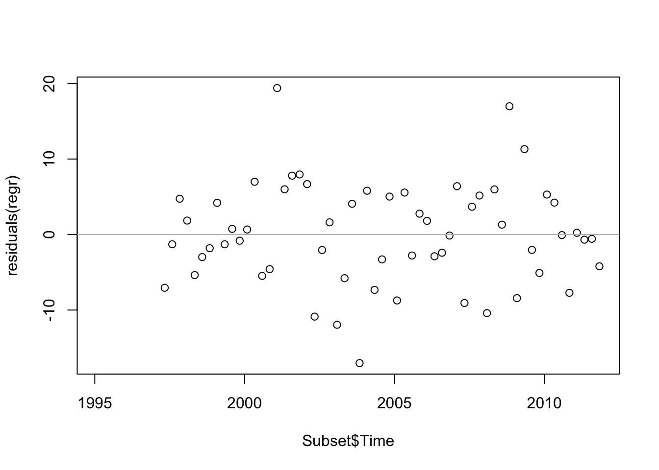
The plot of residuals on fitted values is also okay, albeit there’s a hint of a quadratic pattern.
plot(residuals(regr) ~ fitted.values(regr))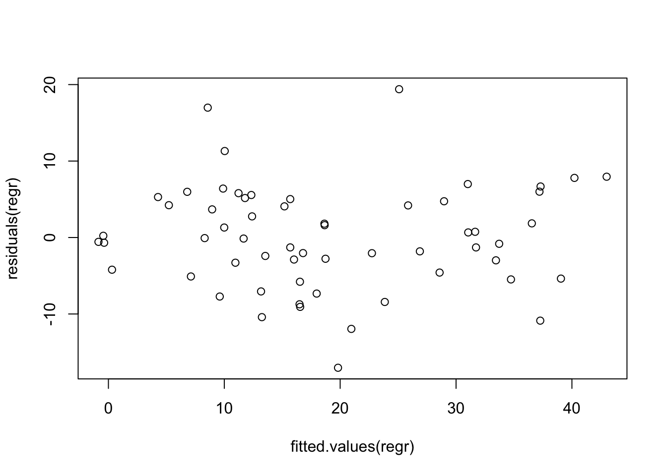
The normal quantile plot is fine.
require(car)
qqPlot(residuals(regr))