3 Describing Categorical Data
Describing categorical data starts with counting, building the frequency distribution of a categorical variable. Displaying counts numerically or graphically requires familiarity with several R functions and the important data structure called a matrix. The key functions and tasks illustrated in this chapter are (in order of appearance):
Viewopens a spreadsheet window on a data frame:produces a sequence of integersorderreturns the indices that put an object into orderas.characterreplaces a factor in a data frame by the underlying strings$can add a variable to a data frame (or remove one)withidentifies the data frame for a subsequent command, saving typingbarplotdraws a bar chartpiedraws a pie chartparcontrols plot features and allows placing plots side-by-sidedata.framecreates a data frame from the command line rather than from a fileas.matrixconverts numerical columns from a data frame into a matrixttransposes a matrix
3.1 Analytics in R: Rolling over
Start by reading the raw data for this example into a data frame. The result of dim shows that the data has 189 rows and 2 columns. A comment on naming conventions: As a matter of habit, I capitalize the name of a data frame to distinguish data frames from other variables. That’s just my preference and isn’t needed, but R is case sensitive. R distinguishes, for example, the names Data and data.
FARS <- read.csv("Data/03_4m_rollover.csv")
dim(FARS)
## [1] 189 2Each row of the FARS data frame records the number of fatal accidents for a named type of vehicle, listed in alphabetical order by the name of the vehicle model. Here are the first 10 rows of the data frame. (The command 1:10 produces the sequence of integers 1, 2, …, 10.)
FARS[1:10,]## Model Rollovers
## 1 190 1
## 2 626 4
## 3 929 1
## 4 940 1
## 5 210/1200/B210 1
## 6 300M 1
## 7 323/GLC/ Protege 3
## 8 4-Runner 34
## 9 810/Maxima 1
## 10 Accent 2You can get a hint of the source of a roll-over problem in just this glimpse of the data. The 4-Runner is an type of SUV. Early SUVs had a relatively high center-of-gravity compared to cars – they were top-heavy. Go around a corner too quickly and the vehicle could tip over.
We can discover which vehicles had the most rollover accidents by sorting the data by the values in the second column. That’s easy when viewing the data frame. View opens a spreadsheet view of the data frame. Clicking on the arrow by the name of the column Rollovers sorts the data frame on this column.
View(FARS)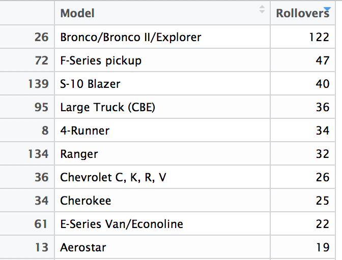
Manipulating these counts takes a more work. First we use the function order; this function does not sort data by itself. Rather it gives you the information that you can use to sort a variable. Rather than sort data, order provides the indices that put the data frame into order. (BTW, sort sorts the elements of a vector.) For example
order( c(1,6,3,10) )## [1] 1 3 2 4Hence, by using the result of order as indices, we get the vector in ascending order.
i <- order( c(1,6,3,10) )
c(1,6,3,10)[i]
## [1] 1 3 6 10The following commands arrange the rows of the data frame into order based on the number of rollovers. Notice that we want the data in descending rather than ascending order so that the models with most rollovers come first. This list matches what we saw with View, but now we can manipulate the sorted data rather than just look at the sorted values.
i <- order(FARS$Rollovers, decreasing=TRUE)    # descending order determined by this column
sortedFARS <- FARS[i,]                         # save sorted data frame as a new data frame
sortedFARS[1:10,]                              # show first 10 rows
## Model Rollovers
## 26 Bronco/Bronco II/Explorer 122
## 72 F-Series pickup 47
## 139 S-10 Blazer 40
## 95 Large Truck (CBE) 36
## 8 4-Runner 34
## 134 Ranger 32
## 36 Chevrolet C, K, R, V 26
## 34 Cherokee 25
## 61 E-Series Van/Econoline 22
## 13 Aerostar 19The example in the textbook limits the display to the 9 models with the most rollovers, and accumulates the others in a tenth category. Let’s do that in a new data frame. We start with a condensed data frame with the most common 10 models, and then replace the tenth row to match the table in the text.
Counts <- sortedFARS[1:10,] # 10 most common modelsNow replace the tenth row by the sum of all but the first 9. The function nrow returns the number of rows of a matrix or data frame.
n <- nrow(FARS)
Counts[10,"Rollovers"] <- sum(sortedFARS[10:n,"Rollovers"])
So far, so good. But now we need to fix the model name of the last row to be “Other”. That hits a snag because R represents the model names as a factor.
Counts[10,"Model"] <- "Other"## Warning in `[<-.factor`(`*tmp*`, iseq, value = "Other"): invalid factor
## level, NA generatedYou cannot add a new level to a factor. We’ll fix this by converting the model name to be the collection of text strings – character data – rather than a factor. Then we can replace the name.
Counts$Model <- as.character(Counts$Model)
Counts[10,"Model"] <- "Other"
The data table looks the same, but the first column is different.
Counts## Model Rollovers
## 26 Bronco/Bronco II/Explorer 122
## 72 F-Series pickup 47
## 139 S-10 Blazer 40
## 95 Large Truck (CBE) 36
## 8 4-Runner 34
## 134 Ranger 32
## 36 Chevrolet C, K, R, V 26
## 34 Cherokee 25
## 61 E-Series Van/Econoline 22
## 13 Other 640Now let’s add the percentages. We already know the total number of rollovers. In addition to reading a column from a data frame, the $ notation allows us to add another column to the data frame, too.
Counts$Percentage <- Counts$Rollovers / sum(Counts$Rollovers)
Counts
## Model Rollovers Percentage
## 26 Bronco/Bronco II/Explorer 122 0.11914062
## 72 F-Series pickup 47 0.04589844
## 139 S-10 Blazer 40 0.03906250
## 95 Large Truck (CBE) 36 0.03515625
## 8 4-Runner 34 0.03320312
## 134 Ranger 32 0.03125000
## 36 Chevrolet C, K, R, V 26 0.02539062
## 34 Cherokee 25 0.02441406
## 61 E-Series Van/Econoline 22 0.02148438
## 13 Other 640 0.62500000Now we can draw the bar chart of the frequency distribution.
with(Counts,
     barplot(Rollovers, names=Model, horiz=TRUE))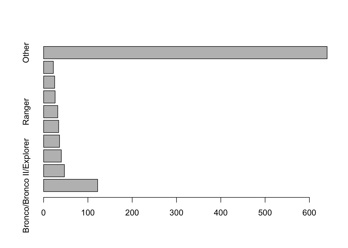
We need to improve this plot. First, the count for the “Other” category makes it hard to see the counts of the less common, but specific models. Second, there’s no room for the labels. The first problem is easy to fix: just omit the tenth row of the table. The second requires shortening some of the names, such as the long collection that includes the Bronco, and making room for the labels.
I’ll do both here, making use of par to control the margins and labeling of the axes in the plot. The settings defined using par are “sticky”. Subsequent plots will use these. (R-studio avoids that problem.) That’s not what we want to happen, so save the current settings and restore them after drawing the plot.
Counts[1,"Model"] <- "Bronco"      # shorten these names
Counts[9,"Model"] <- "Econoline"

savePar <- par(mar=c(4,9,1,1),     # add more to the margin to left of plot
               las=1)              # write the labels horizontally
    barplot(Counts$Rollovers[1:9], names=Counts$Model[1:9], horiz=TRUE)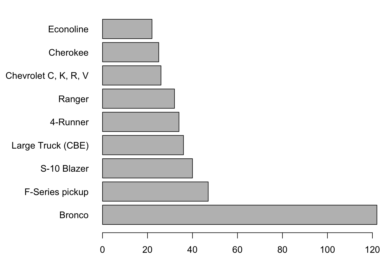
par(savePar) # restore the default plot settingsCareful readers will notice the order of the display differs from the order in the data (as shown in the text). To reverse the order of the bars, change the order of the indices. Here’s the difference.
1:9## [1] 1 2 3 4 5 6 7 8 99:1## [1] 9 8 7 6 5 4 3 2 1The new plot is
savePar <- par(mar=c(4,9,1,1),    # add more to the margin to left of plot
               las=1)              # write the labels horizontally
    barplot(Counts$Rollovers[9:1], names=Counts$Model[9:1], horiz=TRUE)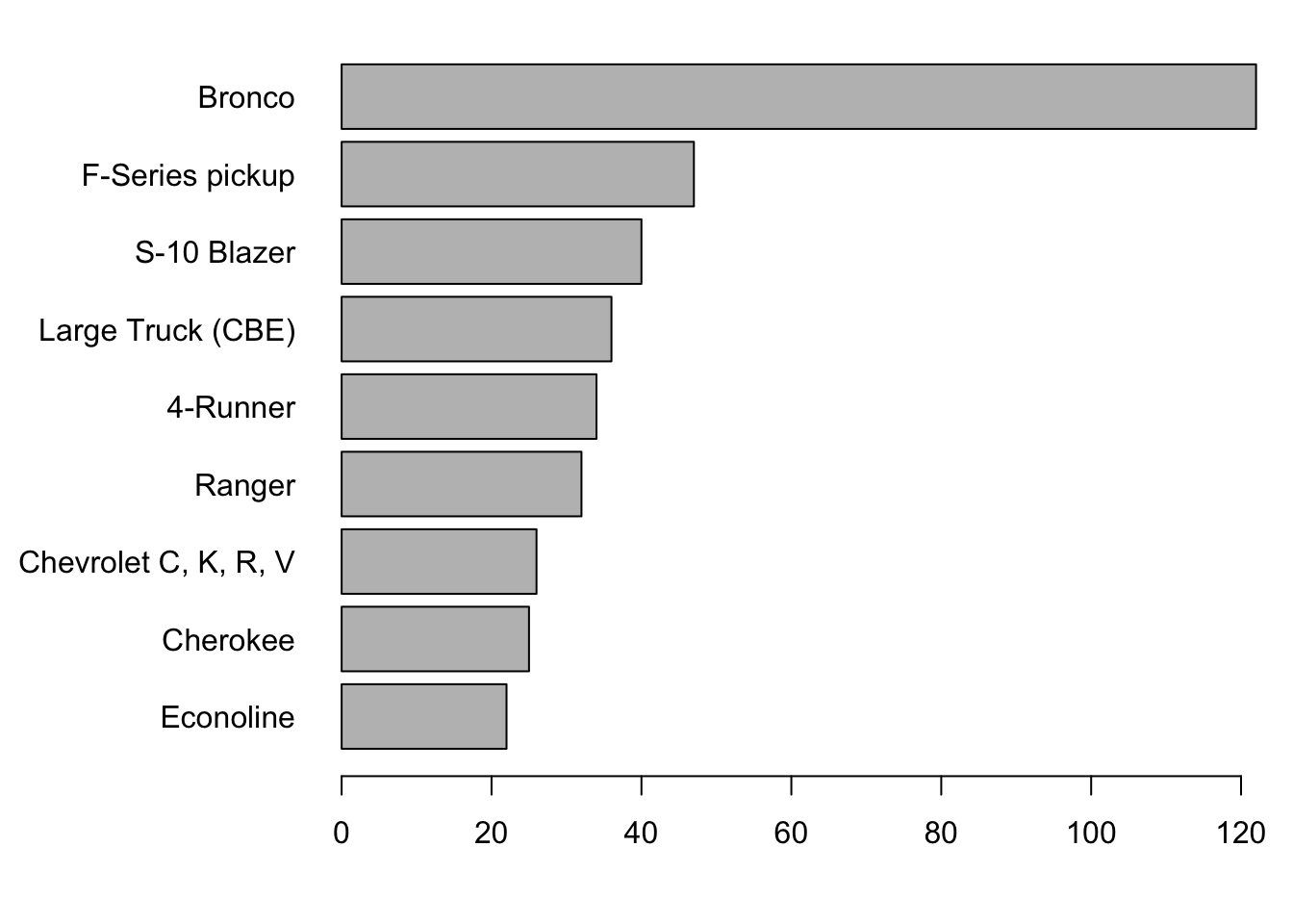
par(savePar) 3.2 Analytics in R: Selling smartphones
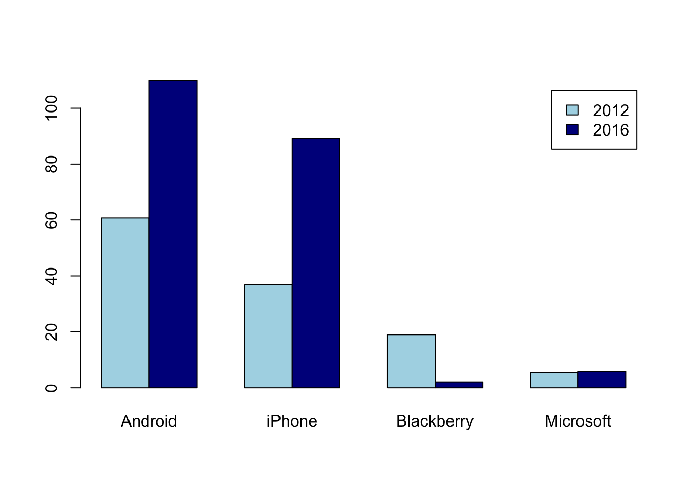
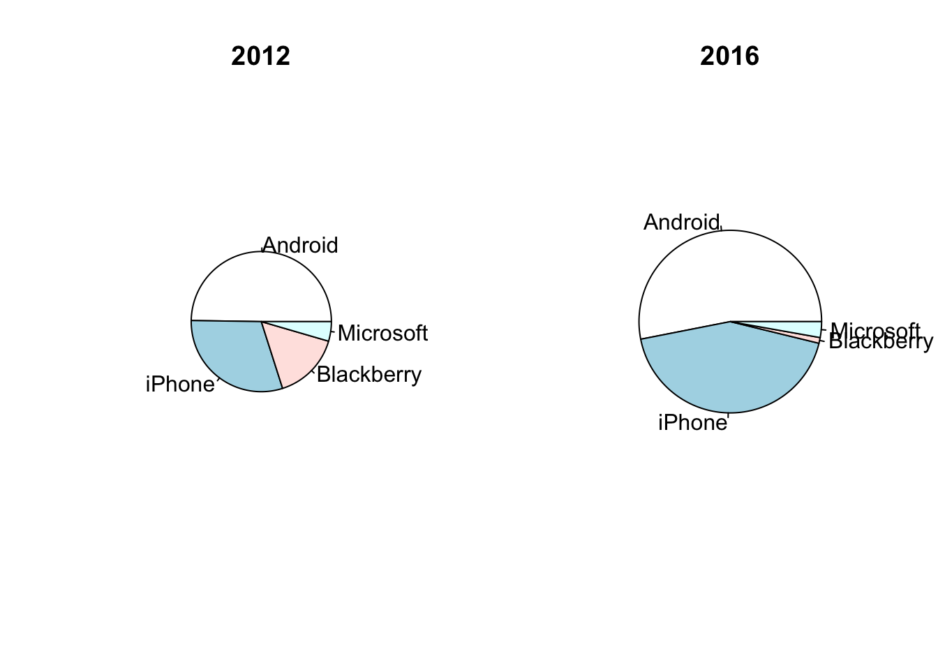
This is another tiny data frame, so I’ll type in the values at the command line. Column names in a data frame cannot begin with a number, so the labels are a little different from those used in the version of this case in the text.
Phone <- data.frame( type=c("Android", "iPhone", "Blackberry", "Microsoft"),
                     sales_2012 = c(60.7, 36.8, 19, 5.5),
                     sales_2016 = c(109.9, 89.2, 2.1, 5.8)
                    )
Phone
## type sales_2012 sales_2016
## 1 Android 60.7 109.9
## 2 iPhone 36.8 89.2
## 3 Blackberry 19.0 2.1
## 4 Microsoft 5.5 5.8Keep the area of the charts proportional to the total sales by setting the ratio of the radii of the plots to the square root of the ratio of total sales. (Recall that the area of a circle of radius \(r\) is \(\pi r^2\).) That the Blackberry label is almost invisible in 2016 is probably fine: you don’t see those on the street very often anymore.
with(Phone, {                            # avoid typing 'Phone$' lots of times
    ratio <- sqrt(sum(sales_2016)/sum(sales_2012))
    savePar <- par(mfrow=c(1,2))            # one row of plots, with 2 side-by-side
    pie(sales_2012, labels=Phone$type, radius=0.5, main="2012")
    pie(sales_2016, labels=Phone$type, radius=ratio*0.5, main="2016")
})
To get the stacked bar chart, use barplot. This function expects the counts to be in a matrix of numbers rather than a data frame, so we have to make that conversion first. A matrix is also a rectangular table, but unlike a data frame, a matrix consists of data of all the same type. (You cannot mix names and values in a matrix.)
matrix <- as.matrix(Phone[,2:3])
rownames(matrix) <- Phone$type      # rather than just 1,2,3,4

matrix
## sales_2012 sales_2016
## Android 60.7 109.9
## iPhone 36.8 89.2
## Blackberry 19.0 2.1
## Microsoft 5.5 5.8This version of the plot shows the data grouped within a year.
barplot(matrix, legend=Phone$type, beside=TRUE)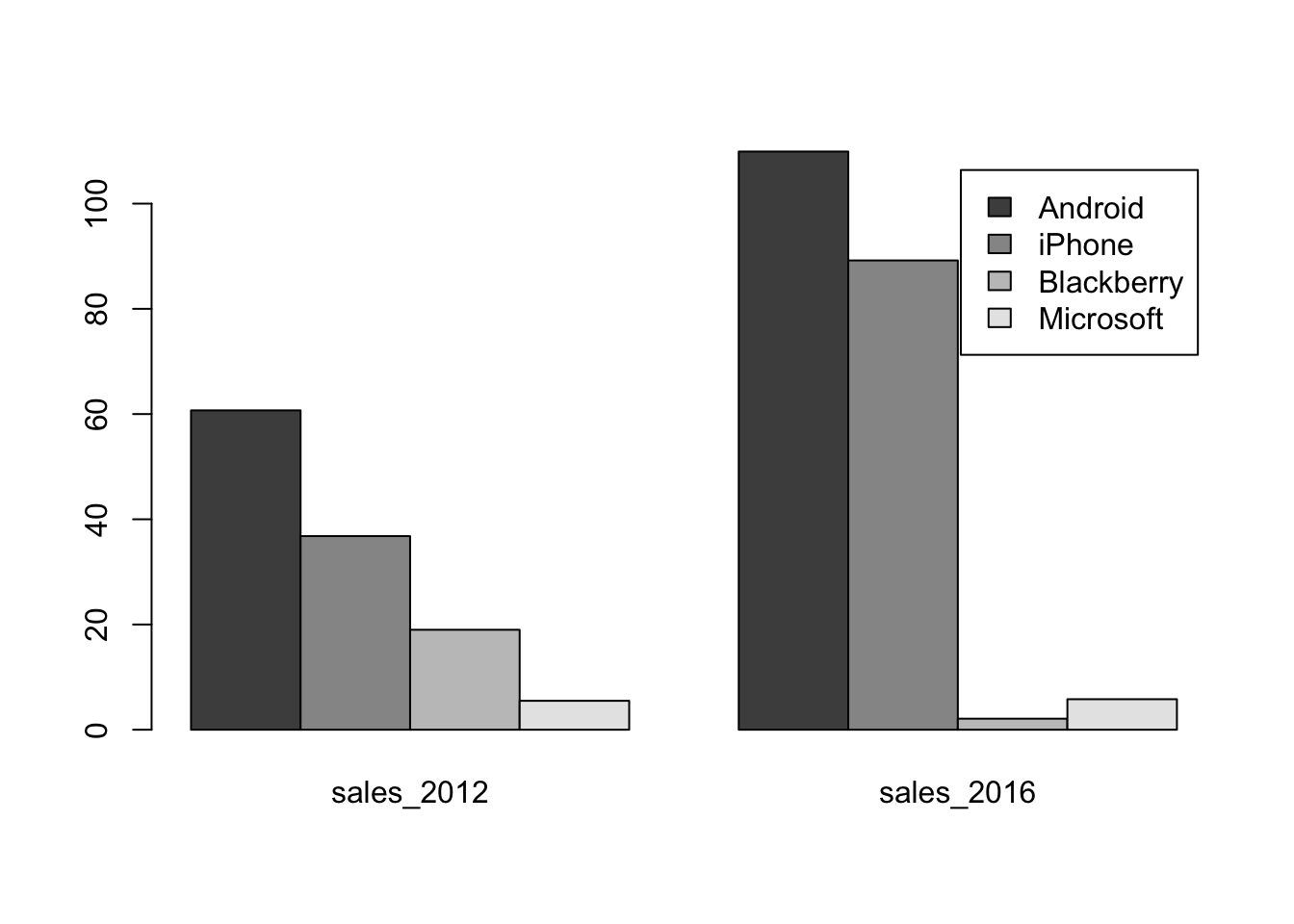
This following version groups the data by the type of phone. Doing so requires transposing the matrix with the function t, so that columns become rows and rows become columns.
t(matrix)## Android iPhone Blackberry Microsoft
## sales_2012 60.7 36.8 19.0 5.5
## sales_2016 109.9 89.2 2.1 5.8barplot(t(matrix), legend=c("2012", "2016"), beside=TRUE)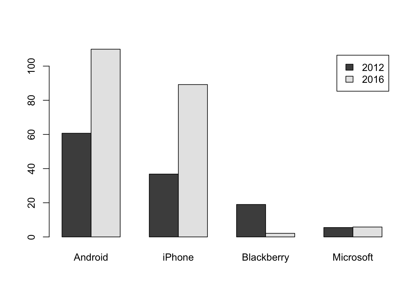
You can use more dramatic colors as well.
barplot(t(matrix), legend=c("2012", "2016"), beside=TRUE, col=c("lightblue", "darkblue"))